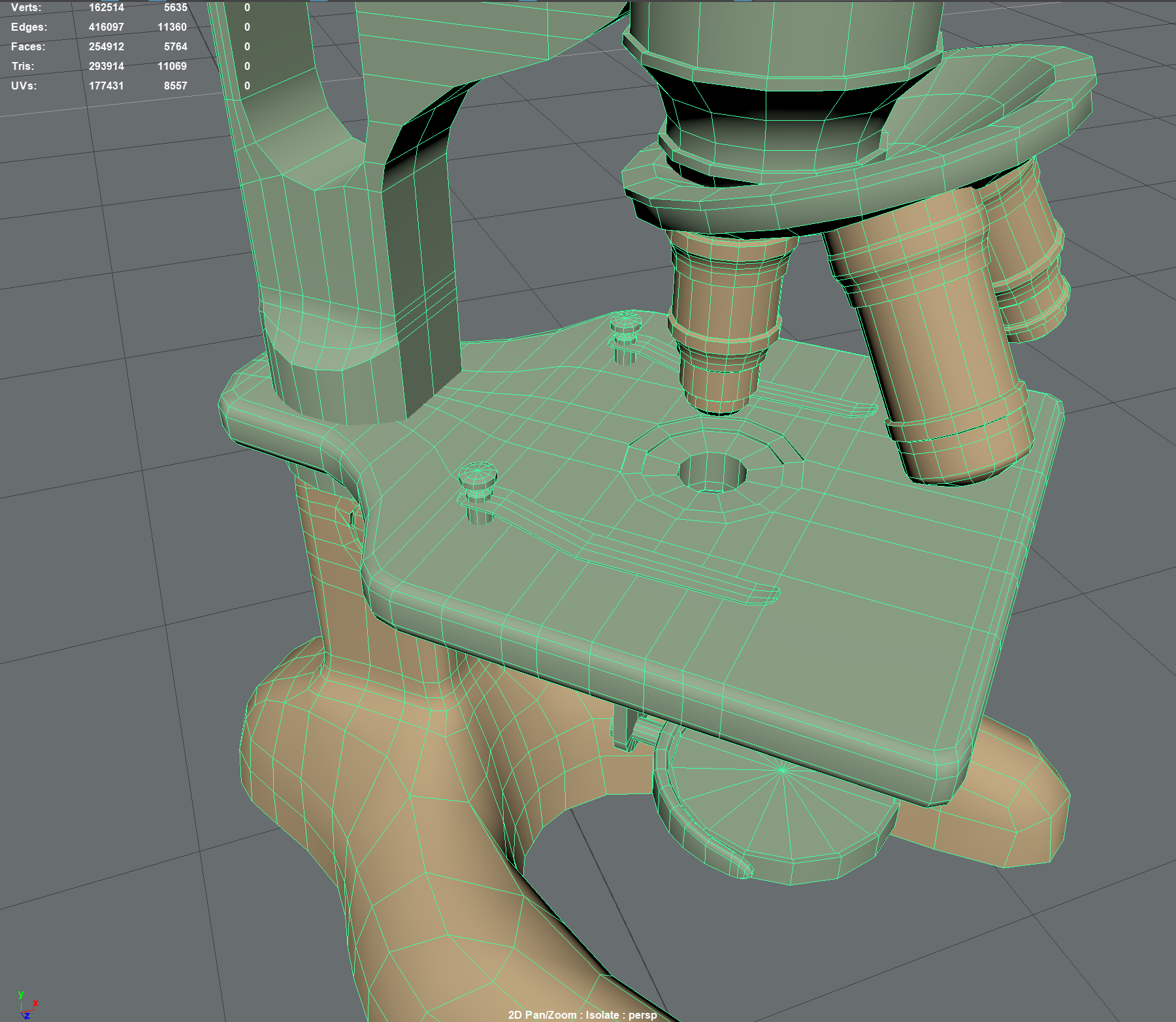
Looking for Feedback on my topology
Hey all!
I have been working on an environment scene and this is one of my hero assets which I would like to showcase in detail later on. I would like to have some feedback on it, particularly the topology. What else could I do to make this asset look better and game-ready?


Replies
is this a lowpoly? a highpoly basemesh? what are we looking at exaxtly?
Hi! It is the lowpoly
Ain't nothing low about it :D
Remove all topology that doesn't offer anything to the silhouette. Don't be afraid of triangles. If this is your hero asset, spend a lot more geometry on defining silhouette - you have a lot of blocky round/cylindrical details which could pass for a background asset, but not for a hero prop.
It would help everyone to give better critics if you can include the concept art/ reference image you used as target for this asset. Target final tris count/ poly count would help too.