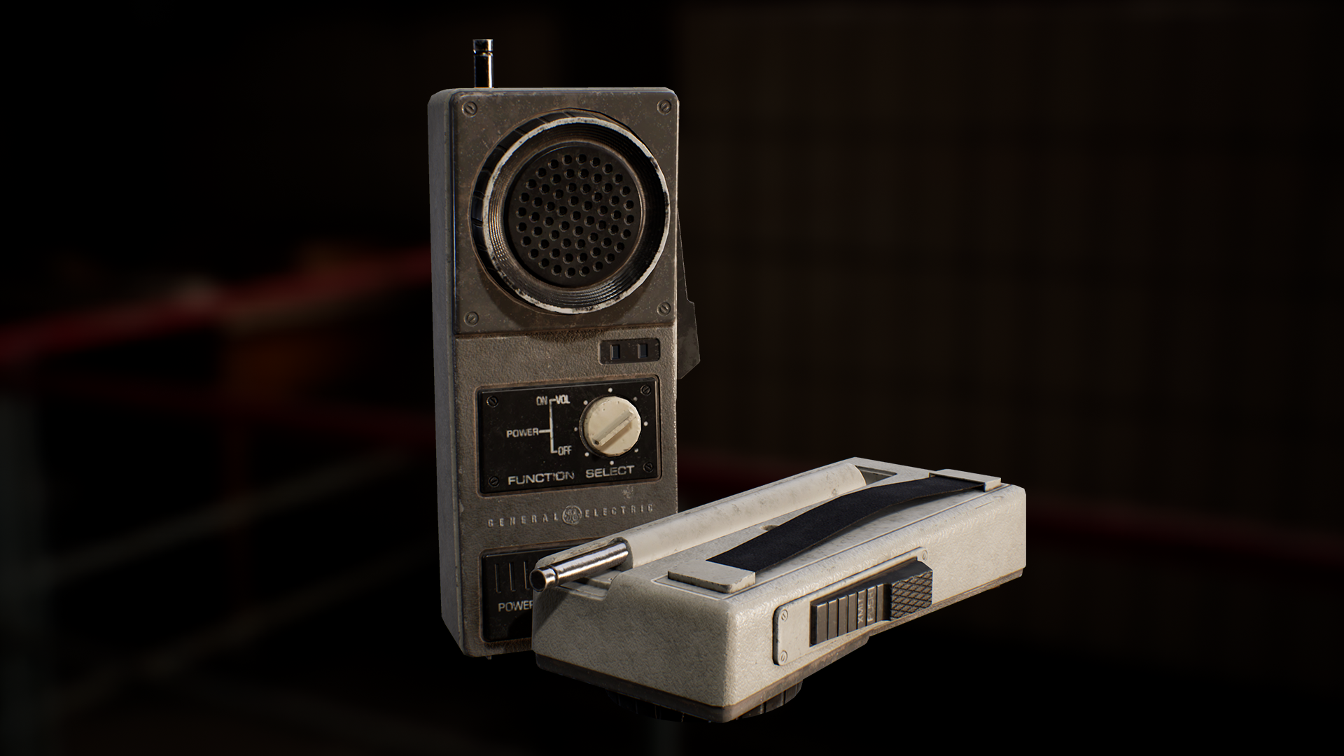
Old Walkie Talkie
Lately I've been following tutorials and doing small exercises to improve my understanding of topology and edge flow. Put what I learnt to use in this project, focusing on making several extrusions on an object without having too many edge loops run around it. Also cut down the tri-count of the low poly by getting rid of anything that wasn't needed to hold its shape so it wasn't just the high poly without the bevels and supporting edges.
Tri-Count - 2,715
Modelled in Blender
Textured Substance Painter
- Alphas made in Photoshop
Rendered in Unreal Engine 4
Feedback is welcome
Low Poly
High Poly
References


Replies
Looks good, your topo passes muster for me and is at a very appropriate polycount. Your high poly has a lot of wandering loops and tight supporting edges that could serve the model a bit better by terminating more coherently, avoiding those enormous thin polys you have currently.
I think your materials look a bit Substance Painter 2016 (if that makes any sense). A lot of this is down to stylistic preference, but I think you have maybe over-weathered your model with respects to your references, and there's perhaps too much reliance on high frequency & quite pronounced bump details alongside cloudy weathering which belies a sort of procedural look. The presentation is okay - I appreciate the inclusion of a lot of different topo angles & references, but the main render is a bit flat and uninspired, being a pretty standard floating model against a blurred-HDR, lit via IBL(?) This could be pushed further with some more dynamic lighting & sense of style, alongside a more grounded scene setup.
Good Work!
It's mainly lit by that blurred HDRI, with a warm directional light hitting the right side of the model and a cool point light hitting the back. I followed Elvis Posa's guide on ArtStation, 'Rendering in Unreal Engine 4', because I wanted to try presenting this model differently. My last model was a PS2 and was placed in a scene, not really grounded, just based on some PS2 photos I saw.
But yeah I'll have a go at making a scene for the walkie talkie.
Regarding the textures, I was going for a more worn out look but I see what u mean. I tend to abuse the generators and smart masks. Whatever I do next, I'll try toning down the weathering and avoid having dirt and whatnot everywhere so it isn't so uniform. Not sure what you mean by "Substance Painter 2016" though. Only been doing this for about a year haha.
Thanks for the input! Appreciate it!
I like that PS2 scene a lot more in terms of composition, doing more in that vein would be good. I would call it 'grounded' as it is presenting a clear narrative of some sort to the viewer: This is someone's collection that maybe they're showing off, or trying to sell. It doesn't have to be explicit or super detailed, but there's a sense of reality & intrigue to the scene you've created, which I can't say is present in the Walkie-talkie render.
By "Substance Painter 2016" I was really just trying to say that it reflects a texturing style that seemed to be popular back then, characterised by a lot of procedural techniques & pronounced height information. This is just a matter of developing your own workflow and personal style however, which really just takes time. Personally, I tend to hand-paint everything if i'm taking it into Substance Painter, as i've already taken the time to unwrap it to the texel density required that I may as well make use of the extra detail. I also rarely paint on height information, letting the high poly bake drive most of it. Again, just a personal stylistic choice!
Had another go at texturing this, toning down the weathering and height info so it resembles the references a little more closely.
Did a little bit of research but didn't find much about this specific model other than being was used for recreation and work. I went with the latter and put together a small scene; a desk at a construction site.
Pencil and ruler by Megascans