Home 3D Art Showcase & Critiques

Female Game Character - Need Feedback

polycounter lvl 2
Offline / Send Message
Moheb polycounter lvl 2
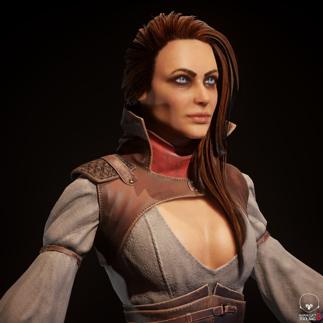
Hi everyone, here is my first game ready character after 5 months of deliberate practice, a personal project.
Please do not hesitate to make constructive criticisms. I am at the beginning of this path and I need your guidance and criticism to progress.
I have had problems with my hair cards for a long time and as it turns out, it did not work well, but I am looking to get better and better with my hair cards. Any suggestions in this regard will help me a lot.
I hope you enjoy


Replies

  • BlueChaos
    Offline / Send Message
    BlueChaos polycounter lvl 2
    I'm no professional yet so take this with a grain of salt, but I really really like this! I adore your work on the materials/textures. The face could have used some more wrinkles if you wanted her to be more realistic in my opinion, but it already looks very good :D  
  • Moheb
    Offline / Send Message
    Moheb polycounter lvl 2
    BlueChaos said:
    I'm no professional yet so take this with a grain of salt, but I really really like this! I adore your work on the materials/textures. The face could have used some more wrinkles if you wanted her to be more realistic in my opinion, but it already looks very good :D  

    Thanks for your honest opinion , I agree with you about details, definitely it need more. in the next project I will pay more attention to these kind of details and I hope to get better.
    Your comment will definitely be very helpful in this regard. wish you the best and thanks again


  • kanga
    Offline / Send Message
    kanga quad damage
    The face is pleasant but looks very low poly. I can't tell if its a problem with the lopoly or baking (no lip line, its just a blur, the lips should give the impression of being able to part and this is true with the rest of the facial features, there are no real crease where there should be). It looks like a very dated lowpoly. The folds in the shirt cloth (and trousers) look unconvincing and need work. Gather a lot of clothing references to use while working and /or get hold of Marvelous Designer. Your lowpoly looks like you have modelled way too much detail. Those little pins should be picked up by the normal map. The seperate parts may be quite a pain to animate together as one figure. The ankle and andle looks off in the front view.
  • Moheb
    Offline / Send Message
    Moheb polycounter lvl 2
    kanga said:
    The face is pleasant but looks very low poly. I can't tell if its a problem with the lopoly or baking (no lip line, its just a blur, the lips should give the impression of being able to part and this is true with the rest of the facial features, there are no real crease where there should be). It looks like a very dated lowpoly. The folds in the shirt cloth (and trousers) look unconvincing and need work. Gather a lot of clothing references to use while working and /or get hold of Marvelous Designer. Your lowpoly looks like you have modelled way too much detail. Those little pins should be picked up by the normal map. The seperate parts may be quite a pain to animate together as one figure. The ankle and andle looks off in the front view.
    Wow, that was great, you've mentioned so many good point and now I know the benefits of good and professional comments. thank you very much. about folds, I used marvelous but I completely relied on it not the references.
    thank you again


Sign In or Register to comment.