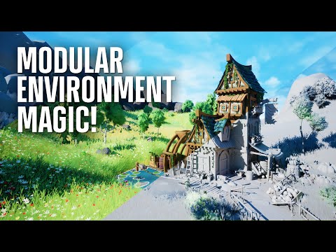
[FINISHED] Merchant in The Valley UE5 - Video breakdown/Tutorial
Hello everyone
I created an environment piece in Unreal Engine called “Merchant in The Valley”. I want to create a short breakdown for Polycount how I created the trim sheets and approached the modular assets and foliage.
If you want to watch a video, I created a video breakdown for Stylized Station. Under the video, I will continue with the breakdown.
I am not an experienced 3D designer/modeller and therefore starting with a large environment is always a daunting task. Normally I start by just modelling some assets and it gets chaotic very quickly but for this project, I tried to maintain sanity and tried working with an overview. For this task, I used trello to keep track of all the tasks and not get distracted.
I am not a very big fan of blockout and therefore I started creating modular pieces in Blender. I used a lot reference images to create this blockout. Ofcourse, modelling a medieval house is perfect to be divided into modular pieces due to all the wooden beams. For reference, all large pieces are exactly 2 meter in height, while the small pieces are 1 meters. I created too many modular pieces and had to remove some because I created too much details. The roof is not modular as the beams are crooked to emphasize the “Medieval feeling”.

I created a wood construction kit, consisting of small, large and medium beams. I decided that I would created a tileable trim sheet to texture the wooden beams. It is very important that you plan this step in advance, especially the UV layout is very important. If you want to follow a step by step tutorial on how to create, plan and texture this trim sheet, you can look at the video breakdown.

For the materials, I created a master material. I am certainly not a shader wizard, therefore it is a basic material. I blend a noise mask (in world space) with the base color, to create some variations in contrast and thus in the texture.
For the wooden beams, I created three different color variations in Substance Painter ( light, med and dark)

My workflow consists of the following:
- Modelling a 3D model
- Sculpting in Zbrush
- Decimating the model in Blender or in Zbrush
- Retopology (lots of time, I skip this step sorry)
- Texturing and baking in Substance Painter
When I exported my textures from Substance Painter to Unreal Engine with the *.png format, I always got very washed out textures. As a solution, I exported all texture maps with the *.targa format and it works much better.

I started with creating a very simple grass mesh. I edited the normal for the mesh, so that the normal directions are all pointing in the z-direction, as you can see in the picture below. If you don’t change these normals, the shading will look very messy and you will not receive a uniform blob effect.

In my video breakdown, I show you how to do it in Blender! The grass texture is a simply material that contains a color gradient in the z-direction, so the UV-unwrap is very important. This video (by Stylized Station, not a sponsor hehe) is a good tutorial on how to create grass.
I used the foliage system in Unreal Engine to place my grass. I created three different grass models, with different colors.
Lastly, I want to talk to you about the trees. Again, my video explains how to do it from scratch! In Krita, I created a alpha mask. In Blender, I created a mesh that contains planes and these planes are UV unwrap to span the complete alpha mask. I used the “Particle System” to scatter my planes around a spherical mesh. If I look back to the video, “Geometry Nodes” would have been a better approach but I didn’t use it yet in Blender. In Unreal Engine, I created a new material that again lerps between two colors in the Z-direction.


The final result:


I hope you learned something today and if something is not clear or you want more information, you can always contact me on Artstation, Polycount or Instagram!
I know how hard some things can be to just get started!

 https://youtu.be/dJnAuVtwxPI
 https://www.youtube.com/watch?v=jq2prOObYrQ&t=418s