Bad to the Bone (Artstation Challenge) - Looking for Feedback
I'm participating in the Artstation challenge for the first time. I've been working on it for the past week and would love to get some feedback!
I chose to do Jeff Colin's Submission for my environment.
Here is his final concept.

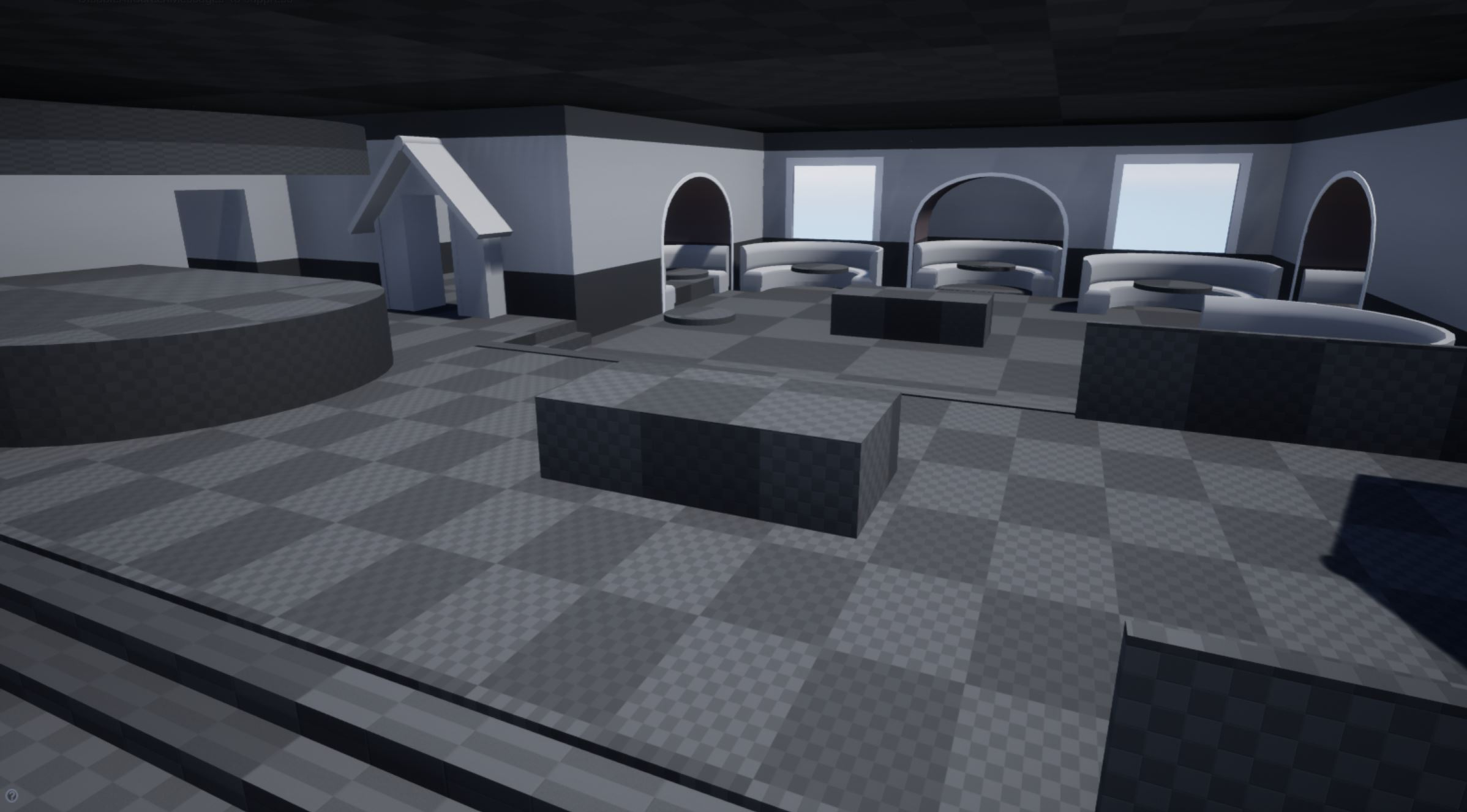
After gathering references, I started out with blocking out the scene.

I wanted to get a first pass of the rooms textures in the scene pretty early. I am using Substance Designer for the tile and wood flooring and ceiling. For the wallpaper, I knew that I don't have the skill level to try and pull that off in Designer (I'm still learning) so I created the alpha in Photoshop.
I created a trim sheet for the wall wood indents, window/wall trims, the bar and the crown molding. I haven't added the crown molding yet, it'll get done in the next few days.
This is where I'm at now.

I've tried playing around with the lighting. It isn't my strength so I know I have a lot of work to make it more appealing. I'm going to add the ceiling lights and the wall light next because I think that'll help.

I chose to do Jeff Colin's Submission for my environment.
Here is his final concept.

After gathering references, I started out with blocking out the scene.

I wanted to get a first pass of the rooms textures in the scene pretty early. I am using Substance Designer for the tile and wood flooring and ceiling. For the wallpaper, I knew that I don't have the skill level to try and pull that off in Designer (I'm still learning) so I created the alpha in Photoshop.
I created a trim sheet for the wall wood indents, window/wall trims, the bar and the crown molding. I haven't added the crown molding yet, it'll get done in the next few days.
This is where I'm at now.

I've tried playing around with the lighting. It isn't my strength so I know I have a lot of work to make it more appealing. I'm going to add the ceiling lights and the wall light next because I think that'll help.

Replies
I haven't started playing around with fog yet. I'll definitely try that out soon.
I wanted to try making a WIP gif. I'm missing the first few progress shots because I didn't have the camera set up yet.
I tried adding some subsurface scattering to the curtain on the right side to show some sun coming through. I also added some picture frames around the bar.
And yet again, I've played around with the lighting.
Did a lot of minor changes over the past few days.
- Room size
- Dog house door skinnier
- Bar colour
- Booth wall border thicker
- some textures revisited
- lighting
Here are some things I think could be improved:
- Billiard table looks a bit simple, more fancy would fit the rest of interior more.
- I agree with Omar about using fog to separate foreground from background.
- the toilet could use some more ao beneath the roof - would make sign pop more
- the metal of the bar looks yellow
- in the concept the floor in front of the bar is very smooth and shows reflections, maybe you can get this in too?
Overpaint for illustration:Since it's in the foreground some details would help to make the large surface more interesting.
Much success finishing your entry
Maybe in the future you can return to it and experiment a bit more with the lighting.