Home 3D Art Showcase & Critiques

[FINISHED] Fantasy forest path Environment

polycounter lvl 5
Offline / Send Message
stefanWilliams_C polycounter lvl 5
Hello again! 
Starting up a new environment project after being quite busy aside from making art. I've set my own time restrictions and goals to try and push me to work on it whenever I can. The main idea is to make an optimized game-ready environment partly using the new nanite technology in UE5. I've been recently quite inspired to make a night lighting environment in a dark, fantasy setting and I managed to get a few references together to start off. Below is my main reference which I am basing my block out off. 

The composition and moody colour scheme of this piece really stood out to me. I have received permission from the original artist to use this piece for a non-commercial portfolio project. 

I started off by creating a few block out models to start blocking out the overall scene and getting the camera set up. At this point was mainly focusing on shape language-silhouette. 
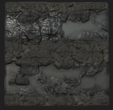
Made a quick base for the muddy path material too as its important for directing the eye in the concept. 


This is where I am currently for block out. Aiming to put more time into the main focal point, perhaps making one more central building. Also going to look more into lighting and tweaking what I have at the moment before going into sorting out what assets I need.
Thanks for checking out my post! Feedback is very much appreciated :)

Replies

  • Lether
    Offline / Send Message
    Lether polycounter lvl 8
    Maybe try to pay attention to the top of you trees on the top right side of your screenshot. Eveything is almost perfectly aligned :) The same for the middle top left (ahah, I am accurate). It might be more chaotic and it will suit better to the overall feeling of darkness of your concept.
  • Phoenix995
    Offline / Send Message
    Phoenix995 polycounter
    Looks good so far, all i would say for now is, try to copy the position of the trees from the concept. the composition on the concept is really good!
  • stefanWilliams_C
    Offline / Send Message
    stefanWilliams_C polycounter lvl 5
    Thanks for your feedback, @Lether and @Pheonix995 I'll look at the trees more as I move on with compositing everything. I aim to have only a few of the trees fully visible, like in the concept, to really direct the eye towards the focal point. 
  • jrigaldies
    Offline / Send Message
    jrigaldies polycounter lvl 2
    Having a few different tree models will also help with breaking the monotony of the forest. I would also note how the ground slopes upwards towards the buildings a bit more in the concept image - I don't know if the current camera view you have will be the exact final shot, but remember we want to be able to see the road texture too.
  • stefanWilliams_C
    Offline / Send Message
    stefanWilliams_C polycounter lvl 5
    Had some time to work on this environment over the past few weeks. Managed to make a few more tree models and changed the composition a little to be somewhat closer to the original concept. Also worked on a cobblestone wall material.


    I'm struggling to get the mood of the original reference, but testing and pushing this as I go along. Gonna work more on the path and ground a little more next! Thanks for reading :D
  • ThisisVictoriaZ
    Offline / Send Message
    ThisisVictoriaZ polycounter
    Hey this is really cool! I would suggest possibly using fog cards for the thick fluffy clouds of fog near the house. Also your carriage tracks are raised and catch the eye almost immediately, but in the concept they more more in the ground and much more dispersed throughout the road.
  • stefanWilliams_C
    Offline / Send Message
    stefanWilliams_C polycounter lvl 5
    Thanks for the feedback @ThisisVictoriaZ ! Yeah I'm still deciding what to do with the ground tracks. Looking more closely at the concept, the tracks aren't at all uniform which kind of adds to the entire feel of the muddy road toward the village. In that case, I will take a look at vertex painting the wetter tracks/puddles in rather than using a spline based system like I made earlier
  • stefanWilliams_C
    Offline / Send Message
    stefanWilliams_C polycounter lvl 5

    Another quick update on this environment! Today I looked into changing the original spline mesh I had for the path to vertex painted puddles and getting the overall mood of the concept. I think it really makes a difference and is looking closer to the concept now! Still got to play around with the grass material, replace a few trees here and there and get some candles going. Also there is a slight slope giving a bit of a Dutch Angle to the scene in the original concept that I want to bring out in this too!
  • stefanWilliams_C
    Offline / Send Message
    stefanWilliams_C polycounter lvl 5
    Been working a little more on this environment over the last week! The focus of this week was still going over composition, trying to nail down what makes the original concept so good. Since most of the screenspace is the trees, I don't want the overall image to look so cramped which is why I've created more high-value areas towards the village/foccal point. Aside from compositional stuff I have made candle models, a few new tree models and worked a little on foliage. I did start a trim sheet for the houses but want to rethink it a little so I can really make the houses look good. 


    This is where I am at the moment! Thanks for reading my post :D
  • stefanWilliams_C
    Offline / Send Message
    stefanWilliams_C polycounter lvl 5
    Hi again! Progress on this environment piece is going quite slowly, so I'm setting more time aside to work on it. As of now, I've been working on some roof tiles that will be visible for the houses, another mud path spline model and general composition/color. Moving forward, I want to take more of a look at the house models and get them looking good in the context of the scene as it's quite hard to make out details from such a long-shot of the village. However, since the houses are more of background filler splitting the scene in half, I'm not going to bother making highly detailed models/textures. 
    (Above) I wasn't happy with how flat the dirt path looked in my previous post, so I made a quick sculpt to drop into my current spline blueprint which I could use alongside the work I had already done on the path. I'm happier with how it turned out right now, but I will probably make a more detailed sculpt later. 


    I also changed the grass model to be a larger clump to make the grassy areas look more lush. 


    Thanks for reading! :) 
  • stefanWilliams_C
    Offline / Send Message
    stefanWilliams_C polycounter lvl 5
    Starting to finalize the composition for this environment! I decided to take some time away from this piece to try and look at it with fresh eyes since I was starting to feel as if I was changing things back to how they were a few iterations ago which was very unproductive. For now, I've altered the positioning of the trees and cobblestone to be closer to the concept and added a new tree model variant, sculpted an improved path with more emphasis on breaking up the mud details to look messier. I also focused alot on lighting since I felt that I missed the mark of the concept's more dramatic lighting setup. 
    (I restrained myself from putting time into the house model since none of the detail is seen in the final composition)

    So that's where I am at the moment! Feedback is very appreciated! 
    My plan so far is to finish this scene within the next week or so, then make my own lighting and alter the concept with my personal touch :D
  • jrigaldies
    Offline / Send Message
    jrigaldies polycounter lvl 2
    This looks good! Here are a few more things I might tweak:

    1. Vary the candle heights a bit more. It looks like you have a few too many tall ones. Also try clustering them slightly like the concept.
    2. The gradient/texture betweeen the water and mud on the road seem bit low resolution or blocky. Try adding some noise or a detail texture to the normal map, or color, or both (however you set up the material/textures).
    3. Your pine foliage is misaligned (I'm a foliage person, so it sticks out to me ;) ). If you look at your cards, many of them seem to have the middle part anchored to the parent branch, or that the starting of point them is out in space. 
    I do like your bark textures though! Just be mindful of tiling in some places.
  • stefanWilliams_C
    Offline / Send Message
    stefanWilliams_C polycounter lvl 5
    Thanks for the feedback @jrigaldies ! Yeah, I was planning to fix the foliage issue but inevitably forgot! 
  • stefanWilliams_C
    Offline / Send Message
    stefanWilliams_C polycounter lvl 5

    Managed to work more on this environment, so I'm just posting here to see if I can get any more feedback on the current state! I think, in terms of assets, I'm done. I just want to master the concept as much as possible at this stage before trying out different lighting setups and assets. 
    Since last post, I've changed the composition of the houses a little more, updated some of the trees and covered up the low res vertex painting on the muddy water :)
    Thanks for reading! 
  • Fabi_G
    Online / Send Message
    Fabi_G high dynamic range
    Looks very atmospheric and matches the mood of the concept :+1:

    What I think would improve the result:
    • Foreground less organic, clear distinction between walls and ground. Would help readability/ guidance.
    • Candles clustered even more
    • Higher contrast for lit windows (shape, value) to ensure they draw the eye.


    Looking forward to see how it turns out :)
  • stefanWilliams_C
    Offline / Send Message
    stefanWilliams_C polycounter lvl 5
    Thanks @Fabi_G
    The people I've talked too already about this piece also mentioned the houses needing to capture the eye more. I've turned down the fog a bit and increased the intensity of the window lights as well as put more contrast between the bark in the fore and midground trees to guide the eye more. 
  • stefanWilliams_C
    Offline / Send Message
    stefanWilliams_C polycounter lvl 5
    Managed to get far enough with this piece to post it on artstation! I'll mark this one as finished since I've spent just over 2 months on it (a little over my set deadline already haha) and I want to get it out there whilst I work on another project. Thanks for all the feedback though, and obviously I welcome more feedback and critique! 
    https://www.artstation.com/artwork/EaLKlN
Sign In or Register to comment.