[WIP][UE5] Oasis Observatory Environment
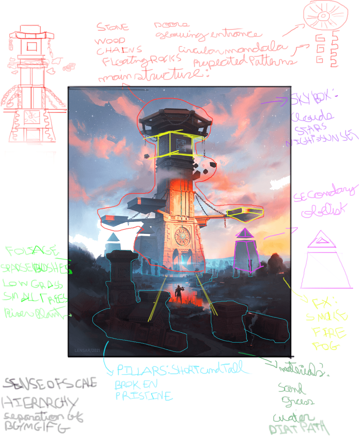
Going to be following this concept by Alexander Borodin i really like the sense of scale and wonder this concept has.

It has a nostalgic fantasy vibe(that screams tabletop RPG dungeon) to it that I fell in love with it and the vibrant colors and lighting.

Planning and breaking down the scene and concept

References for the general Architecture and Foliage.

Blocking out the structures

It has a nostalgic fantasy vibe(that screams tabletop RPG dungeon) to it that I fell in love with it and the vibrant colors and lighting.

Planning and breaking down the scene and concept

References for the general Architecture and Foliage.

Blocking out the structures

Replies
Mostly working on the scale and composition at this point
Getting the shapes and scale to be more in line with the concept.
Also added a cubemap to the scene and changed the fog colors and opacity.
Some adjustments and basic sand and stone landscape material.
video with ambient effects
Attempting to add some wind effects and dust/sand to the scene, it still needs a lot of tweaking, currently it feels repetitive and kind of noisy
Made a simple panning material for the vertical "runes" going up the crevice.
Also made some simple bramble/thorn meshes, i still need to make some foliage and also work on the water.
Spent a lot of time working on the sky and the atmospheric fog, I still need to tweak some of the values and colors but I'm happy with the current result
Sculped a trim sheet and used it to texture the stone portions of the main object
Working on the High-poly meshes of the pillars and the center mandala structure
Pillar #1 - Going to make 1 or 2 more variations to populate the scene
Center Mandala
Finished more pillars and placed them around the scene.
Now i will focus on finishing the main structure, making high poly version of the obelisks, work on the river/lake, fog, floating debris and the foliage
Sculpted and Textured the missing elements of the main structure, and added a basic river.
Entrance pillars and stairs High Poly
Top structure High Poly
Will work on making some sand particles, the floating debris and fog around the tower and Foliage next
Adjusted some landscape colors, added a few more elements to the scene.
Worked on a basic sand vfx and some floating debris and i feel like i'm in the final 20-30% of the scene.
Next I will work on the clouds, fog, making some broken pillars, foliage and setting up a couple more(1-2) camera shots .
Beware uncomfortable tangents in your composition. The foreground pillar on the left is lined up with the distant pillar, making a bit of visual confusion. Compare with the concept, where the artist was careful to offset the overlaps.
Added some foliage and falling sand to the scene, also changed some of the positioning of the assets.
Figured out how to enable Run Time Virtual Textures
Changed the landscape texture colors
And made the cloud material by following this amazing tutorial https://www.artstation.com/marketplace/p/xkDm/ue4-cloud-creation-tutorial by Tyler smith
I believe I'm almost finished at this point, going to make some small rocks, adjustments to the main tower and smaller obelisks, refine or remove the wind effects and some of the lights before calling it done.
The color scheme is pretty jarring though. The deep purple sky doesn't fit with the orang fog, and the contrast in values is too strong. I would suggest taking a close look at the original concept, and trying to replicate those colors as close as possible.
Try to understand why the artist made those color and value choices. It's a very specific time of day, when the sun is close to setting, and it is peeking underneath low clouds.
That's why the upper tower is in shadow, while the lower lower is sunlit, and the red band between is the sun diffusing through the bottom of the shadowing cloud.
In the original, the foreground is also in heavy shadow. This helps focus the viewer's eye on the silhouetted figure, and the bright tower face.
The lighting and colors tie it all together and tell a narrative. It'd be great if your piece got more of that feeling across.
I tried applying what you said and this is how it's turning out, I tried to tone down the purple and the intensity of the fog and generally reduced the intensity on some of the lights.
Also made some changes to the Cloud material and added some more cloud planes
I still need to tweak some of the colors in the sky a bit more
i hope this is closer to the original feeling of the concept, and if i should tone some stuff down further
Here's a possible guide... concept, next to your current, next to a paintover. I find it's super helpful to judge images side-by-side.
Ultimately it's up to you, but I think it's important to show the ability to nail a concept, and show how to interpret it in 3D without losing the original flavor.
I hope this helps!
I tend to go off course sometimes and end up doing my own thing and making a simulacrum of the original concept,
what you said about showing the ability to nail a concept is completely correct.
Your Paintover helps a ton and i'll try to get the environment closer to that aesthetic.
Will also work on making some puddle meshes like in the paintover
Here is how the scene is looking after I desaturated the Sky and atmospheric fog a bit, increased the brightness of the lights hitting the tower and make the foreground darker.
trying to get the colors and values closer to the concept
I might have goon a bit overboard on some of the lights