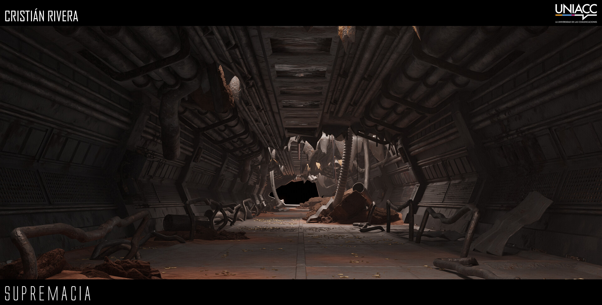
Help! What can I do to get to a more professional level
Hi! Nice to meet you all.
I'm Cristián Rivera. I'm a 3D artist from Chile and I don't feel very confident with my work yet.
I aspire to get into Environment art and here is a glimpse of my work
https://www.artstation.com/artwork/OoKkzv

I'd be very happy If some of you can check out my work and give me feedback for my future projects.
I'ts the first time I'm looking for a more professional advice in this forum but don't hold anything becaouse of that.
I'm Cristián Rivera. I'm a 3D artist from Chile and I don't feel very confident with my work yet.
I aspire to get into Environment art and here is a glimpse of my work
https://www.artstation.com/artwork/OoKkzv

I'd be very happy If some of you can check out my work and give me feedback for my future projects.
I'ts the first time I'm looking for a more professional advice in this forum but don't hold anything becaouse of that.
Replies
I0t my first time posting here and it was a little confusing
Firstly - Do you want to work in games? Or film and TV? This is a realtime and games focused forum so I will assume you want to work in games. Before I get into some tips for the next project, let's just touch on how you can improve on your fundamentals.
Try to pick out some props at least and work on them as unique assets. Fill dirt in cavities, add wear to exposed edges, keep it subtle and grounded. You could also stand to improve your material definition some. The surface of this Sci-fi wall is glossy.. but very mottled and rough. Why is that? What material is it? What's covering the material? I think you are working from the point of view of your final shot - but you now need to work to make the individual assets stand on their own.
I think as you continue to work and try new programs, you will naturally improve. I would recommend for your next scene, you try to build a kit of modular assets that can be put together to make and environment, and focus on making those modular blocks as grounded and polished as you can. Work also on a small assortment of props to decorate the scene, and try to spend time on making the props look great on their own.
Good luck!