Home 3D Art Showcase & Critiques

Spooky Forest House - Feedback pls

rohom3Des
polycounter lvl 2
Offline / Send Message
Pinned
rohom3Des polycounter lvl 2
Hello everyone, this is my first post and I would like to show you my last project. This is a final project for the course that I just finished about Environment Art.

It was also the first project that I would be working on from scratch on every aspect and first contact with the 3D environmental art pipelines. 
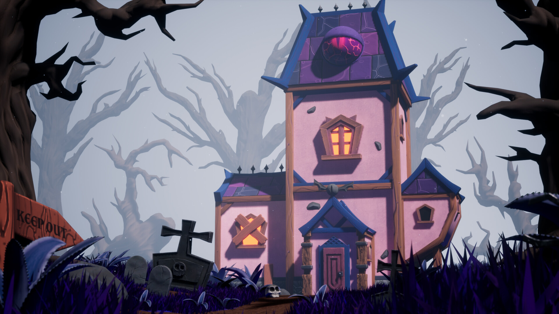


I hope you guys like it and please, share any feedback or opinions so I can improve my future projects. 

I'll be doing this bi-monthly challenge, hope I see some of you do it too 

Replies

  • simonBreumier
    Offline / Send Message
    simonBreumier greentooth
    Nice, I like how your shapes are pointing mostly toward the house to draw attention.
    I think you could also increase the lighting contrast between the house and the rest (maybe add a vignette and a light in front of the door that would create a nice color gradient on the walls ?). Right now, I feel some of the trees behind the house (and that 'keep out' sign) are a bit distracting.
    Also the roof texture feels a bit flat and the edge highlights you put on those cracks is is so strong it creates some kind of noise when seen from far away.
  • rohom3Des
    Offline / Send Message
    rohom3Des polycounter lvl 2
    Nice, I like how your shapes are pointing mostly toward the house to draw attention.
    I think you could also increase the lighting contrast between the house and the rest (maybe add a vignette and a light in front of the door that would create a nice color gradient on the walls ?). Right now, I feel some of the trees behind the house (and that 'keep out' sign) are a bit distracting.
    Also the roof texture feels a bit flat and the edge highlights you put on those cracks is is so strong it creates some kind of noise when seen from far away.
    Wow, thank you so much for the feedback! I will definitely try to improve what you mentioned. Really appreciate it  <3
  • Blendermonkey
    Offline / Send Message
    Blendermonkey polycounter lvl 10
    Hey! really like it so I did a small paintover. Ok first off the keep out shrek sign (:p) doesn't looks rushed and kinda bad, the gravestone on the left is squished too. I think you miss like 10% to make it great. You have this cool eye but no focus is on it. I'd make it glow and have the rest of the house illuminated by it rather than some off screen light (which doesn't make sense cause your weather is misty and overcast). I also made everything more purplish cause you can't go wrong with purple and spooky ;)

    Hope this helps. Post it if you make changes! Also for artowrks you can always photoshop them a bit for presentation :)

  • rohom3Des
    Offline / Send Message
    rohom3Des polycounter lvl 2
    Hey! really like it so I did a small paintover. Ok first off the keep out shrek sign (:p) doesn't looks rushed and kinda bad, the gravestone on the left is squished too. I think you miss like 10% to make it great. You have this cool eye but no focus is on it. I'd make it glow and have the rest of the house illuminated by it rather than some off screen light (which doesn't make sense cause your weather is misty and overcast). I also made everything more purplish cause you can't go wrong with purple and spooky ;)

    Hope this helps. Post it if you make changes! Also for artowrks you can always photoshop them a bit for presentation :)

    Wow, man! haha I really like this mood, I'll take this photoshop advice to try to improve my scenes after the composition is done. And yes, I also feel like the eye could have been a good focal point.

    Thank you so much  <3
Sign In or Register to comment.