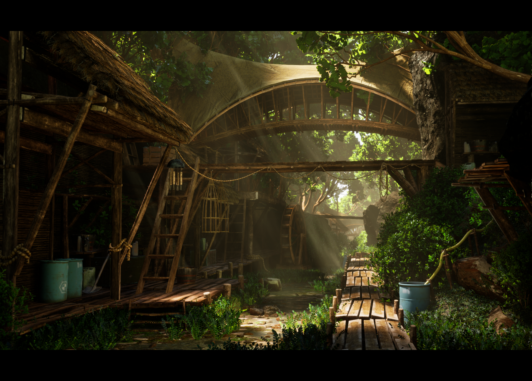
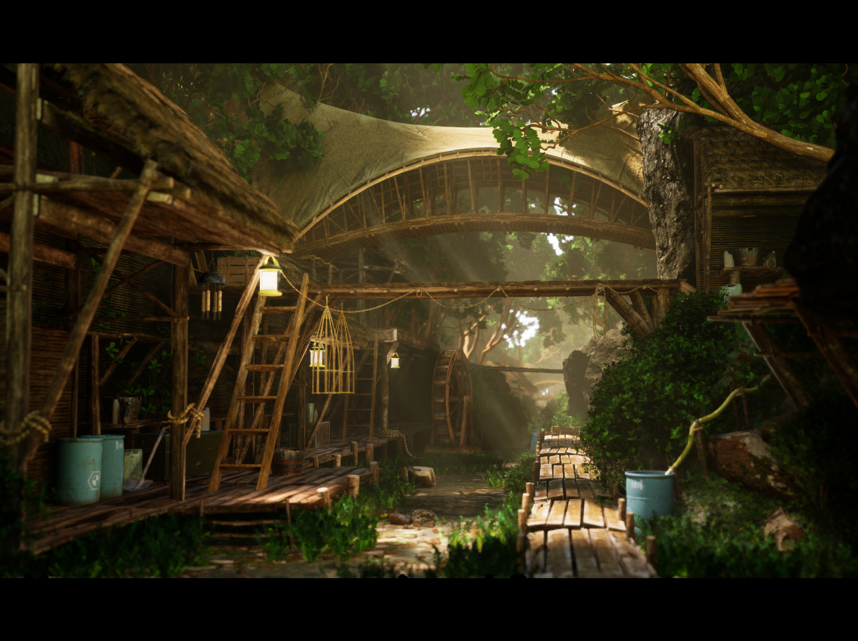
River Village Environment (UE5) 90% Done and need some professional input!
Update:
From feedback from Ged


First time posting!
This is my first environment I've ever done with my own assets (aside from some basic ones learning the software) and am trying to build out a portfolio so I can get my first job in the game industry. This took about 2.5 weeks and except for the foliage and rocks, everything is original assets/texturing.
I really could use some professional critique as I have very little to go on other than my traditional art background. So please be as harsh as needed!
I used Leif Heanzo's "Tribes of Europa" concept art for this environment and he has been really helpful with tips but wanted to hear some 3D environment artist input : https://www.artstation.com/artwork/oA19Bw
Thank you everyone in advance!
From feedback from Ged


First time posting!
This is my first environment I've ever done with my own assets (aside from some basic ones learning the software) and am trying to build out a portfolio so I can get my first job in the game industry. This took about 2.5 weeks and except for the foliage and rocks, everything is original assets/texturing.
I really could use some professional critique as I have very little to go on other than my traditional art background. So please be as harsh as needed!
I used Leif Heanzo's "Tribes of Europa" concept art for this environment and he has been really helpful with tips but wanted to hear some 3D environment artist input : https://www.artstation.com/artwork/oA19Bw
Thank you everyone in advance!

Replies
you dont have the character there so its up to you where you want to lead peoples eyes
That leads me to my next point. Create focus in your scene with lighting, in the concept the area that has the brightest highlights and contrast is the focal pont of the image. Youve already done some of this but in my opinion you could be even more deliberate with your light sources eg turn down the brighness of the lanterns emissive.
The last thing that is making this piece hard to read is the depth of field, it feels almost like tiltshift. I dont think you would get strong depth of field on the foreground like that in real photography without doing something strange. Have a look at some photography or movies and see if you can find a good reference for this type of scene and how the camera and post process should be set up. stuff like this https://www.pinterest.com/pin/574490496201903354/?d=t&mt=login
lastly, I really like the contrast of the AO but I know when receiving feedback that I should always try and listen instead of defend so I’ll give a try!
EDIT2:
Think I balanced it a bit better than the 2nd image:
EDIT:
I am going to completely rework the lanterns, but in terms of lighting and foliage, is this more of the direction you were talking about?
Oh another thing you could do to help seperate elements from eachother more is pay a bit more attention to the colour values in the original concept. There are quite different shades of wood and thatch on the concept, a lot of your wood assets have the same orangy brown value and a lot of your green foliage is similar green tones. The right variety of value difference will give your scene more variety and depth.