Feedback for a complete beginner
Hi folks,
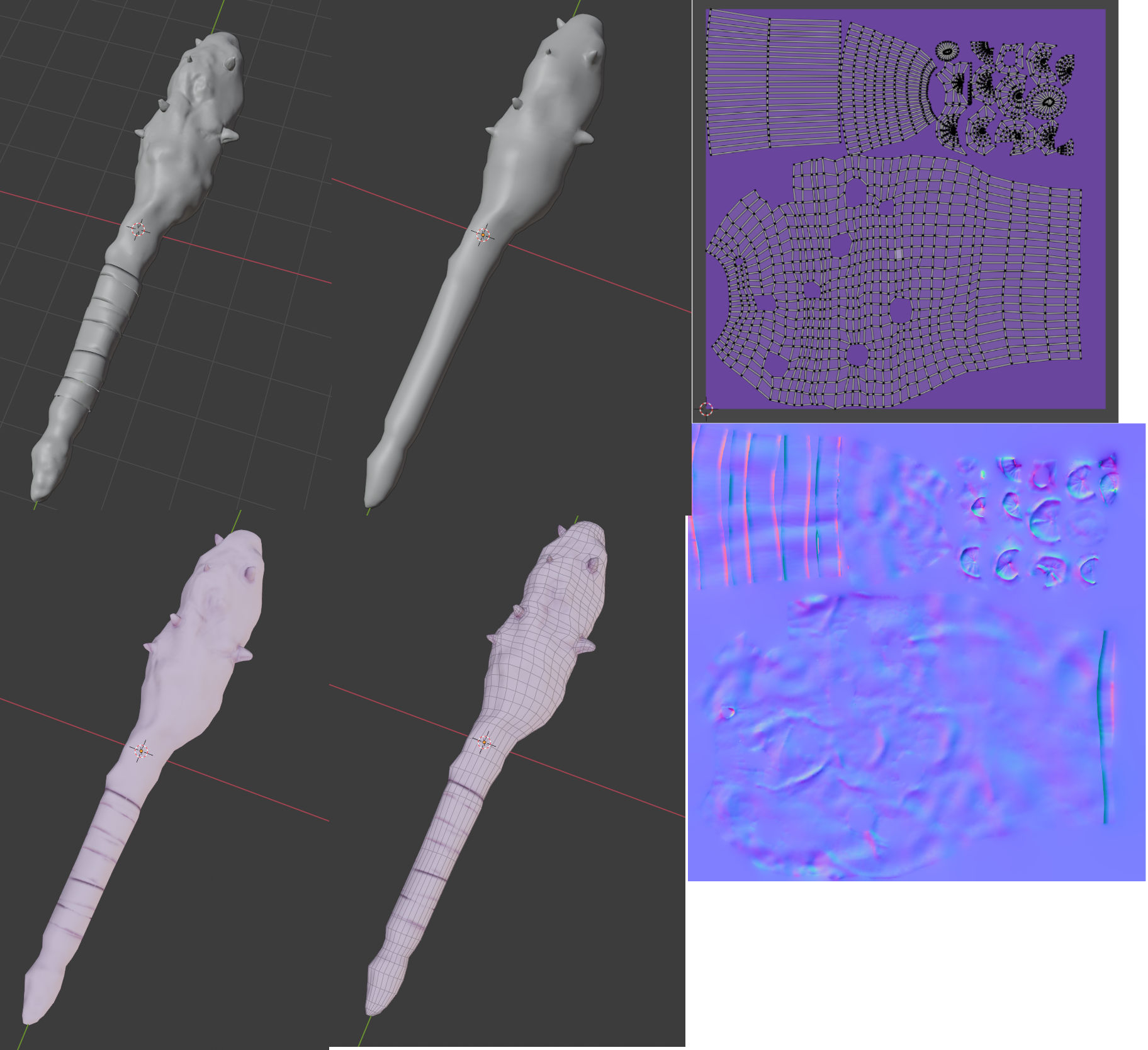
I decided to start learning to create some game assets. I have read a bunch about what is expected of such models but I got overwhelmed and confused with the information. I decided to go ahead and try my hand at a relatively simple model, so I created a spiked club. I had previously followed a quick course about creating a sword and wanted to try a different approach - namely sculpting. So this is what I came up with:
High poly -> Remesh to low poly -> Bake the normal maps. And here is the result (https://skfb.ly/o6AoH and some images below)
To my beginner's eyes, it looks acceptable, but I am fairly certain this is not the case. I was hoping I could get some feedback to better focus my efforts on what to improve for my next models. Not to leave the question too open, though, some points:
1) Is the UV map fine? I have read that for hard surface models, the UV should be generally as straight as possible. It certainly didn't work here. I have fidgeted with this map/UV seams for while trying to get rid of overlapping faces and texture artefacts. I don't know however if the current layout would be prone to issues either in terms of visual artefacts or something else.
1.1) Related to the UV texture, I have baked them in 4k resolution and would, if needed, resize/rescale them. Is this a good approach or is better to generate the maps already in the appropriate resolution?
2) Is the topology reasonable? I have seen a lot discussed about keeping the silhouette, which I understand as keeping the overall shape in line with the high poly model. Is this correct and does this mean the internal geometry for static meshes are not that important?
3) I know this is a trick question, but is the poly count (~3k tris) reasonable? To make this a bit more targeted, I will give 2 scenarios: isometric (turn-based or diablo-like) game and FPS, thinking about a popular video card (GTX 1060).
4) Anything else I might be missing here?
Any feedback is greatly appreciated!

Replies
I typically bake my maps at twice the resolution I need them in, yes. Frankly its probably unnecessary but it's just nice to have that flexibility. It's a workflow detail, whatever you are most comfortable with. So long as the final textures are at an appropriate resolution!
You seem to have a solid grasp of what you need to be doing, which is good! I found teaching myself the whole baking workflow terribly confusing and it took me a long time for my workflow to mature (and it continues to do so). It will be the same for you, with practice.
One question though: is there any preference for smaller/larger islands or is this entirely dependent on the model?
You will get a feel for what's most appropriate depending on your needs and workflow.