[FINISHED] Old Barn
Old Barn
Hello there, this is a project I have been working on for the past two weeks working in Unity to build the scene in, Maya to model the assets and substance designer and painter to texture the assets and create the trim sheets.
Any feedback would be much appreciated
Reference Images:

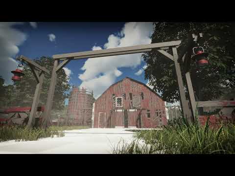
These are some of the reference images that I had saved into a folder the idea behind the environment is that it would be an old dilapidated American style barn and the main features that stuck out to me were the curved roof and the colour of the barn mainly using white and red, and that was the style I was going to stick with
Block Out:

The Blockout I didn't spend much time on as I wanted to keep the environment simple and to a small scale and I knew the type of design I wanted to go for so it was a matter of creating the shape of the barn and some fences to populate the scene a bit.
The next step was adding the grass and trees to the scene as I had found some assets online to help with adding some foliage to my scene
I also added an arch, a grain silo and lamp posts to try and populate the environment a bit more as the initial block out looked bland

Importing:
after the block out, I had started to model up the assets in Maya.
I added variations to the walls, windows and roof sections as those were the parts that were going to be used the most.
Barn Modular Set:

Grain Silo:

Assets:

Post-processing and lighting:
After importing the assets I started to assemble the scene and began working on the post-processing effects, using effects such as Exposure, Depth of Field, Ambient Occlusion, Vignette and Bloom to brighten the scene and add a bit of dept to the scene and using

Substance Designer:
For this project, I wanted to attempt to be efficient with texturing the assets in the scene so I only made in total about three textures. One texture for the wood, one for the rusty roof, and one for the metal the rusty roof, and the wood I made in substance designer as for the wood texture I had created a Trim sheet for all of the planks as well as exposed some parameters to controls the amount of paint wear on the wood and for the roof texture I wanted to use the software to create the indents on the metal plains as well as expose some parameters in order to add some variation to the material.
Rusty Roof:

Wood Planks:

Final Result:
This is the scene complete inside of Unity the ground textures I had obtained from Textures.com and adjusted them in substance designer using hue, light, saturation tool to make them match up to the other materials while using some grass assets that I had brought off the unity asset store.

Assets:

Thoughts on the future:
Overall I'm happy with how the project came out, thoughts for the future, I would like to expand this environment so it's not so small by adding additional buildings such as a dilapidated farmhouse as well as adding more assets to the scene to help flesh it out more and tell more of a story.
As mentioned before any feedback on this project will be much appreciated.
Personal Artstation: https://www.artstation.com/joshhowes
Barn Time Lapse: https://www.youtube.com/watch?v=tNRnHniIgis
Hello there, this is a project I have been working on for the past two weeks working in Unity to build the scene in, Maya to model the assets and substance designer and painter to texture the assets and create the trim sheets.
Any feedback would be much appreciated
Reference Images:

These are some of the reference images that I had saved into a folder the idea behind the environment is that it would be an old dilapidated American style barn and the main features that stuck out to me were the curved roof and the colour of the barn mainly using white and red, and that was the style I was going to stick with
Block Out:

The Blockout I didn't spend much time on as I wanted to keep the environment simple and to a small scale and I knew the type of design I wanted to go for so it was a matter of creating the shape of the barn and some fences to populate the scene a bit.
The next step was adding the grass and trees to the scene as I had found some assets online to help with adding some foliage to my scene
I also added an arch, a grain silo and lamp posts to try and populate the environment a bit more as the initial block out looked bland

Importing:
after the block out, I had started to model up the assets in Maya.
I added variations to the walls, windows and roof sections as those were the parts that were going to be used the most.
Barn Modular Set:

Grain Silo:

Assets:

Post-processing and lighting:
After importing the assets I started to assemble the scene and began working on the post-processing effects, using effects such as Exposure, Depth of Field, Ambient Occlusion, Vignette and Bloom to brighten the scene and add a bit of dept to the scene and using

Substance Designer:
For this project, I wanted to attempt to be efficient with texturing the assets in the scene so I only made in total about three textures. One texture for the wood, one for the rusty roof, and one for the metal the rusty roof, and the wood I made in substance designer as for the wood texture I had created a Trim sheet for all of the planks as well as exposed some parameters to controls the amount of paint wear on the wood and for the roof texture I wanted to use the software to create the indents on the metal plains as well as expose some parameters in order to add some variation to the material.
Rusty Roof:

Wood Planks:

Final Result:
This is the scene complete inside of Unity the ground textures I had obtained from Textures.com and adjusted them in substance designer using hue, light, saturation tool to make them match up to the other materials while using some grass assets that I had brought off the unity asset store.

Assets:

Thoughts on the future:
Overall I'm happy with how the project came out, thoughts for the future, I would like to expand this environment so it's not so small by adding additional buildings such as a dilapidated farmhouse as well as adding more assets to the scene to help flesh it out more and tell more of a story.
As mentioned before any feedback on this project will be much appreciated.
Personal Artstation: https://www.artstation.com/joshhowes
Barn Time Lapse:
 https://www.youtube.com/watch?v=tNRnHniIgis
Replies
I'd love to see more views of the finished result. Multiple angles of the finished result should dominate your post, they should be the first thing we see, followed by your breakdowns. As writers will tell you, start with "the hook", then flesh it out with more details.
The showreel. I embedded it for you. But it's not actually a showreel, it's a timelapse, so I would suggest naming it as such. A showreel would be a flythrough or walkthru of the scene, highlighting all the cool bits (which would be awesome to see!).
Overall the color looks great. But the render is pretty low-resolution (make it 4k!) and aliased (barn slats especially).
Definitely will expand more on this project as there isn't much else outside of the screenshot but will consider adding more to the environment as well as fleshing out the interior of the barn more.