Home Marmoset

Toolbag 4 - Ray Traced Shadow Artefacts

polycounter lvl 12
Offline / Send Message
Ricky polycounter lvl 12
Hi,
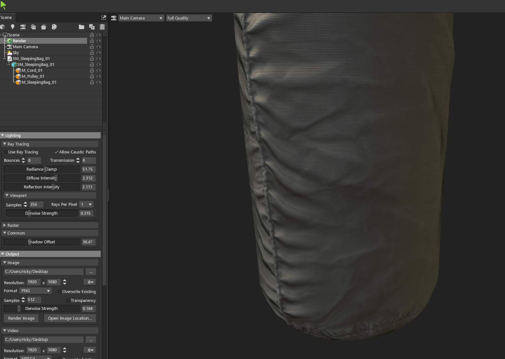
I've recently moved up to Toolbag 4 and love the ray tracing capabilities, but keep getting these horrible shadow artefacts only when ray tracing is enabled. It's as if the lighting is looking at a hard-edged version of the model to light rather than taking into account the normals properly with the textures.
With ray tracing:
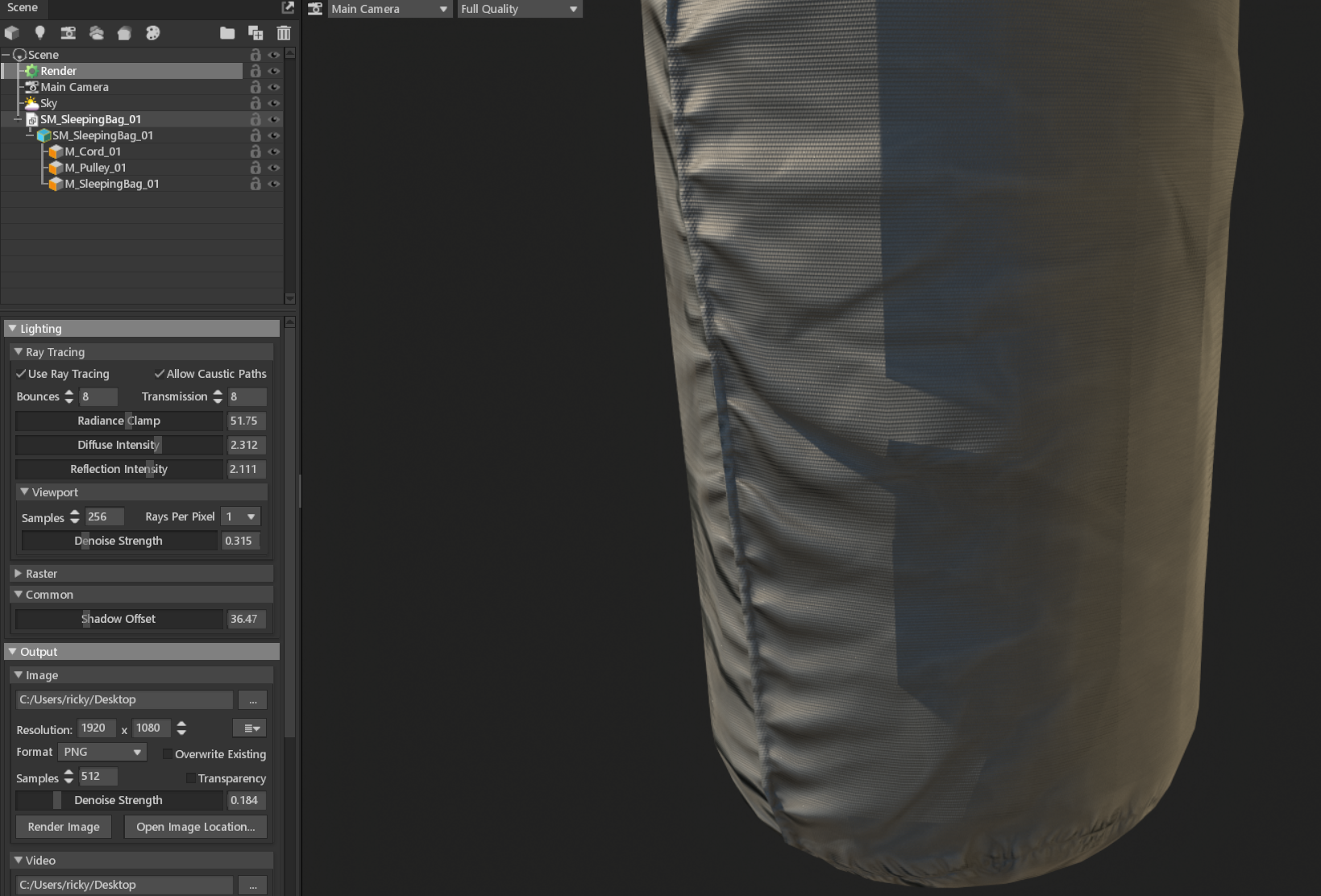

With raster:


• I've checked the tangent space for the model. it's set to 'Marmoset'. The model was made in Maya, and changing it to that makes no difference. No other option there fixes it. 

• Disabling 'Cast Shadows' on the mesh fixes it, but then means it wont cast shadows on itself. 

• Latest video drivers.

Any help would be much appreciated! 
Thanks,
Ricky

Replies

  • Ricky
    Offline / Send Message
    Ricky polycounter lvl 12
    Found out it only happens when I use HDR images for the skybox instead of jpegs
  • Ricky
    Offline / Send Message
    Ricky polycounter lvl 12

    Bump. I'm also finding this kind of issue with GPU VRay for Maya and in Substance Stager (all different scenes and models). I read somewhere someone say its an issue with GPU renderers, so not sure how to fix this other than changing the lighting setup. If anyone else is experiencing this or similar would be handy to know how others deal with it.

  • EarthQuake

    This is generally expected. What you're seeing here is shadows cast from the low poly geometry. If the low poly geometry had more detail or was more smooth, you would see more smooth, detailed shadows as well. A few things you can try:


    1. Edit the low poly model to have more detail/more closely match the high poly model
    2. Sub-divide the low poly model in Toolbag
    3. Consider adding a displacement map (along with sub-division)
    4. Adjust the Shadow Offset setting in the Render object (Common panel)


  • AndyC_Art
    Bump. Im having the same issue and I can confirm I dont need further subdivision for it to look good because its happening only on a specific part of  my model, by that logic everything in my model should look faceted but it doesnt, its only on a specific part, this bug is annoying
  • EarthQuake
    @AndyC_Art as explained above, this is a fundamental property of ray-traced rendering. Shadow quality is dependent on the detail or smoothness of the geometry, which can't be faked with a normal map to make it appear more smooth than it is.

    Please try some of the suggestions in the response before yours.
  • AndyC_Art
    @AndyC_Art as explained above, this is a fundamental property of ray-traced rendering. Shadow quality is dependent on the detail or smoothness of the geometry, which can't be faked with a normal map to make it appear more smooth than it is.

    Please try some of the suggestions in the response before yours.
    I would like to know this then, why is it that the highlighted areas shade correctly while the other area doesnt? why is it only on the part with the decal? its all similar poly density


  • EarthQuake
    @AndyC_Art try reducing the intensity of the normal map in this area, or running a normalize filter on the normal map, it's possible that invalid normal vectors are being used here which could cause shading artifacts
  • Sidney Eliot
    Offline / Send Message
    Sidney Eliot polycounter lvl 2
    Just wanted to add my own experience with this issue: 

    I'm still in the process of finding out best practices in regard to this issue and will keep this post updated when I find out new things.

    Btw, the official term for this problem is "Shadow Terminator Atrifact".

    ---
    Adding sub-division level in Marmoset
    This solution is not practical, as it's a good practice to force triangulate specific quads in modeling software, that aren't very flat and might flip incorrectly + even good retopologized models occasionally have tris, which won't yield the best results when subdivided.
     
    Modeling low mesh with higher topology density to better match the high
    This is definitely not a good fix. There are things which should dictate the structure of the low poly mesh like what one can see in the silhouette, or making it animation friendly, but ray tracing shouldn't be a reason to massively increase the poly count. Also, shadow terminators will never ever go away just because the topology density is higher, it will only become less visible, so with close up shots one will still see them. This can be especially bad in the face area (even with quite a high poly face) as one often has very close shots there, and just throwing more polygons at this problem will not fix it. (Allthough higher cast shadow detail could be a reason to increase silhouette affecting topology)

    Disabling shadow casting for specific objects
    This will fix the issue but depending on the model, will make the shadow lighter/ less and thus worse (one can compensate with AO maps, although they will mostly only carry smaller shadow details)

    Disabling self shadow casting for specific objects
    This is probably one of the best fixes and is a better version of disabling shadow casting from the object entirely. Sadly Marmoset doesn't have this feature yet

    Shadow Offset
    Changing the shadow offset will make it better, but the result still has quite visible shadow terminators.

    Disabling normal map or adding a blank one
    Does nothing in regard to this issue

    Enabling and editing render Shadow Cascade
    Does nothing in regard to this issue

    Checking maps like normal and AO for grid like patterns
    This can help but in my case is not an issue (proper checking is done in image editing software like PS by adding adjustment layers like exposure to reveal hidden detail)

    GPU/ Other Hardware
    For any one thinking it might be their hardware, I'm very sure that this is not the case

    Changing light intensity, location/ rotation and other light properties
    This works but is obviously not desired as one doesn't want to change lighting just for shadow terminators. However, just reducing the intensity by a bit might fully fix the issue, and your lighting might have been to intense/ physically unrealistic anyway. A better option to having super bright lights might be to add more lights or add a HDRI/ let the HDRI take over more of the lighting

    HDRI
    This could be an issue for some, but I still have these issues with the default HDRI

    Some more tid bits:
    - Shadow terminators can appear in non ray traced render mode as well (this is interesting as Blender only seems to have this issue with it's ray traced render engine (cycles) and not eevee)
    - Sub surface scattering can lessen the Shadow Terminator effect by quite a lot, which is great for the face (using a black and white SSS control map while ray tracing is off will however worsen the effect)
    - funnily enough sometimes shadow terminator artifacts are way worse in non ray traced mode and other times they are only visible in ray traced mode (I don't have an explanation for that yet, but all in all shadow terminator artifacts feel quite erratic)
    ---

    Also, if you have issues with this then your AO maps that you baked with Marmoset might have experienced the same issues. As having a low which is very different from the high, surface wise, will introduce topology imitating grid patterns into the AO map. I however made sure that my topology density on the low mes was good enough to achieve clean AO map bakes, but am still having ray traced shadow terminator issues.

    - Searching through https://developer.blender.org/docs/ for "Shadow Terminator" will also bring up some interesting results

    ---

    Here an example, the shadow terminator artifacts around the breast and arm are brutal, it's with shadow offset off, with it set to 1000 the shadow terminators get a lot better, but that too has some drawbacks (first image ray tracing ON, second image ray tracing OFF)


    And even the super high poly flat forehead is having the issue, so as I said topology won't fix this issue (this image has ray tracing OFF, turning it on makes the grid pattern disappear)


  • iam717
    Offline / Send Message
    iam717 interpolator
    Just going to add my experience,
    i feel either the lights have to have an added power "numeric" so example, currently its 0.000 i think an additional space + 0 to lighting so that we can get 0.0000 spaces values to play with will fix a lot of the "issues" or patch it till another more accurate solution can be "found". 

    If anyone hasn't already tried this i feel this can "smooth" out transitional issues, sometimes i want to "test play" with things and i feel like if i could add more value to lighting situations i might get a smoother result.  If shadows have a value numeric in engine scripting also add it there. 0.000 +1 = 0.0000, thinking it over, add an additional value to all settings across the application . (to help make it make sense to anyone that needs to know.)

    Also for normals, what is substance painter view-port doing that eliminates a lot of this stuff and even has some really amazing looking lighting? worth looking into, even if "re-engineering" to figure it out if one needs to, obviously calculating your own version of the solution.

    :) hope this made sense, i would make a gif. but this was in the moment post.

    // still editing there is more to this..

    Learning the lighting i do not touch these settings:
    Post Effects / Color / Exposure : 1.0 always.
    The brightness of the HDRI + importance sample i leave on.
    Also found that adding a new light with a more mid "grey/gray" tone can help nuke out "ultra" highlights so there is a tip i had to "figure out", it was a fix for my issue with yellows highlights(tennis sphere).

    Here is a video that will be more explanatory than my txt.
    https://www.youtube.com/watch?v=dvm_5c-CSvw
    didnt use this video it was for you.
    just fyi, i do not like promoting that lil'demonic symbol design but it is the most recent light guide.


  • EarthQuake
    @Sidney Eliot  Generally speaking, these shadow issues are fundamental to all renderers, not specific to Toolbag. There are some tricks that can be done in raster rendering engines to soften shadow faceting somewhat, but as you note in the last part of your post it's a problem there too. The software can only render shadows from the geometry you import.

    As mentioned earlier in the thread, there are various ways that you can improve shadow faceting. Adjusting the shadow offset and area light width settings to blur the shadows is generally the most effective. SSS materials tend to blur the lighting contribution so they can help mask the problem too.

    There is a balance to be struck with adjusting the shadow offset - too little and the shadows will be faceted on coarse low poly meshes and too far the shadow accuracy will suffer. We've made this easier to control in Toolbag 5, now raster and RT modes each have a dedicated setting. In RT it should be easier to control too (small values have a more obvious effect).

    The good news is that as the artist you have full control here (low polygon limits on mobile projects and such notwithstanding). The more detailed or accurate the mesh is, the better the shadow quality will be. This doesn't necessarily mean sub-dividing (though that can be a quick fix in some cases) or using excessive amounts of triangles for the low poly. What it requires is creating a well-optimized low poly mesh that doesn't have wide variations in geometry density or under detailed elements that are visible.

    For example, the breasts on this character stand out because they have ~1/4 the geometric detail as nearby parts, and ~1/16th the detail of the face. By contrast, the armor meshes in front of the breasts have many unnecessary edge loops - probably half or more of these loops could be removed without affecting the appearance. This would allow you to add more detail to round areas like the breasts without increasing the triangle count - you could probably round out the breasts and hit a lower total triangle count by optimizing the armor. This would make the mesh look better as a whole as well - not just the shadows.

    When you have complex surfaces with overlaps and such, disabling self-shadowing is unlikely to solve the problem, it will simply introduce a new problem (incorrect shadows/lighting). For example, disabling self-shadowing on the body mesh would mean the arms/armpit area wouldn't cast shadows on the breasts, ribs, hips, legs, etc - depending on the light direction. The video with the spheres isn't a representative case - there is minimal geometric detail to be self-shadowed on a sphere. I wouldn't view disabling self-shadowing as a general-purpose solution or a good practice.
  • EarthQuake
    Now, let's say you can't edit the topology for whatever reason. You're not necessarily out of luck. Here's an example:


    From left to right:
    - Base lighting.
    - The Diameter setting in the Area/Shape panel for the lights has been increased, this converts the light into an area light which softens the shadows and makes them look nicer in general.
    - The Shadow Offset setting has been adjusted in the render settings. I'm using Toolbag 5 here so this only needs a very small nudge (0.003), but you may need a larger value in Toolbag 4.


  • EarthQuake
    One more example:


    Top to bottom:
    - Base lighting
    - Shadow casting disabled. Since there are not any other objects in the scene to cast shadows on the hippo, this simulates turning off self-shadowing. With no self-shadowing, the body doesn't shadow the legs, the upper jaw doesn't shadow the inside of the mouth, the back doesn't shadow itself from the rim light, and so on.
    - Shadows enabled again, but light width and shadow offset have been adjusted similarly to the last post with the spheres.
  • Sidney Eliot
    Offline / Send Message
    Sidney Eliot polycounter lvl 2
    @EarthQuake Thanks a lot for this detailed answer with great images. When I get around to it, I'll try this stuff out. I'm also looking forward to TB 5 (love the new UI direction). Any rough estimate on when it will leave beta testing? Also, I'm happy that both PCs and consoles are getting stronger and stronger over the years, making higher poly counts more acceptable and as a result making this issue slowly fade more and more into obscurity.  
     
    You also brought up a good point with poly density variation (face size variation) and I never feel like I quite know what to do. On the one hand one wants to have fewer faces on flatter areas that don't need them, and will probably see not too much deformation action, but on the other hand it's probably better to keep poly density very uniform across the entire model. (The reason I didn't give the breasts more polygons, was because silhouette & deformation wise they had enough polygons, but as we can see not enough for shadow terminators.)


Sign In or Register to comment.