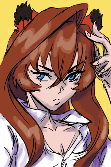
HELP on my Character's face
Hello all, I am struggling with knowing why this character's face is not feeling right. Anyone have help or feedback would be great. I feel like her lips need help. But not sure what I am doing wrong! HELP!


I am loosely basing her off of Margot Robbie. But I want to make her 34 year old or so. Need to add the winks still, but I want to get her face right first.
Hope you enjoy this!


I am loosely basing her off of Margot Robbie. But I want to make her 34 year old or so. Need to add the winks still, but I want to get her face right first.
Hope you enjoy this!

Replies
As a more general critique/piece of advice, I'd really try to focus on getting the forms of the female face looking right at a lower subdivision, where it's easier to manipulate the forms. Then you can slowly increase the subdivisions as you refine the shapes closer to the end goal. Right now the sculpt feels a tad muddy. It pays itself in dividends when you take the care and time at lower subdivisions.
I see in your reference board that Margot Robbie is your main reference, but also have others on your board. This can become a little hard to pinpoint what's not working and why, when youre pulling certain elements from different reference. So I would really lean on Margot's face as much as you can and hold up screenshots of your sculpt to compare all the proportions and shapes. This should give you a more clear target/concept. Then perhaps if you don't want to do a 1:1 of Margot, after getting a basic look that you like, you can add in other facial features from different ref.
The female face takes a lot of finesse, and typically everything is much "softer" in look and feel. It's this softness (along with correct proportions and forms) that gives the feminine feel. I think with female faces, its a matter of selectively smoothing forms out to create that subtlety. And with male faces, its a matter of adding definition and hardness. When adding detail to a female face, its easy for it to turn masculine.
Lastly, I think her eye shape should be slightly bigger. Bigger eyes also add to the feminine look.
I cannot thank you and @Bazarov for your feedback! You were right, I was editing it all of the highest level. Ack! I forget so many things as I am learning. So thank you! And your comments are SO right! So I focused more on the reference of Margot and nothing else. I think is is looking a TON better.
Lips are almost there, but I think I have a better understanding of how lips work. So please let me know if there is any other thing that can be fixed!!!!
And I want her face to be a little more angular because of the character she has. So let me know if she reads okay. I could round her out more, but I like her face shape a lot now. But always glad to hear feedback to improve. Let me know what needs fixing, I need to start working on the pores and higher details SOON!
THANKS A TONNNN!!!!! Here is the new character's face:
I think, at this point, it would be nice too see how far you can push it and see what you end up with. Since you have a particular direction that you want to take this character.
So here is her with more detail, I want her to look tough and battle worn. Her left ear needs fixing. Let me know if the neck seems too thin or something. But I cannot thank you enough @Bazarov and @SDimitrius for your help!
Alright, I think she is ready for more now. But will be adding a few more face details, but that is it.