I'd like advice on current pieces I recently published to FV Portfolio ArtStation: https://fvportfolio.artstation.com/ I'm interested whether this is sufficient for lowest entry employment in game industry and if yes which pieces are best kept or which should be removed to certify best chances for the goal. Thank you.
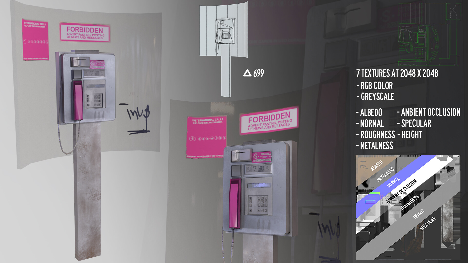
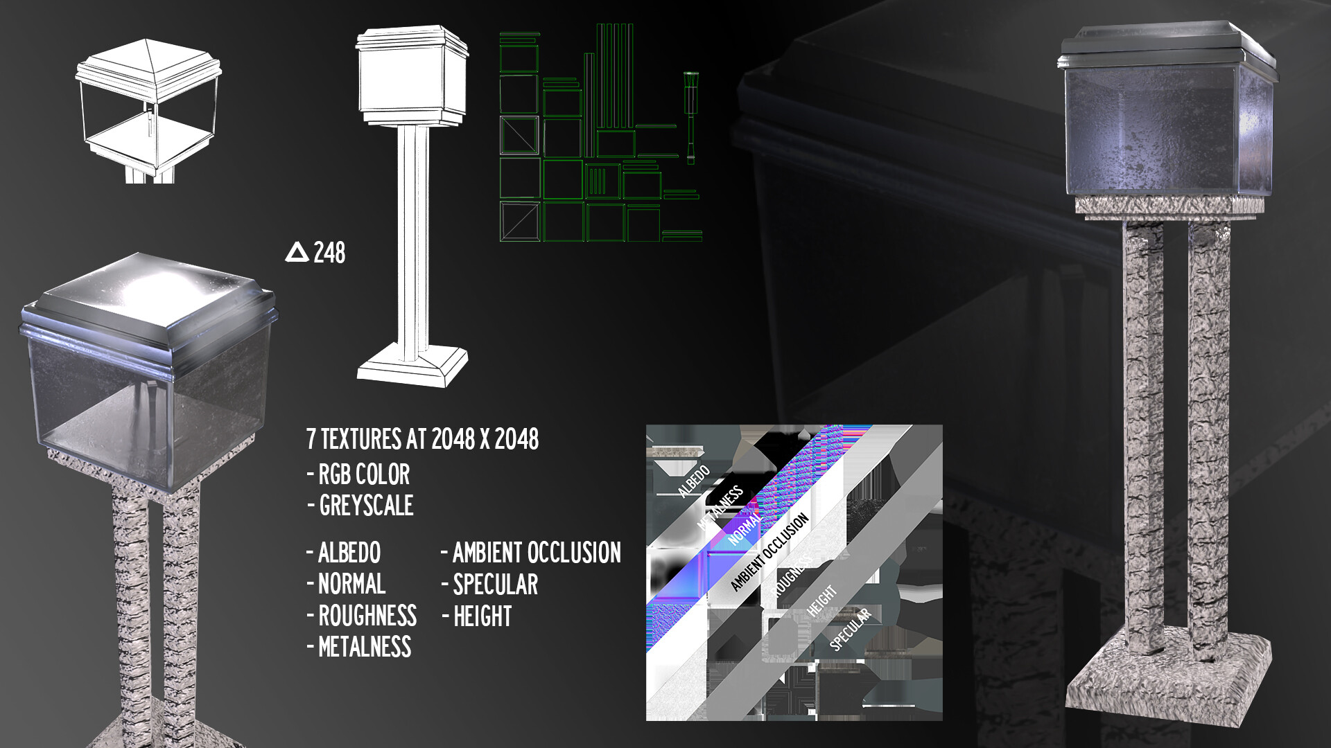
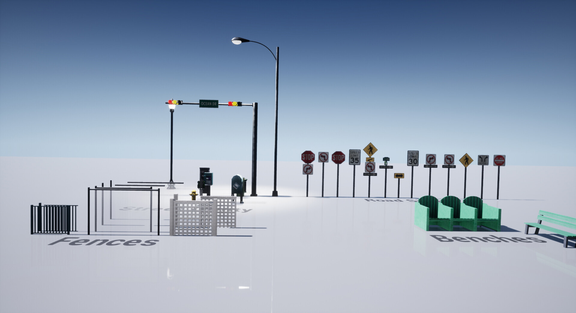
Hey, So i've been doing 3d stuff for a while now but i dont work in the industry. I've tried a lot of stuff and absorbed a great deal of information either through trial and error, tutorials, GDC talks, etc. So take what i am about to say however you see fit. There is a big difference between knowing how to use the tools and understanding why they are used. Same goes for knowing some workflows or pipelines vs. understanding why people have reached those flows in their day to day work. You seem to have a lack of understanding of why you need a normalmap, why we do these steps and what is the purpose of an asset. The mindset that you must have is that of efficiency, performance and "less is more" as they say. In short, this whole conundrum is because we are doing assets for real-time apps. What that means for a 3d artist is that you cannot have lots and lots of polygons and each texture must count. In fact, in some cases each texel (texture pixel) counts. The way you model efficiently is by creating polygons only where you need them, like in the silouette of an object. Textures must be packed together where possible and UVs must have very little wasted space. Lots more theory goes into this business but lets focus on the basics. So lets look at some examples. The mobile/pda has a flat face so why model all of those elements and bevels when you can do them in the normalmap!? Its easier for the game engine to render large polygons than those small thin ones and its easier for you to model and uv a simpler model. You can see that it has lots of normal problems either from the modeling or the baking. The tazer gun is basically high poly and should be a lot more optimised. Material definition is not very good. Im guessing it should be made out of dull plastic but it looks like shiny leather. Materials are a really broad subject but a simple advice would be to gather lots of references and ask for feedback early on. You have unwrapped every model uniquely but used tileable textures that are very noticeable. The point of unique textures is to have a material that has unique features for that model and doesnt repeat over and over, otherwise just use overlapping uvs. The payphone has a really bad uv layout with lots of wasted space and strips of polygons that are not straight (making them prone to texel artifacts / pixelization). The model has very sharp edges. The texture lacks features like numbers and has a random noise applied to simulate wear/grime. The exterior scene has the most problems. First of all it doesnt look finished. Set dressing phase is apparently missing. No cars, no small props, no story. The interiors look empty and that coupled with the lack of decals on the outside creates the feeling that this livable place is not lived in. No wear and tear, no grafitti, no variation in the tileable textures. The trees have weird normals that dont work in the daylight scenario. So, lots of room for improvement. You seem to know how to use the tools, all you need to do is think about why you use them.
Thank you for those tips and tricks. I've worked with normal maps for a long time and I in fact do know their purpose which is to grant high poly mesh detail onto a low poly (and this detail will provide depth from hi to low poly). What you may be right about though is I could've spared a few more polys, but not much as is emphasized. I consider this piece a hero asset for close use so I allowed more polys.
I'm interested whether this is sufficient for lowest entry employment in game industry and if yes which pieces are best kept or which
I'm afraid not, and you still have a long way ahead of you.
This portfolio tells me that you are at the beginning of your journey as a 3D artist. The models you made so far have very basic shapes, bad UVs and weak materials.
As you can see the M5 Phalanx is not even close to the reference material you can find online,proportions are wrong and it lacks details. It looks like you eyeballed it. If you want to make a proper Phalanx you need to start with getting the model right.
The stun gun has a very basic shape and way too many polys, even if its a hero piece I see a lot of vertices that do nothing for the shape. And again, lacks proper UVs and textures.
I don't say these things to be mean etc, my models were on the same level when I started. These days there are great tutorials out there that will get you up to speed very quick.
The recycling bin has realllllly sharp corners, and the wheels aren't round. The texturing is too clean. Your city block looks about PS2 era. The stun gun is really basic shapes with a crazy amount of topology. As was mentioned above, you have a bit of a journey ahead of you. This is not a bad thing. I wouldn't suggest updating your old portfolio items to try to push your portfolio to professional level. Spend time trying to make a new piece, and make it to the best of your ability. Don't rush. Get on the polycount slack or discord and get help in there. Spend time on ArtStation looking at modern game ready pieces, and figuring out how to achieve those.
OP has been updated. Do you think anything has changed from before, is there any progress, how are employment chances? I'd like to hear new lease on critical views for current portfolio.
There is progress, but I think you're not quite there yet.
Let's take your trash can as an example. Your goal should be to take it to a quality level similar to this: https://sketchfab.com/3d-models/urban-trash-pack-vol-3-low-poly-01ecd2b93da340d5b81a47584c3b22e4 Notice how even the sharpest corner in this model is still pretty smooth, it resembles the real thing quite a bit and the textures are well placed and well thought out (i.e grunge is more present near the ground and wheels, stickers are slightly worn, some have paint drips and so on...)
What I recommend is taking a good tutorial from beginning to end like the ones @Zi0 suggested above, they are affordable and explain every part of the process very well.
If you keep at it you will definitely get there, but make sure that the models you put in your portfolio are at the best of your ability, even if that means making less models. Quality over quantity.
I did a lot of work and stripped portfolio of work I found unnecessary. Have a look at https://fvportfolio.artstation.com/ and feel free to comment what you reckon where I'm standing now.
I think you're paying far too much attention to your portfolio as a whole. You should probably choose a new environment to make and try to make that as good as possible, instead of making a bunch of adjustments to your current portfolio in an attempt to make it job worthy.
I'm interested whether this is sufficient for lowest entry employment in game industry [...]
Why ask for critique if this is your perception of the industry?!
Basically admit that you're far from the standard required to even think about competing for roles - YET!
Until you do...It's really a pointless exercise trying to polish on the run, content you consider portfolio worthy.
Seriously be honest with yourself, game art creation as we all know is HARD both technically and artistically so by taking on board advice already offered by others above, will at least provide a base line to begin fomenting a competent proficiency.
FWIW since I specialize in weapons, here's a well worn path many had utilized in the past proving successful getting that proverbial "foot-in-tha-door"
Replies
So i've been doing 3d stuff for a while now but i dont work in the industry. I've tried a lot of stuff and absorbed a great deal of information either through trial and error, tutorials, GDC talks, etc. So take what i am about to say however you see fit.
There is a big difference between knowing how to use the tools and understanding why they are used. Same goes for knowing some workflows or pipelines vs. understanding why people have reached those flows in their day to day work. You seem to have a lack of understanding of why you need a normalmap, why we do these steps and what is the purpose of an asset.
The mindset that you must have is that of efficiency, performance and "less is more" as they say. In short, this whole conundrum is because we are doing assets for real-time apps. What that means for a 3d artist is that you cannot have lots and lots of polygons and each texture must count. In fact, in some cases each texel (texture pixel) counts. The way you model efficiently is by creating polygons only where you need them, like in the silouette of an object. Textures must be packed together where possible and UVs must have very little wasted space. Lots more theory goes into this business but lets focus on the basics.
So lets look at some examples. The mobile/pda has a flat face so why model all of those elements and bevels when you can do them in the normalmap!? Its easier for the game engine to render large polygons than those small thin ones and its easier for you to model and uv a simpler model. You can see that it has lots of normal problems either from the modeling or the baking.
The tazer gun is basically high poly and should be a lot more optimised. Material definition is not very good. Im guessing it should be made out of dull plastic but it looks like shiny leather. Materials are a really broad subject but a simple advice would be to gather lots of references and ask for feedback early on.
You have unwrapped every model uniquely but used tileable textures that are very noticeable. The point of unique textures is to have a material that has unique features for that model and doesnt repeat over and over, otherwise just use overlapping uvs.
The payphone has a really bad uv layout with lots of wasted space and strips of polygons that are not straight (making them prone to texel artifacts / pixelization). The model has very sharp edges. The texture lacks features like numbers and has a random noise applied to simulate wear/grime.
The exterior scene has the most problems. First of all it doesnt look finished. Set dressing phase is apparently missing. No cars, no small props, no story. The interiors look empty and that coupled with the lack of decals on the outside creates the feeling that this livable place is not lived in. No wear and tear, no grafitti, no variation in the tileable textures. The trees have weird normals that dont work in the daylight scenario.
So, lots of room for improvement. You seem to know how to use the tools, all you need to do is think about why you use them.
Portfolio link: https://fvportfolio.artstation.com/
Wonder if it's any better now, if yes please suggest what to leave and what to keep? Thank you.
Do you think anything has changed from before, is there any progress, how are employment chances? I'd like to hear new lease on critical views for current portfolio.
Let's take your trash can as an example. Your goal should be to take it to a quality level similar to this: https://sketchfab.com/3d-models/urban-trash-pack-vol-3-low-poly-01ecd2b93da340d5b81a47584c3b22e4
Notice how even the sharpest corner in this model is still pretty smooth, it resembles the real thing quite a bit and the textures are well placed and well thought out (i.e grunge is more present near the ground and wheels, stickers are slightly worn, some have paint drips and so on...)
What I recommend is taking a good tutorial from beginning to end like the ones @Zi0 suggested above, they are affordable and explain every part of the process very well.
If you keep at it you will definitely get there, but make sure that the models you put in your portfolio are at the best of your ability, even if that means making less models. Quality over quantity.