[WIP][UE4 Environment] Village in the desert
Hello there 
Here some boring information:
Let's start with the first blocking I did. Whith this I wanted to represent a small town with a piece of street filled with poor houses on it, a temple and such a local mini-palace but inaccessible inside + natural landscapes around.3d model can be rotated here on my Sketchfab

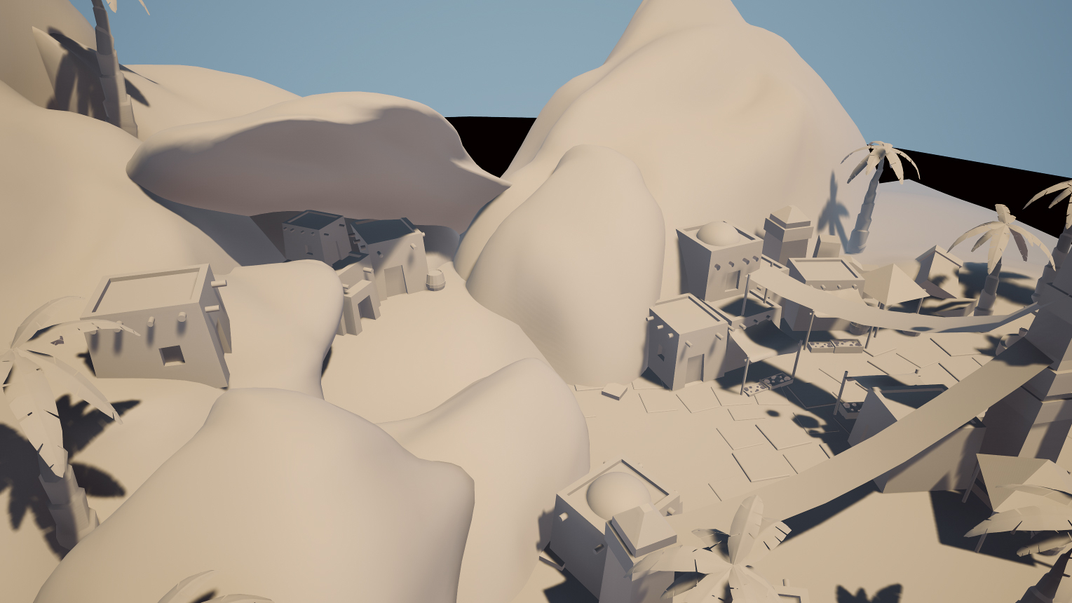
But it seems to me that this variant lacks interesting areas. So I tried to make a new, simpler, but more lively version. This one is a small village on ancient ruins. Here we have the remnants of past buildings, a drying oasis, different areas of the village: market, stone ledge, well, part of the village falling into an oasis, and farm part.

Some close looks from Unreal 4:


What do you think, which variant is better and why?
Here some boring information:
My name is Egor Izotenkov and this is my first post here. I started this project some time ago while studying 3D graphics courses in Kyiv. Many thanks to the guys from ArtCraft, I learned a lot of new and interesting things from them. Unfortunately, for some reason, I was not able to finish the project then. And now, almost a year later, I am still slowly working on it and trying to learn as much as I can.
I like the polycount community, you can always find a lot of great advice here, and I hope that I myself can show something to those who are still studying like me. I've already learned a lot on this project, so if anyone is still thinking, start doing In the community of creators, we are all inspired by each other.
Well for all this I mostly used such programs as blender (personally like this little dude) for modelling, ZBrush for sculpting, RizomUV for UV of course, Photoshop, Substance Designer and Painter for texturing part and Unreal Engine I used it to put all together and render. I was also glad to try SpeedTree in vegetation part, cool stuff.
The theme of the project was chosen at random and it sounds like "Aladdin", so this is a Middle Eastern Arabic theme in which I decided to add a little from fantasy and from the famous cartoon of course. Further in the topic, I will share with you piece by piece what has already been done, perhaps some plans and certainly various breakdowns. When the project is finished, I think I'll post most of the models and materials for free as a kit. So I hope for some feedback about this or that.
I like the polycount community, you can always find a lot of great advice here, and I hope that I myself can show something to those who are still studying like me. I've already learned a lot on this project, so if anyone is still thinking, start doing
Well for all this I mostly used such programs as blender (personally like this little dude) for modelling, ZBrush for sculpting, RizomUV for UV of course, Photoshop, Substance Designer and Painter for texturing part and Unreal Engine I used it to put all together and render. I was also glad to try SpeedTree in vegetation part, cool stuff.
The theme of the project was chosen at random and it sounds like "Aladdin", so this is a Middle Eastern Arabic theme in which I decided to add a little from fantasy and from the famous cartoon of course. Further in the topic, I will share with you piece by piece what has already been done, perhaps some plans and certainly various breakdowns. When the project is finished, I think I'll post most of the models and materials for free as a kit. So I hope for some feedback about this or that.
Let's start with the first blocking I did. Whith this I wanted to represent a small town with a piece of street filled with poor houses on it, a temple and such a local mini-palace but inaccessible inside + natural landscapes around.

But it seems to me that this variant lacks interesting areas. So I tried to make a new, simpler, but more lively version. This one is a small village on ancient ruins. Here we have the remnants of past buildings, a drying oasis, different areas of the village: market, stone ledge, well, part of the village falling into an oasis, and farm part.

Some close looks from Unreal 4:


What do you think, which variant is better and why?

Replies
By the way, one of the desert house models can be downloaded from my sketchfab page.
Substance Designer Acacia Bark - Part 1
P.S. Attached mesh that I made specifically for the normal display of non-square textures in the Substance Designer
Here nice tutorial from Tim Simpson
And here is a look on current state of scene. I placed the rock assets around the scene, created in SDesigner some basic texture materials nedeed for my project and also created landscape shader. Then I started applying materials here and there just to see how they looked in the environment and how they fit together. And in the end, they didn't really match, so I had to work hard on them to improve the situation. And hey, I also add this arch and I so excited about how it all will look finished. Tell me how you feel about the current placement in the scene, maybe somewaht looking not well?
Some views under the spoiler:
Landscape materials. I use normal map from this rock material for additional fine detail on top of the unique materials of rock assets. Recently I made a post on an artstation about these materials, basically everything is visible here (but there is a spinning animation). Anyway I will be glad if you go and check it here
 Desert rock assets. Wall, several slabs, boulders and small stones. All are made in zbrush and painted in SPainter (So I created a base smart material of desert rock and used it as a base for a quick texturing this assets. Also, since I am lazy and heard about this interesting method of procedural rock creation, I decided to try to do something like this in a blender. The result was far from perfect, but it works great as a base for zbrush. Maybe later I will show you how it can be used if someone is interested.
 And finally, a couple of images of how materials are combined now.

Thank you all, leave your thoughts and do not get sick, because this bad.
So, initially I made an atlas with many different leaf blades in Substance Designer and after made several variations of palm fronds out of them. However, despite the many variants for blades, I ended up with not very visible differences between fronds, and also with large amount of polygons. Therefore, I decided that baked fronds baked into the atlas would be the best solution (cheaper and with a visible difference).
I found a great article at 80.lv ( link ) where Ducrocq Hugo shows different tricks from his project. In it I was interested in the leaf generator. Following his example, I built my own generator, which I later used to create fronds. I also made a simple decal of fallen leaves based on it.
To create fronds, I used SpeedTree, where I assembled three different variants for my needs. And here I baked all texture maps: Color, Normal, Roughness, Translucency, Opacity (I want to note one nice thing about SpeedTree. To my surprise, while baking opacity map it respects opacity maps that is already on the meshes, not ignoring them like almost every other software).
Then, of course, I needed bark textures, which I also decided to make in Substance Designer. The date palm has an interesting trunk, and as a newbie to SD, I didn't know where to start right away. Well, since I don't want to use a unique texture for the palm trunk, my choice fell on the 1:2 format. And also I made a simple material for frond's stem, as well as chunks of bark scattered along the trunk.
Also at the very end, I decided that it might be good thing to add actual dates on date palm:). I didn't want to spand a lot of polygons for this, since the bunches hang high and the player won't be able to see them very much, so I decided to make them from a simple sphere and planes based on one tile material. In order to make everything look uniform without sharp shading, between sphere and planes I used custom normals method.
And as a result, I gathered all the textures except for main bark into an atlas in Substance Designer. This will be my first Unreal material and tiling bark - the second one. Palm tree assets were made in SpeedTree. I put all together into one version from which later, with some tweaks, I got 6 more variants + some of them with date bunches.
Thank all, I hope that u find something interesting for yourself in my notes.
It's looking really good over all!
Happy new year to everyone. I made some progress over the holidays, finally getting into buildings. To save some time and create more variability, I decided to move towards tile textures instead of unique ones. A small comparison of an old building with a unique texture atlas and a new one utilizing tiled textures (with still WIP complex wall shader).
And some WIP houses: