Home 3D Art Showcase & Critiques

Spanish Town Unreal 4 environment + Tutorial

polycounter lvl 16
Offline / Send Message
Minos polycounter lvl 16

Yo!

Thiago Klafke here, sharing updates on my next personal project, "Costa Del Sol"!

This environment is inspired by the Costa Del Sol region in Spain. I fell in love with the architecture of this place right away. I love how bold and straightforward the shapes are and how the color pops come from plants, props, and organic elements.

My main goals with this environment are to finally deep dive into Substance Designer, create a fun VR space to explore, and document my entire journey to turn into a tutorial that will stand the test of time!

Concept 

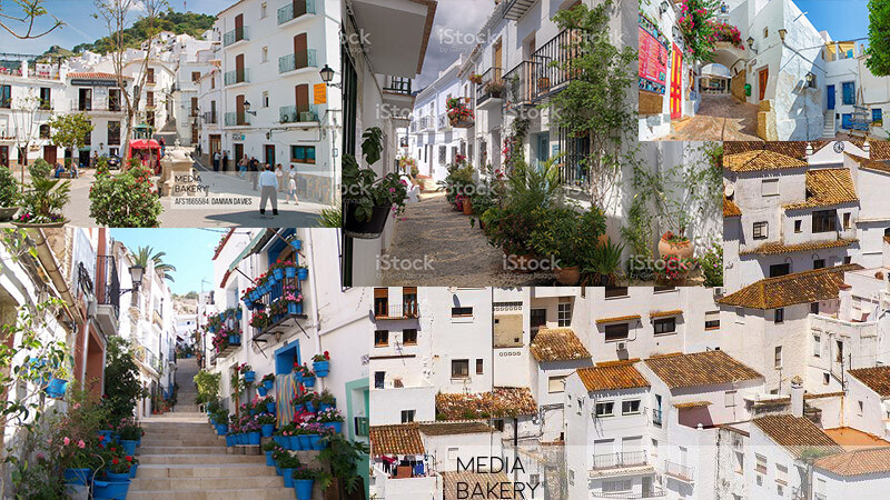
I'm not recreating any area specifically but creating my version taking inspiration from these places:
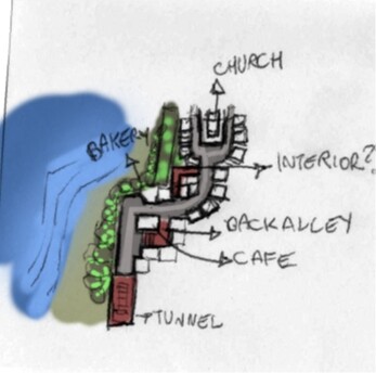
Here's a top-down sketch with the main points of interest. The player starts down in a tunnel, walks up to the street, and has the coast to one side and the town surrounded by rocks on the other. I want to have a strong sense of directionality and leave some "hooks" to expand the environment later to make the VR version more fun to explore.
The first Dev Log video on my Youtube channel explains more about this part if you are interested:

https://www.youtube.com/watch?v=_-p7qNjuIkg

I then created a kit with primitives and simple shapes that I'm using to quickly blockout the level in Unreal 4. My main goal for this phase is to get a rough idea in place. I will then replace all this geometry with "real" geometry and iterate on the whole map in stages. Think of it as a progressive JPG loading, where each pass enhances the entire picture at once.
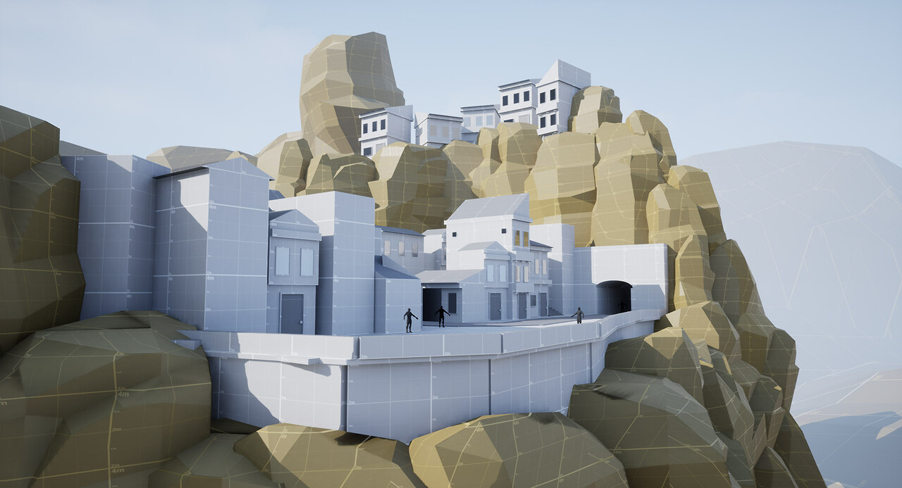
View from the rocks
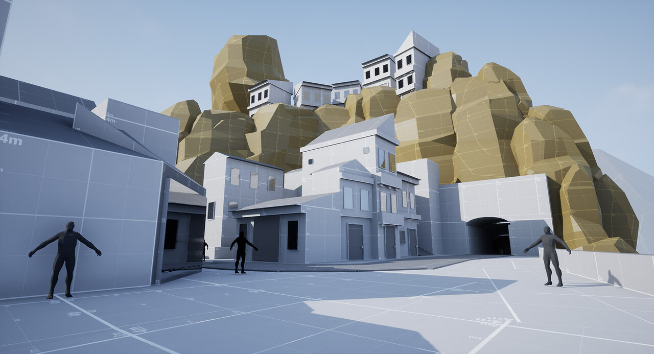
The backdrop will be much more populated later on, but I want to make sure I get the idea across.
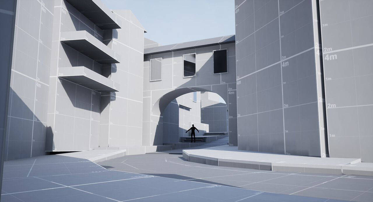
An archway
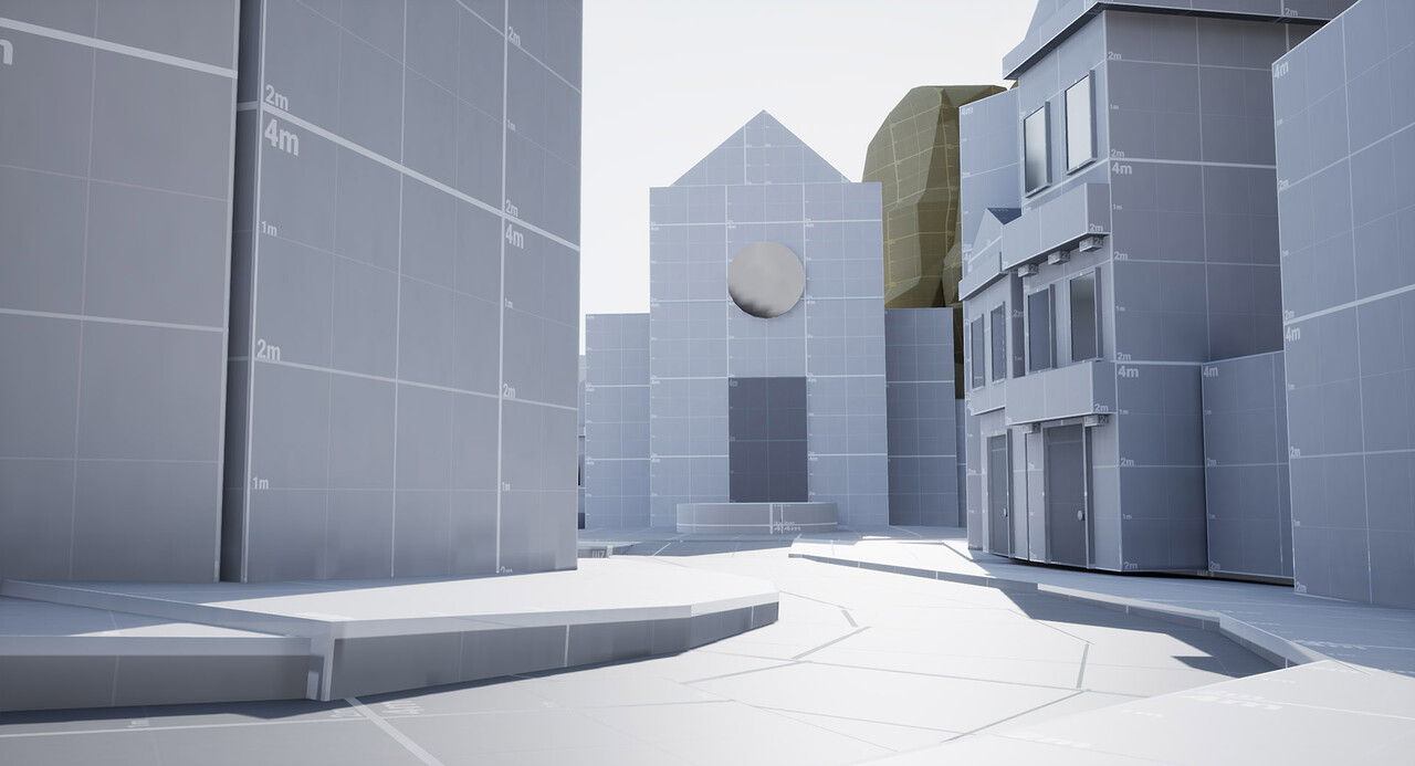
The church.
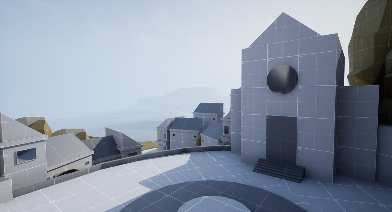
A view from one of the apartments towards the Church plaza, showing the coast in the distance.
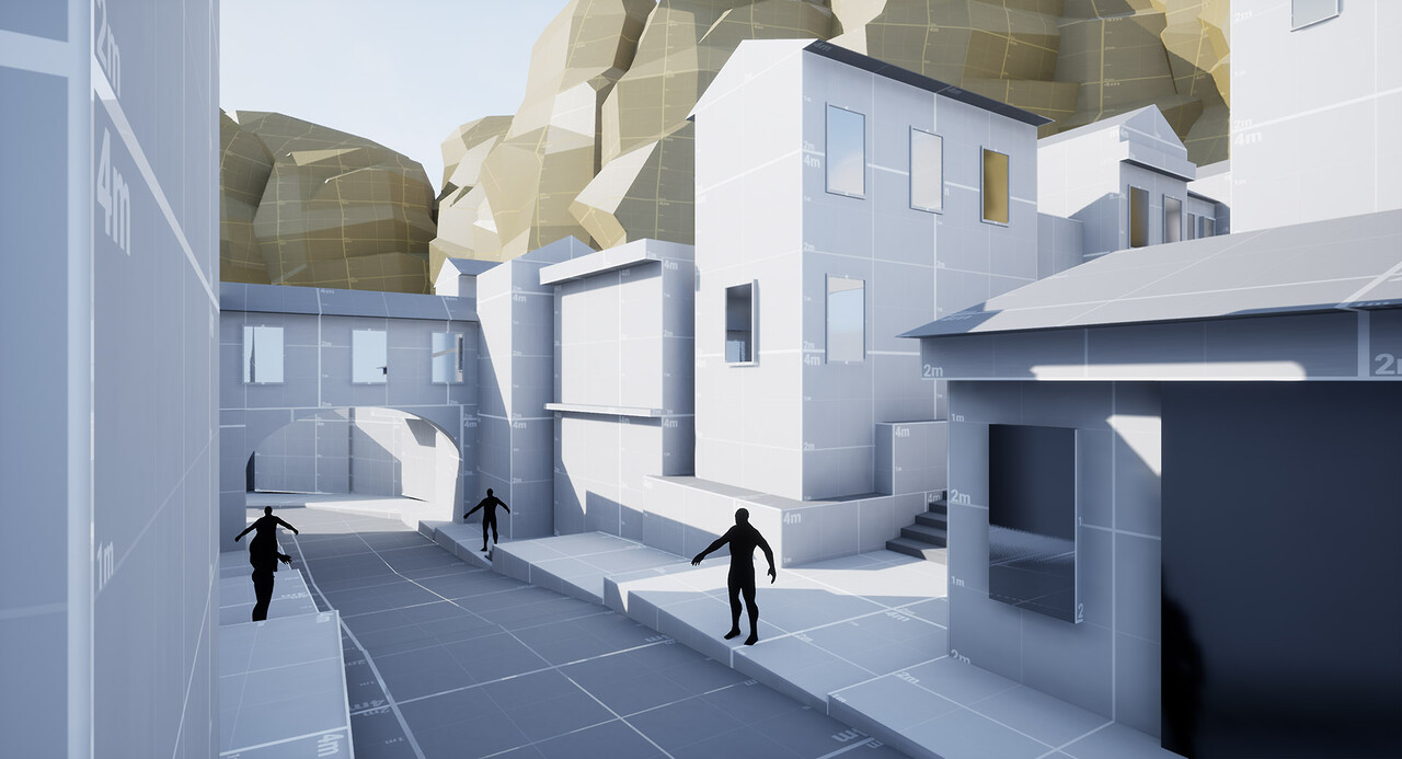
The main street where lots of commerce will be.
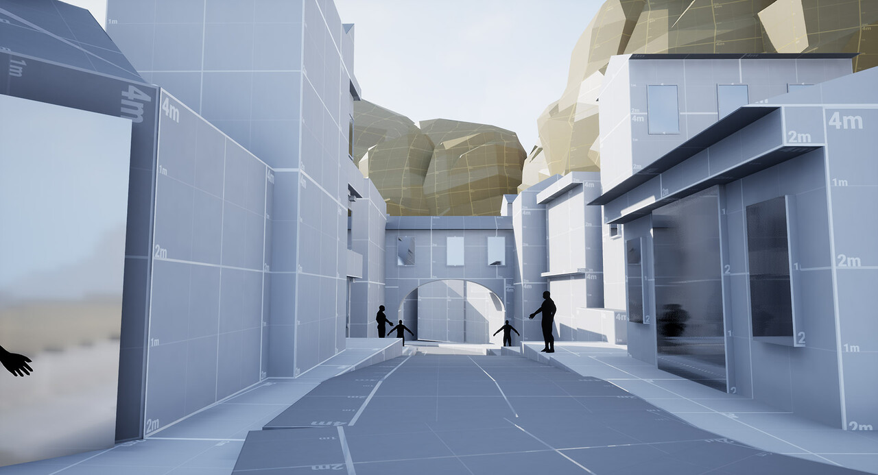
Another shot from the main street.
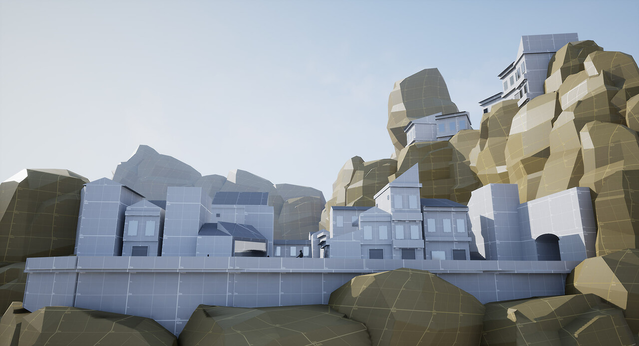
The town carved into the rocks.
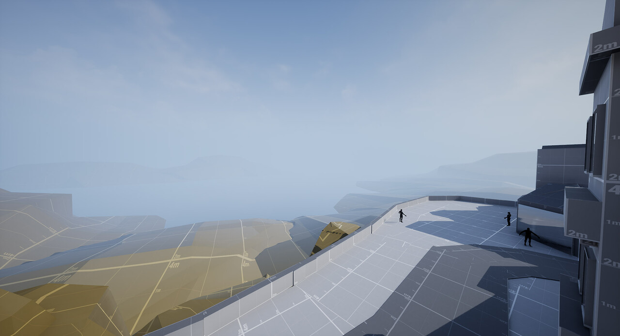
A view of the backdrop.

Dev Log #2

I also recorded a new Youtube Dev Log, where you can see the blockout in action:
https://www.youtube.com/watch?v=OPdIS_ilERY

Mailing List

If you want to stay in touch, you can subscribe to my mailing list!

Thanks for reading!

Thiago

Replies

  • Minos
    Offline / Send Message
    Minos polycounter lvl 16
    Hey everyone! Time for a quick update :D 

    I've been working on the back alley area and I'm finally happy with the compositions. This area posed an interesting challenge, and I learned quite a bit about what works in VR and what doesn't (tip: lots of random lines, stairs that go up and down cause instant motion sickness 
    🤮). I redid this area twice, but now it feels amazing in VR. No motion sickness and navigation is much better, because I have different points of interests. I'm planning to do another Dev Log video soon focusing on what I've learned in VR, for now, enjoy some screenshots!


  • [HP]
    Offline / Send Message
    [HP] polycounter lvl 13
    Oh sweet, looks awesome thiago!! 

    *subbed* :D
  • warby
    Offline / Send Message
    warby polycounter lvl 18
    Wise choice. Little dreamy picturesque villages were always my favorite settings in counter-strike maps.
  • shabba
    Offline / Send Message
    shabba polycounter lvl 15
    I wonder if, in "design_blockout_05.jpg" it'd be cool to see that church turned more to a 45deg so the shape/lines of its roof, and orientation open up that shot, and leave potential to tease the reveal of the vista to come, as some of that vista would be exposed by rotating the building.

    I feel it might be more pleasing than if it was perpendicular to the camera, /w the current lighting, its facade isnt providing enough contrast of shadow anyways

    Cool idea man, looking forward to seeing more! 

    O, unless its a playable interior for the church, then i'd ignore me completely!
  • Minos
    Offline / Send Message
    Minos polycounter lvl 16
    shabba said:
    I wonder if, in "design_blockout_05.jpg" it'd be cool to see that church turned more to a 45deg so the shape/lines of its roof, and orientation open up that shot, and leave potential to tease the reveal of the vista to come, as some of that vista would be exposed by rotating the building.

    I feel it might be more pleasing than if it was perpendicular to the camera, /w the current lighting, its facade isnt providing enough contrast of shadow anyways

    Cool idea man, looking forward to seeing more! 

    O, unless its a playable interior for the church, then i'd ignore me completely!
    That's a cool idea! The church is the next area I will iterate, I will definitely play around with the angle and size. I'm making this primarily for VR, and because the FOV in VR is narrower than on my screens, the compositions look a bit different. But yeah, I'm not a 100% happy with where the church is yet :D Thanks for feedback!
  • Minos
    Offline / Send Message
    Minos polycounter lvl 16
    Hey! Here's another update, just finished the blackouts, set up the lighting (+ fog, reflection probes etc) and will now move on to everyone's favorite part: texturing :)


  • Minos
    Offline / Send Message
    Minos polycounter lvl 16
    Does anyone still visit polycount, or everyone is gone to Artstation? :smiley:
    Here's a new dev log, with some behind the scenes and thoughts about the map:
    https://www.youtube.com/watch?v=0CWQMIekUwk&ab_channel=TKEnvironments

    Cheers!
  • wirrexx
    Offline / Send Message
    wirrexx quad damage
    Still Checking out this (as its added to my favourites) :D. SO no worries !
  • Sage
    Offline / Send Message
    Sage polycounter lvl 19
  • Minos
    Offline / Send Message
    Minos polycounter lvl 16
    When I was learning SD, I was put off by how long the official videos are. So I recorded a crash course introduction, where I show only the main tools you need to know to make cool textures, and also the general method that I use for most textures, so you can go from zero to this in about an hour and half 
    image
    There's a lot more I can do to this texture to make it look much better, but I wanted to keep it simple and not overwhelm the user with too many different concepts. Anyone can do this really :)
    image
  • motionblur
    Offline / Send Message
    motionblur polycounter lvl 12
    Ooooh ... looking super cool! Sub'd! :)
    (Though I already have bought your "Office Environment" Tutorial and it's still waiting for me to even start watching it...  :#)
  • Minos
    Offline / Send Message
    Minos polycounter lvl 16
    Ooooh ... looking super cool! Sub'd! :)
    (Though I already have bought your "Office Environment" Tutorial and it's still waiting for me to even start watching it...  :#)
    Haha awesome! I think the tutorials are very complementary to each other. In the office one I focused on modular interiors, and this one is more about "free form" exteriors (though they are still kind of modular, and would be very easy to just plug interiors using techniques from the Office tut into these buildings).
  • KrashDer
    Offline / Send Message
    KrashDer polycounter lvl 3
    Nice blockout ! it's all starting to come to life. Do you think you will make a realistic rendering? the material already gives me an idea. Anyway, I can't wait to see the end result.
  • Minos
    Offline / Send Message
    Minos polycounter lvl 16
    KrashDer said:
    Nice blockout ! it's all starting to come to life. Do you think you will make a realistic rendering? the material already gives me an idea. Anyway, I can't wait to see the end result.
    Thanks! That's a very good question that I actually want to ask the people who are following this what they think. I'm inbetween stylized realism (like Dishonored) and more stylized (like Overwatch). What would you guys choose?
  • KrashDer
    Offline / Send Message
    KrashDer polycounter lvl 3
    I love Dishonored style ! very subtle and slightly realistic.
  • wirrexx
    Offline / Send Message
    wirrexx quad damage
    I love semi realistic style, So for me Dishonored is also a yes go! (love Overwatch artstyle though)
    Bought the walkthrough! hope too see more! <3
  • Minos
    Offline / Send Message
    Minos polycounter lvl 16
    Awesome! Yeah I'm leaning towards 80% Dishonored, 20% Overwatch if that makes sense haha. But as I record, I also show ways to stylize assets more or less.
  • Sage
    Offline / Send Message
    Sage polycounter lvl 19
    Thank you for taking the time to make these. It's really cool.
  • JamieRead
    Offline / Send Message
    JamieRead greentooth
    Loved seeing the progress on this so far, dude!

    I'm super-intrigued in how the texturing style develops. Landing somewhere between Dishonored and Overwatch sounds great :)
  • Minos
    Offline / Send Message
    Minos polycounter lvl 16
    I just finished recording a "crash course" on making textures, by using a combination of Substance Designer, Photoshop and Zbrush. I start from zero and assume that you never used SD or Zbrush before, and walk through the tools I use the most. Still a lot of polish to do with these, but I'm digging how graphic they look already :)


  • kateblacks
    Offline / Send Message
    kateblacks polycounter lvl 4
    I really love this texture so far! I can't wait to see the tutorial come out - I've been looking through your current tutorials and they've been so informative. Amazing job on this so far, it's really cool to see how it's building on itself.
  • Minos
    Offline / Send Message
    Minos polycounter lvl 16
    Thanks Kate! really enjoy seeing your recent artwork too :D 

    Quick update for today, polished up the Plaster texture, and made a blend material with a dirty/damaged version. I think the texturing style is starting to become clear for me now :)


  • Rhemi_
    Offline / Send Message
    Rhemi_ polycounter lvl 3

    This is all some amazing stuff! Will this eventually be a full-scale purchase-able tutorial? I'd love to try it out!

Sign In or Register to comment.