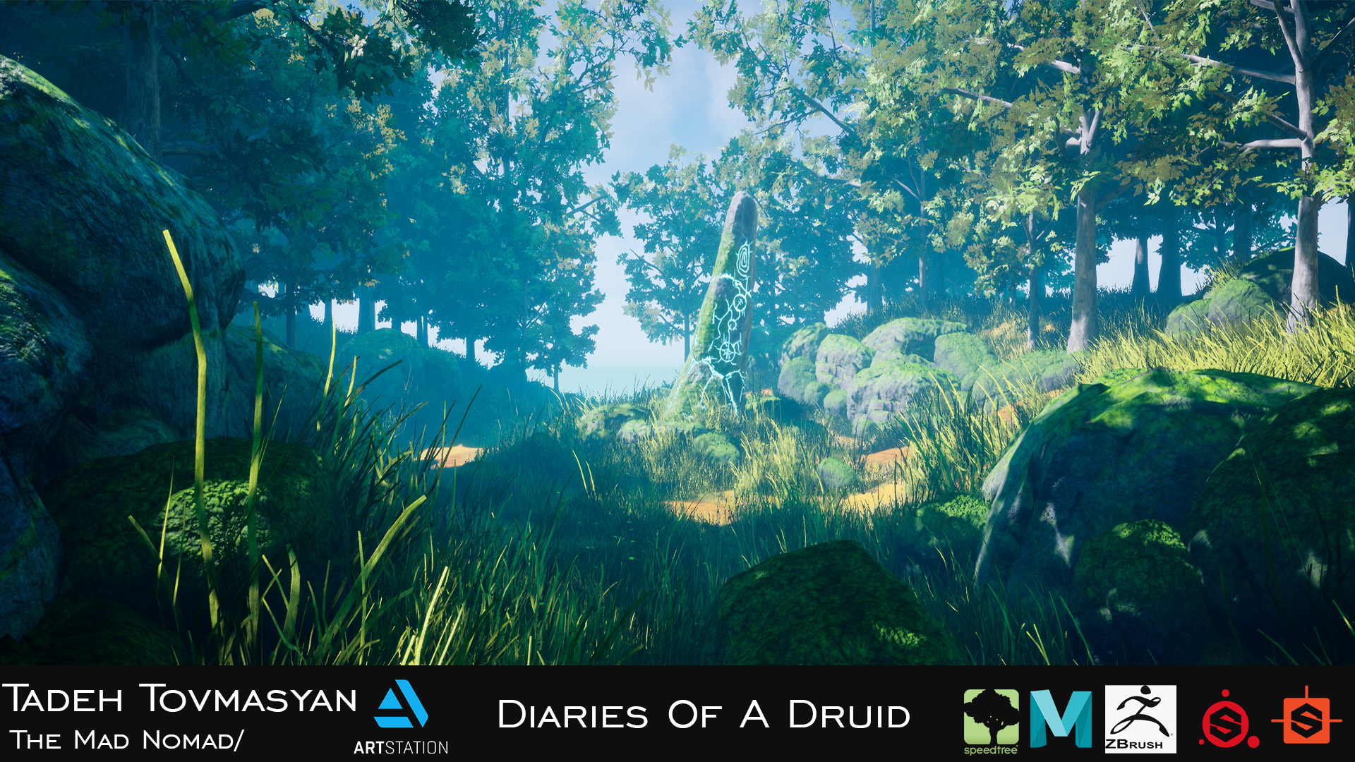
Diaries Of A Druid (UE4) _ Critiques are welcome!
Hello there dear polycounters , this is my first work inside of Unreal Engine i made it during the Organic World Building in UE4 course by Anthony Vaccaro . Just wanted to ask your opinion about basically everything ,things i should fix or to improve for my next projects .
Critiques are welcome!


And here's the link to my artstation page .
i would be more than happy if you could check it out and drop a like if you want to
artstation : https://www.artstation.com/artwork/9m3VOW
and if there are any students and junior artist like myself feel free to share your work in this topic so hopefully we can learn and share something even though in the primary and the basic steps that we are in .
Critiques are welcome!


And here's the link to my artstation page .
i would be more than happy if you could check it out and drop a like if you want to
artstation : https://www.artstation.com/artwork/9m3VOW
and if there are any students and junior artist like myself feel free to share your work in this topic so hopefully we can learn and share something even though in the primary and the basic steps that we are in .

Replies
Heres my list of gripes:
- the rocks look very spherical, usually they have a lot of flat faces and some sharp transitions.
- the tree branches are disconnected from the trunk for some reason
- look into altering the normals of the leafs so that you get a more homogenous lighting.
- grass blades usually have a sharp end.
- fog is extreme, looks like someone made a bbq
- scene is very small and looks like it ends abruptly. Its ok to do a small scene but at least give the illusion that there is something beyond it, either add a distant landscape or use a hdri with some hills/mountains/whatever.
- i cant stress enough how bad the default sky sphere looks. Get a free hdri with some nice clouds.
Currently i'm trying to improve my modeling skills a bit but i'll keep your list in mind!