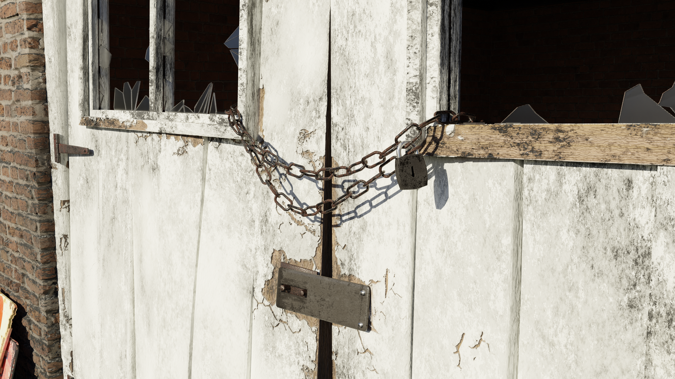
[WIP] Abandoned Shack Environment
Hi everyone, I was hoping to get some feedback on my latest 3D scene. I recently switched to Blender from Maya so I used this project as a way to learn the ropes, and I must say that Blender is awesome! Right now all this work was done solely in Blender (for learning purposes) but the plan is to put this scene into Substance Painter.

My inspiration for this scene came from the Sonoma/Napa region in Northern California. Also known as the Wine Country for its prolific vineyards, the area is mostly rustic with lots of wide open space and lazy rolling hills. My focus was to create a photo realistic scene using the PBR metalness workflow. The scene was lit using an HDRI. I used 4k res photoscanned textures for every object except the barrels which I made myself in Substance. However all the dirt in this scene was created procedurally using the Dirty Vertex Colors feature in Blender.

I also used adaptive subdivision in conjunction with texture painting on the wood shack doors, allowing me to hand paint where I wanted things to appear cracked and chipped, which in turn generated tessellated geometry. I chose this workflow specifically in order to get the up close details I so desired.

The Ivy Gen Blender Addon was also used in this scene. The grass field was made using particle effects. Dry and new grass clumps were generated using generated cloud masks. I created several of my own grass clumps and then used a free grass set to add variation to the vegetation.

If I could go back and do things differently, I would not have used the Dirty Vertex Colors procedural dirt workflow, and instead would have used Texture Paint mode to paint dirt grunge maps. Dirty Vertex Colors required me to subdivide my models in order to get better results which was not worth it. Also, since this is still a WIP I think I might want to actually add a vineyard in the background, to better tie the Wine Country theme into my scene.
Thank you and if you have any feedback please don't hesitate to post!

My inspiration for this scene came from the Sonoma/Napa region in Northern California. Also known as the Wine Country for its prolific vineyards, the area is mostly rustic with lots of wide open space and lazy rolling hills. My focus was to create a photo realistic scene using the PBR metalness workflow. The scene was lit using an HDRI. I used 4k res photoscanned textures for every object except the barrels which I made myself in Substance. However all the dirt in this scene was created procedurally using the Dirty Vertex Colors feature in Blender.

I also used adaptive subdivision in conjunction with texture painting on the wood shack doors, allowing me to hand paint where I wanted things to appear cracked and chipped, which in turn generated tessellated geometry. I chose this workflow specifically in order to get the up close details I so desired.

The Ivy Gen Blender Addon was also used in this scene. The grass field was made using particle effects. Dry and new grass clumps were generated using generated cloud masks. I created several of my own grass clumps and then used a free grass set to add variation to the vegetation.

If I could go back and do things differently, I would not have used the Dirty Vertex Colors procedural dirt workflow, and instead would have used Texture Paint mode to paint dirt grunge maps. Dirty Vertex Colors required me to subdivide my models in order to get better results which was not worth it. Also, since this is still a WIP I think I might want to actually add a vineyard in the background, to better tie the Wine Country theme into my scene.
Thank you and if you have any feedback please don't hesitate to post!

Replies
When you zoom in it starts to crack
Try to avoid using random noise as grime and dirt. Use a photo that looks like random noise.
Cracks in the wood material look unrealistic because they are very sharp and the layer of paint seems to have an uniform thickness which doesnt happen in real life.
Also, the glass is very clean.
The lighting could use some work, maybe more bounce, it seems like a bright day and judging from the sharp shape shadows the sun is high and strong, but I don’t see any over exposure or “bright areas”
Be nice to see less shadow intensity under the leaves, ideally the leaves would bleed light through themselves and give more light penetrating though. Be nice to see the reference shot you used.
Looks cool.
As for the bricks, I can easily scale up the brick size so I will be experimenting with larger brick sizes. And I have all my reference photos, I'll upload them today when I get home. Thank you very much!
EDIT: Also I forgot to mention, I'll try adding some translucency to my ivy leaves to see if I can get some more light to pass through them, good call!
Reference for the painted sign:
And here is some reference photos I used for the padlock and chain:
https://youtu.be/OpBrg1iZEY0
As for the grass field, I had to create that using a hair particle system. I started off by creating several of my own grass clump models. There wasn't enough variation in the field at that point so I found this free foliage pack online. I added a few of the plants and grass models to my particle system from here: https://www.cgtrader.com/free-3d-models/plant/other/lowpoly-pbr-rocks-and-foliage
And working with the particle system settings for the foliage was a chore but this tutorial cleared things up for me: https://youtu.be/eshOzshjt90
I hope that helps!
https://en.wikipedia.org/wiki/Lost,_mislaid,_and_abandoned_property