[Finished] (Environment) - Cute Stylized House | UE4/5
Edit:
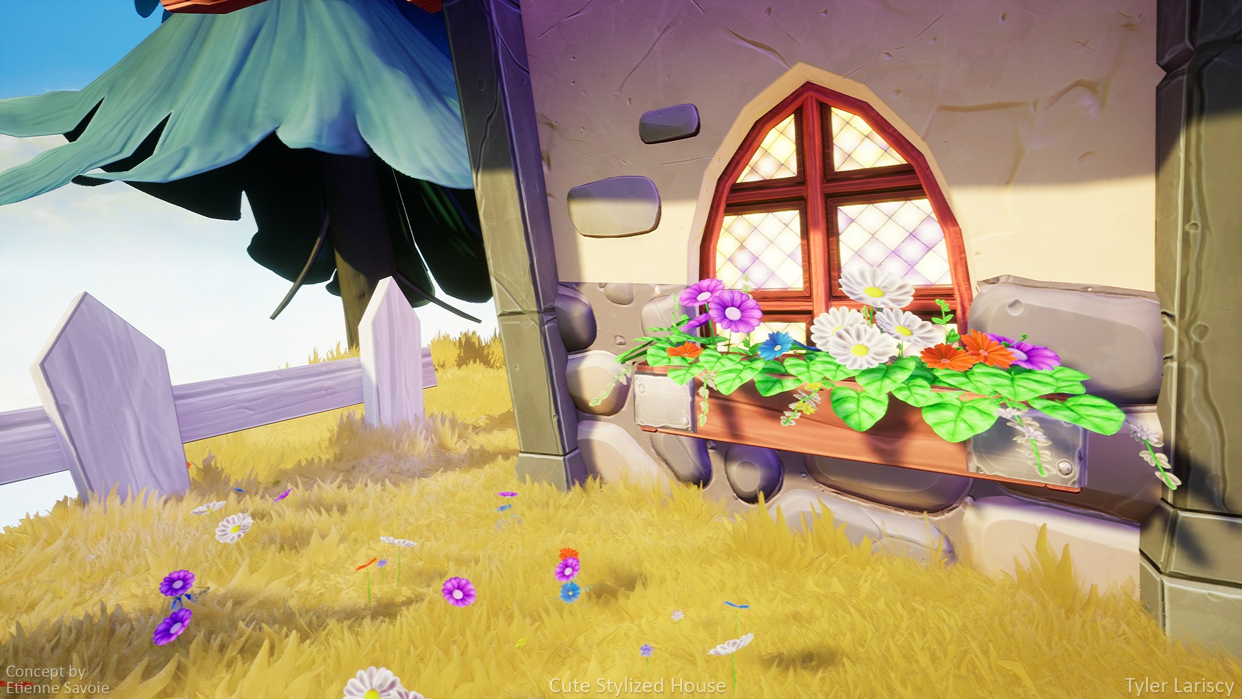
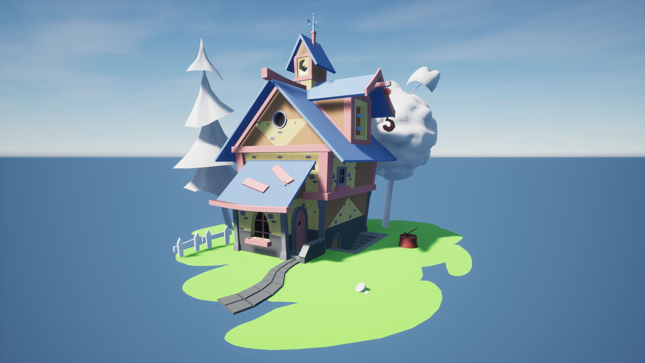
It's finally finished!
It's been awhile since I updated this post and I kind of neglected it. But my Cute Stylized House project is finally finished! I wanted to thank everyone on here who gave me feedback! I learned a lot from this project and though there's things I'm not too happy with I've got to move onto the next project and utilized what I've learned!
Find higher-res images on my post on Artstation.
Concept by Etienne Savoie.



_______________________________________________________________________________________________________________________
Hello!
I've been working on a new 3D stylized environment for my portfolio for the past month or so. The below awesome concept is by the artist Etienne Savoie. I've had this one saved in my ideas folder for a while and felt like this was the perfect piece to make for my portfolio! I just love the overall style of its shapes and the textures going on. Eventually once finishing up the house I plan on putting it in this full environment concept piece Etienne also did.
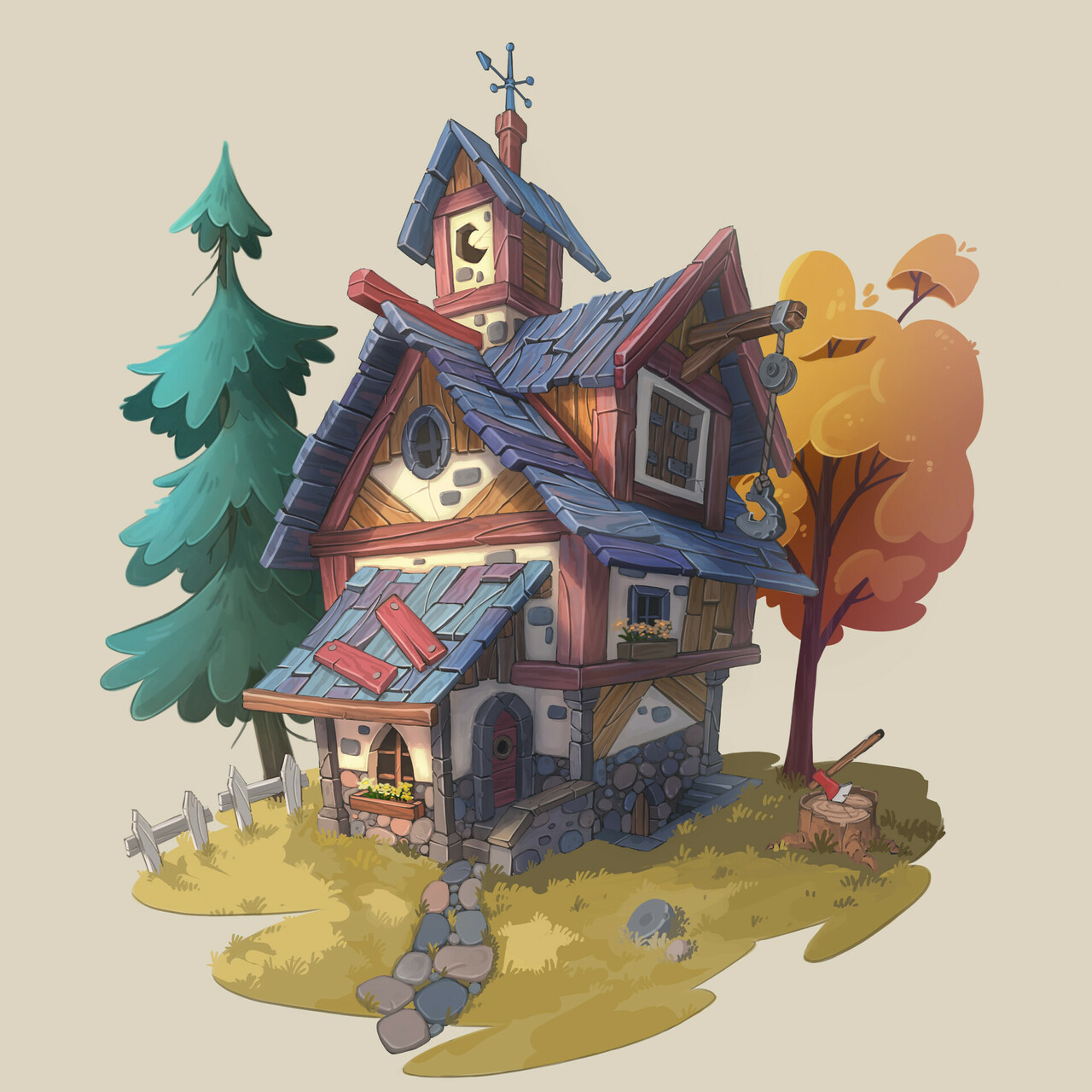
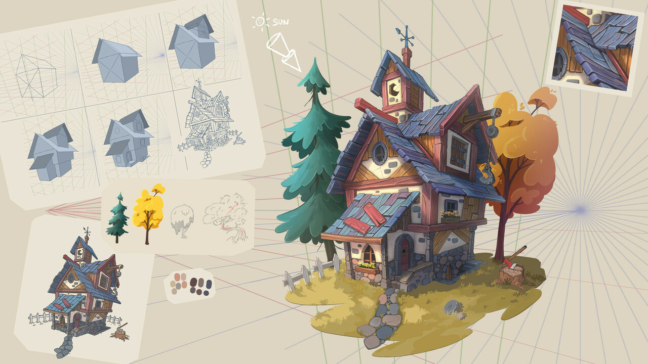
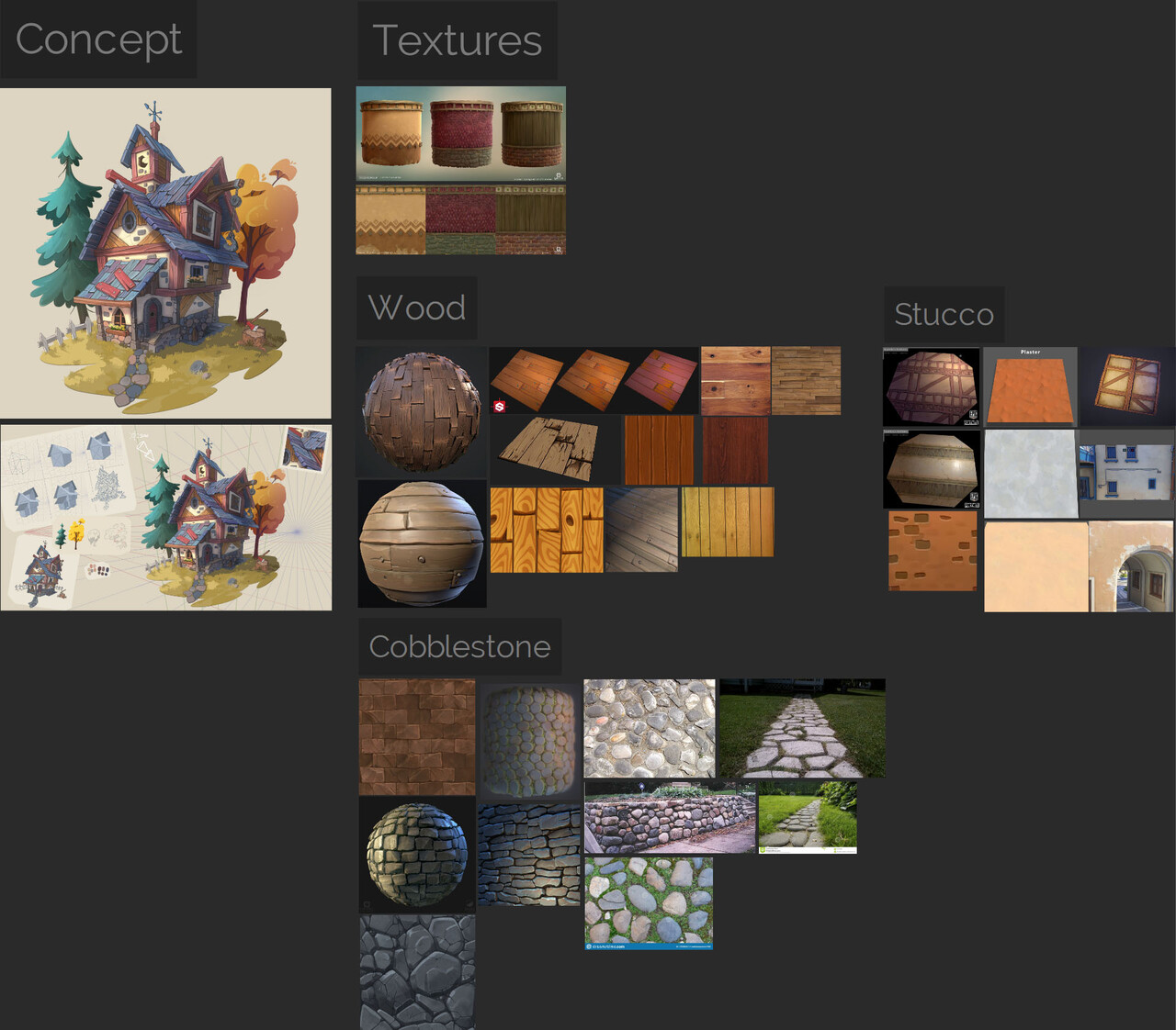
I started by collecting reference images into PureRef for some of the assets. I'll add more for the trees and other assets. After this, I brought the concepts into Maya and blocked everything out.
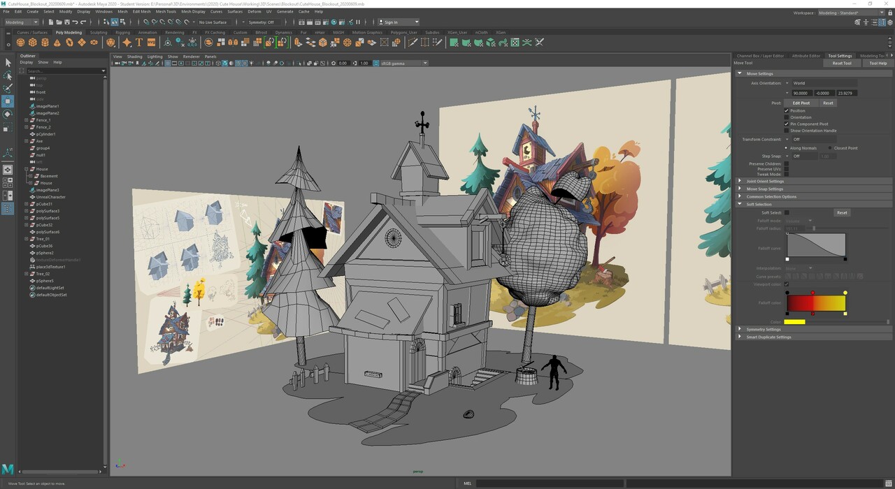
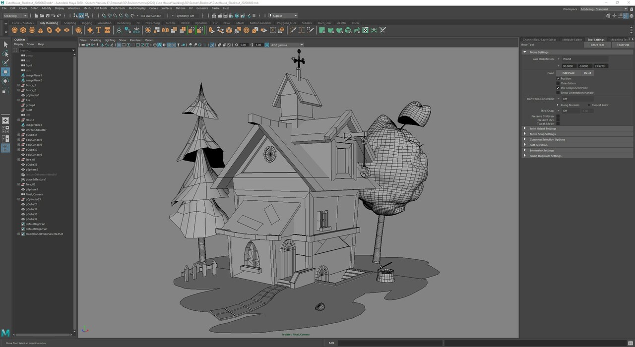
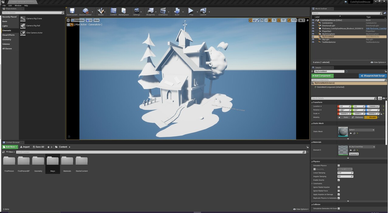
Once I had the overall general scene figured out I brought it into UE4 so I could get a rough idea of lighting.
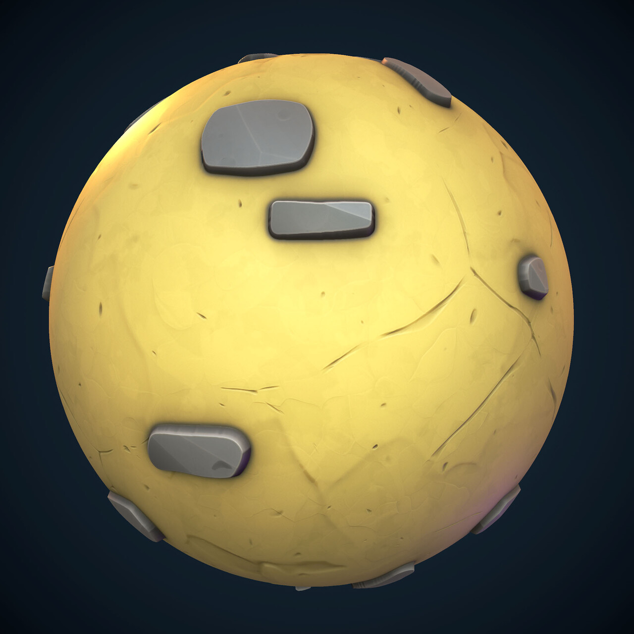
I then switched it up by working on the main stucco brick tiling texture that would be used for the walls. Got that to a point where I felt satisfied but I'll probably revisit it to work on the repetition of the bricks and to tweak the colors to get more variety in the albedo map.
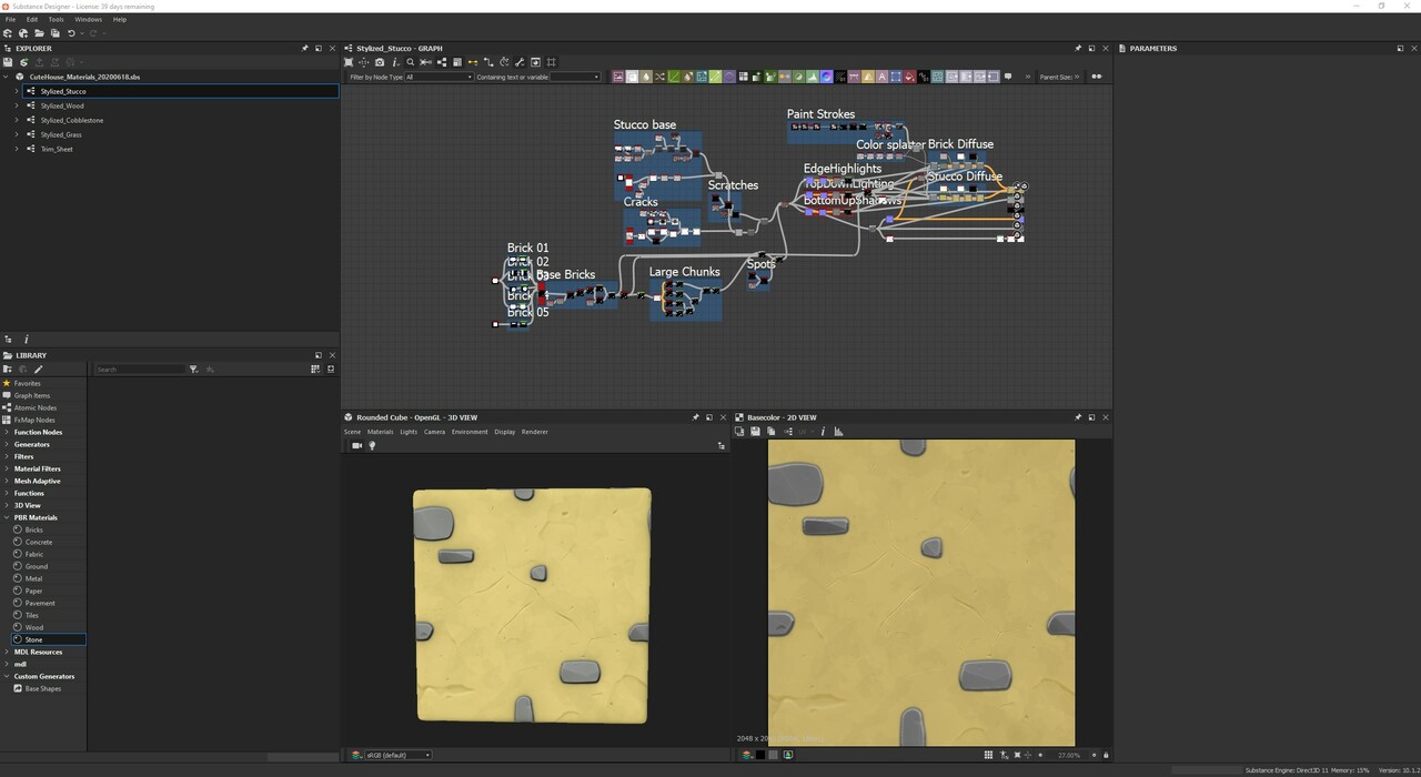
I switched back to working on making the majority of the lowpoly assets for the final scene. Whereas I'd do a lot of this in ZBrush, I'm trying to see how much I can get out of tiling textures and trim sheets. While I've got some experience with the former I've not made a trim sheet yet so I'm looking forward to that.
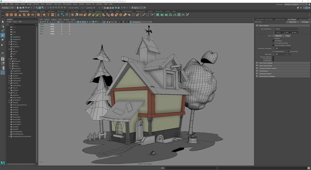
Threw on some quick automatic and planar UV mapping so I could put my stucco brick texture on it.
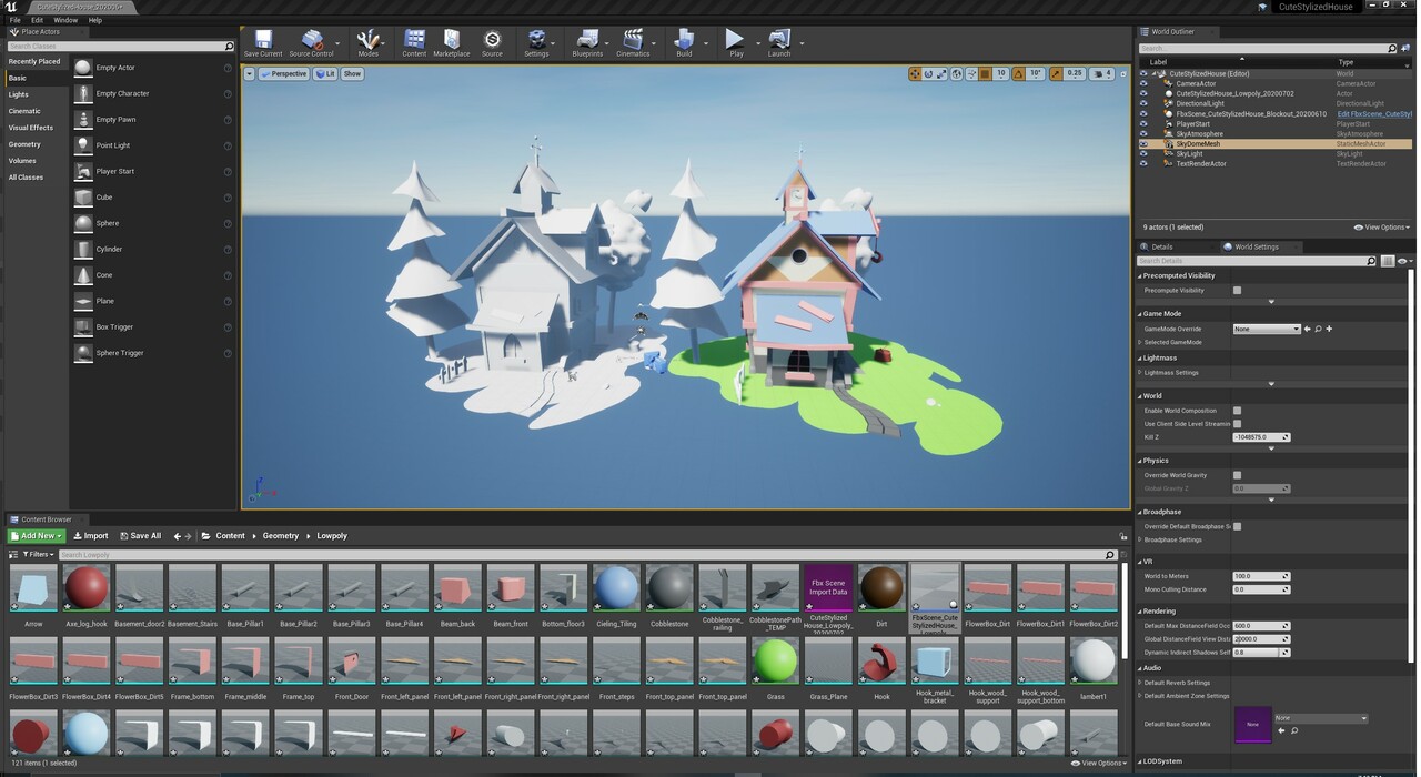
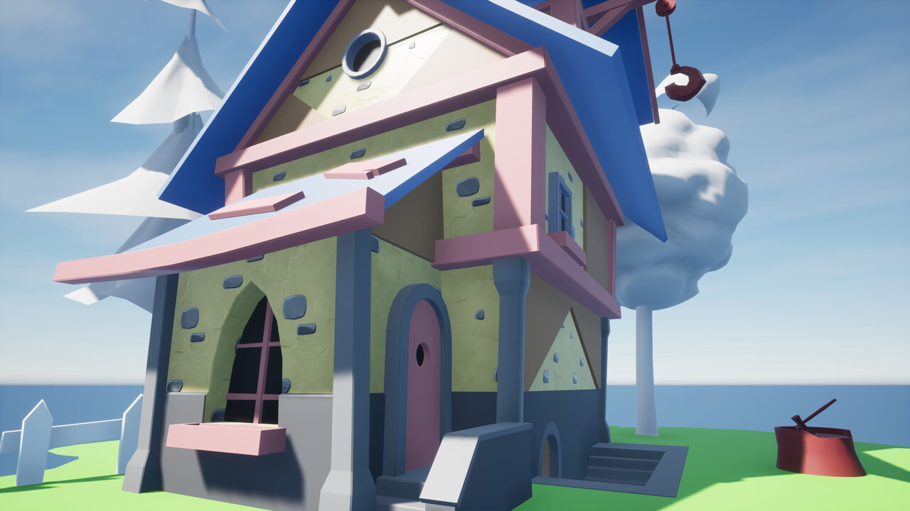
I switched back to creating one of the other main tiling textures for the wood panel roof. Again I've got it to a point where I think it looks good but I'll be revisiting it to again tweak the colors and some of the other stuff like cuts and cracks.
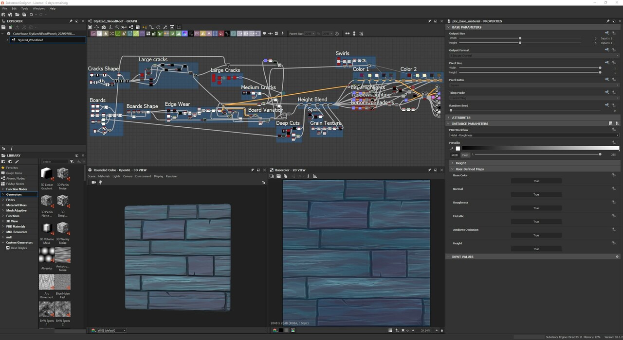
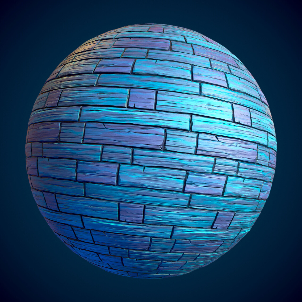
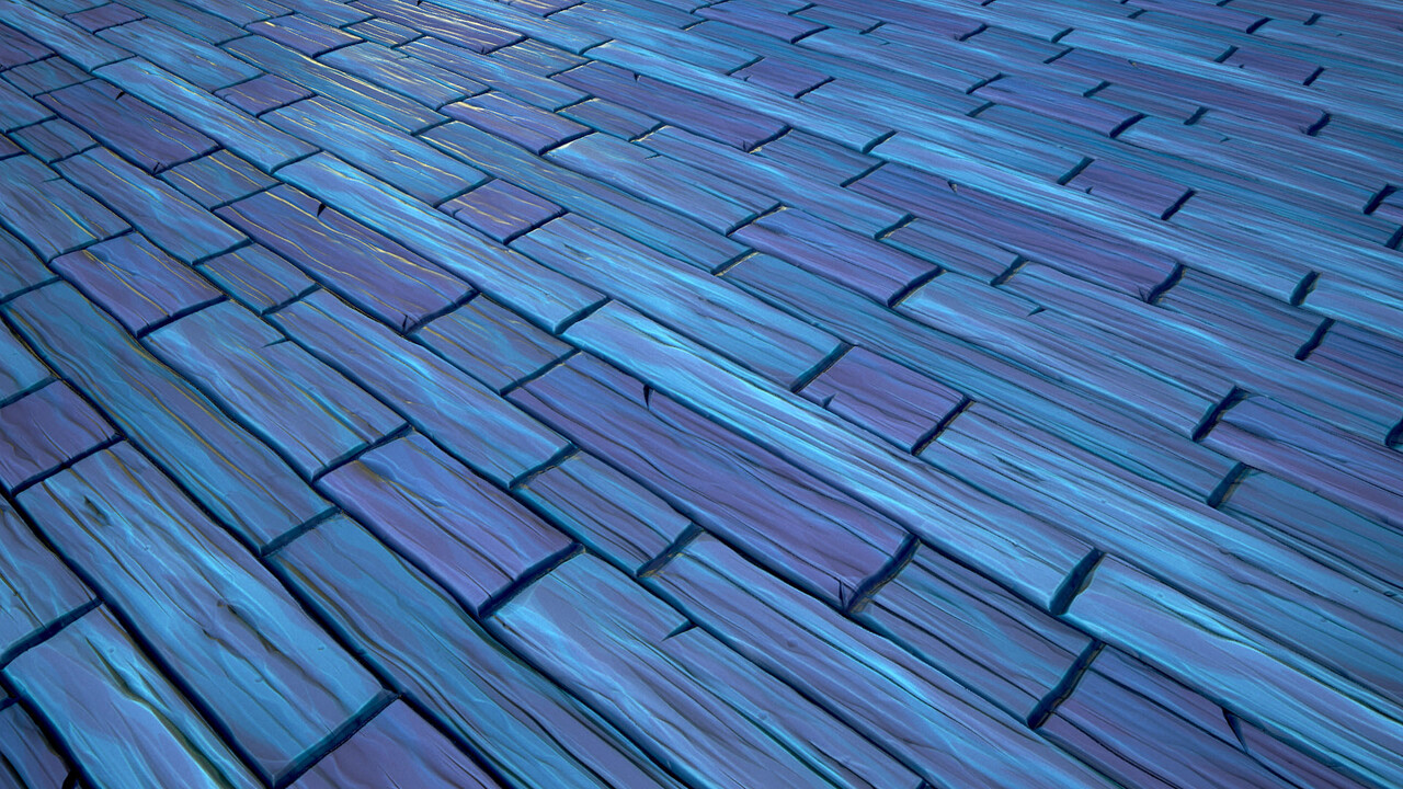
I then just threw in a separate set of color nodes as I plan on reusing this for some of the other tiling wood in the scene. I'll probably break it off and tweak it to reduce the number of planks.
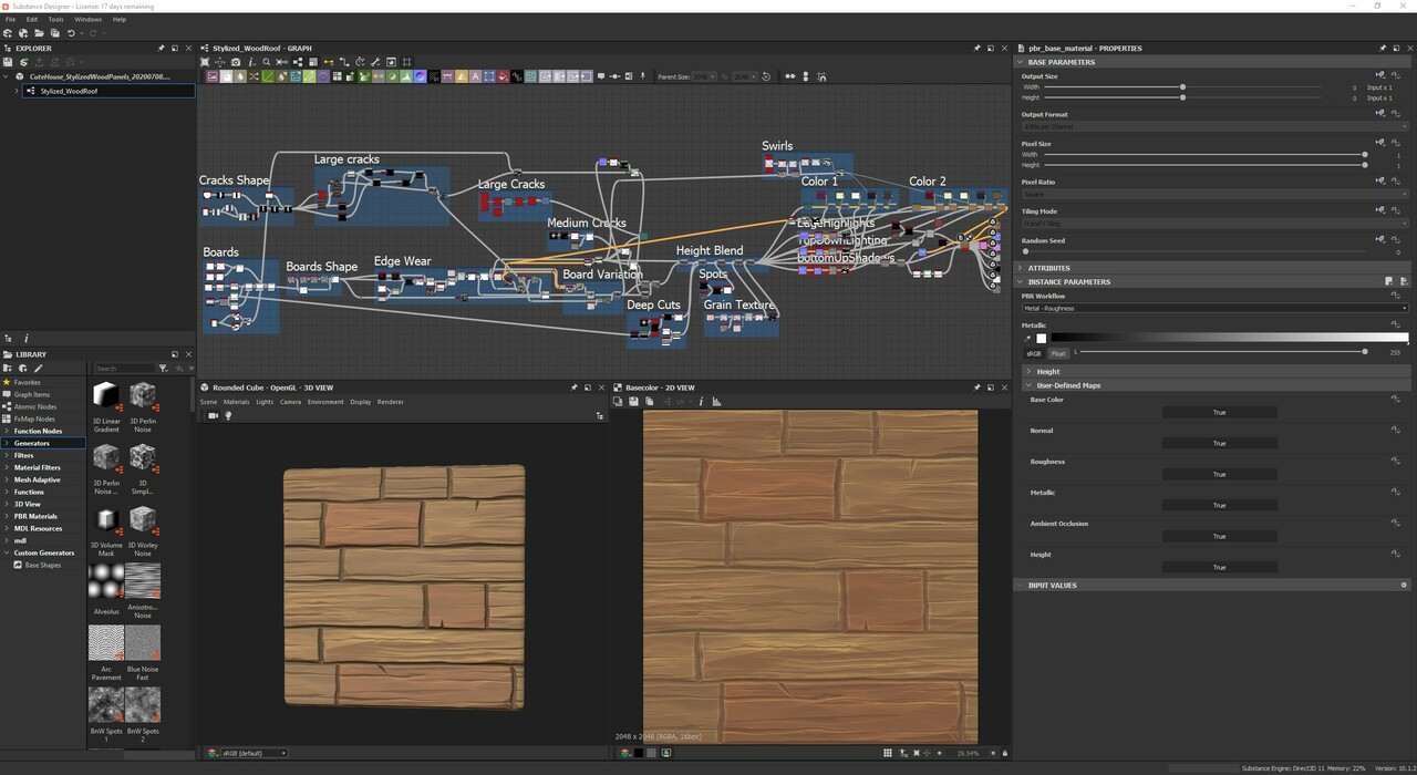
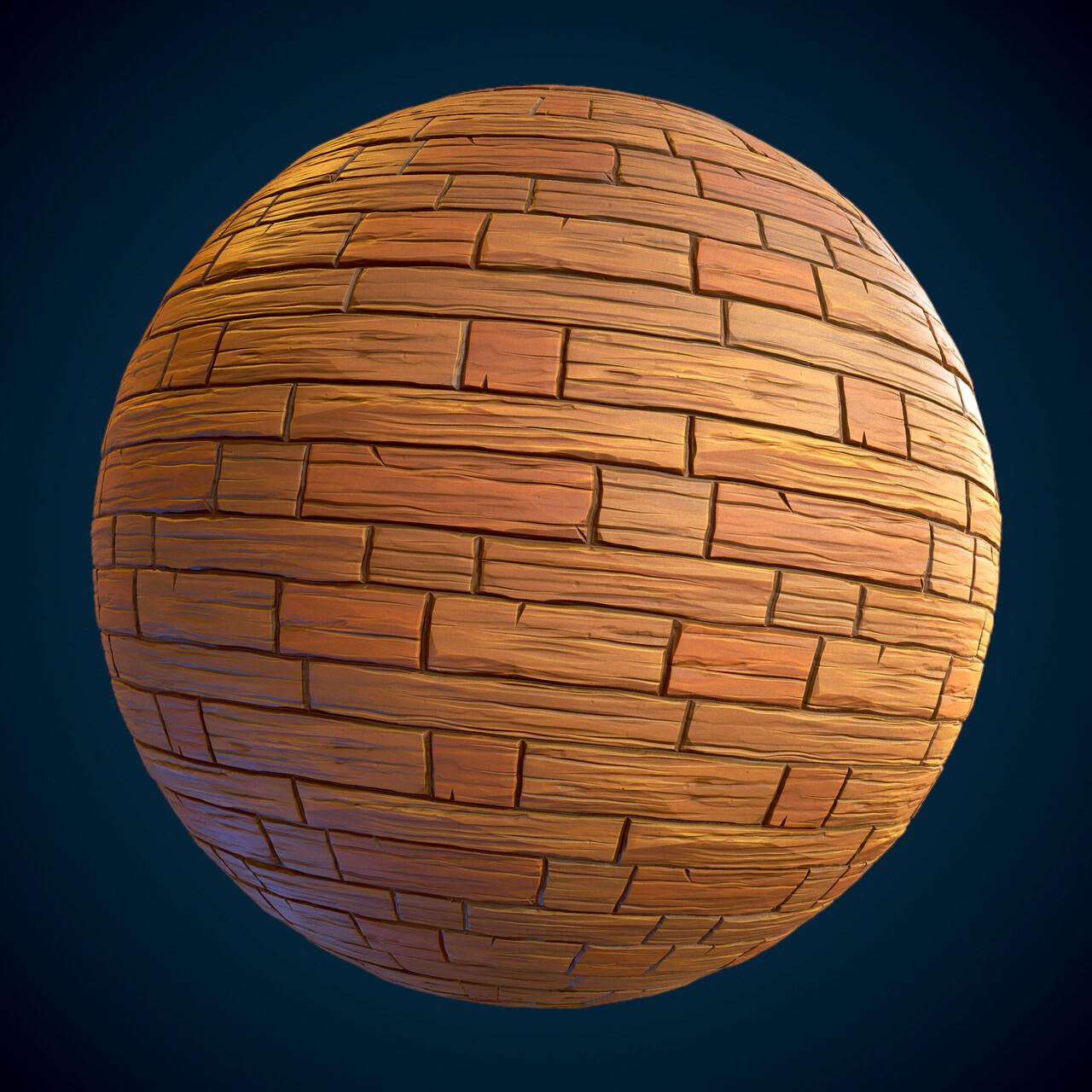
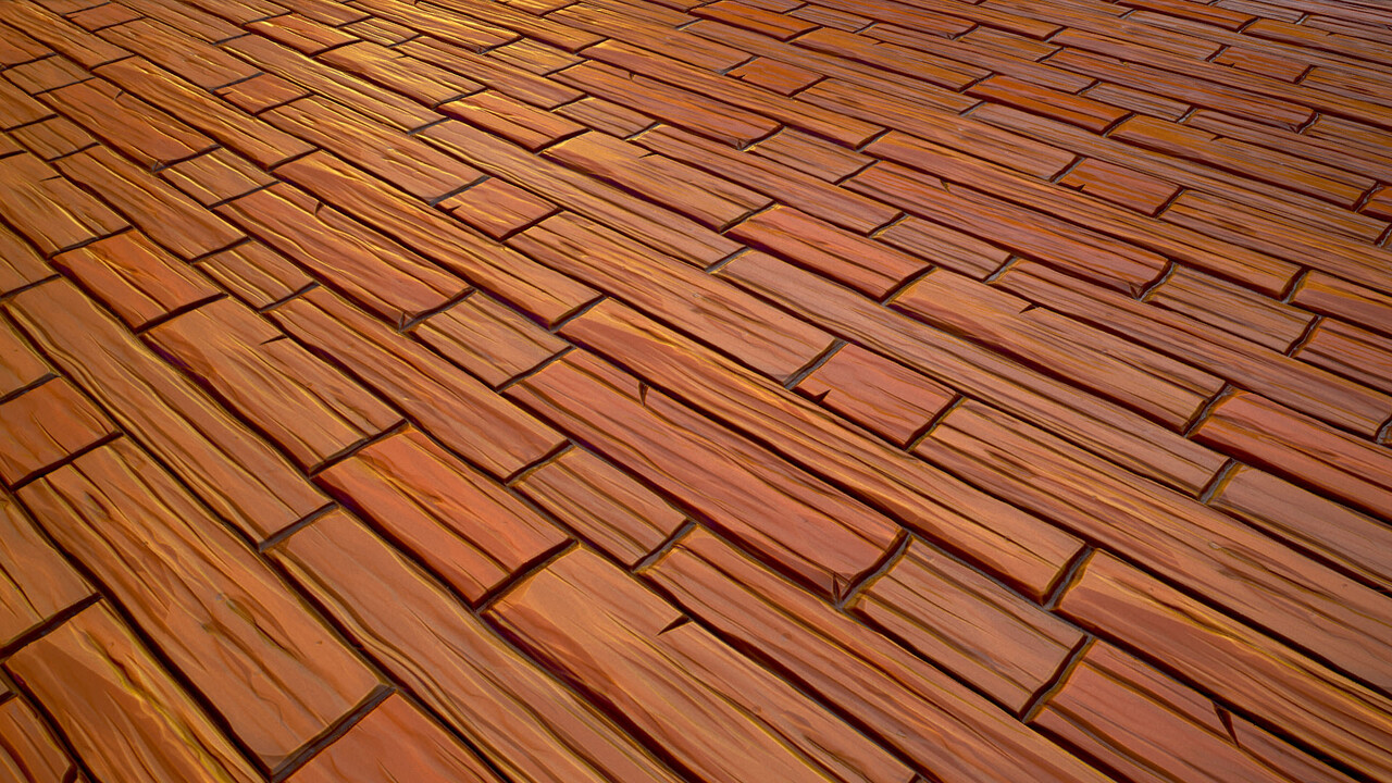
Threw these into Unreal as well to see how they'd look on the temp models. I plan on modeling out the roofs and some other wood pieces in Maya with the tiling texture on them to break the silhouette.
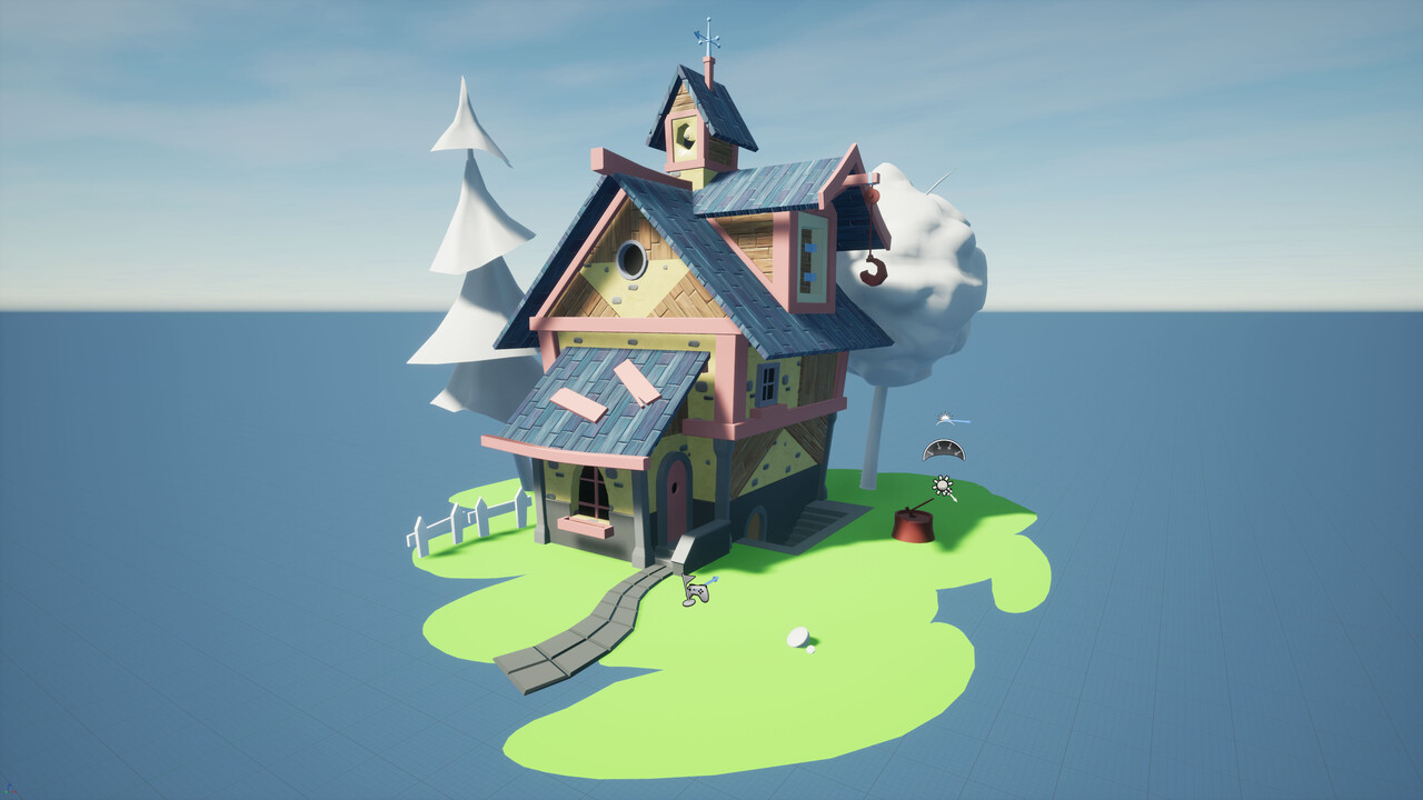
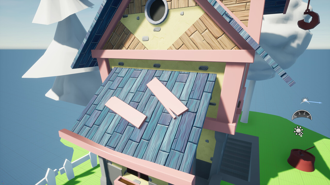
And that's where I'm currently at! I think I'm going to tackle the trim sheet next as I can re-use my wood texture for most of it.
Follow along on my other platforms!
Artstation thread
Instagram
Twitter

Replies
Did a first rough lighting pass as well as setup a two sky dome setup so I could have the solid color background. I'll do another pass once I get more of the assets done.
[WIP-03] (Environment) Cute stylized house | UE4
Been a few days and I've created a few more stylized materials for this scene.
Here's a tiling round stone wall material. I punched up the colors in them probably a bit much so I'll most likely tone them down once I finalize all my materials to make sure they sit well together.
Here's a tiling wood trim material with some rope at the top. I'll most likely take the rope out and move it to its own unique texture for the rope and hook.
And also a tiling stone trim material.
And then here's the updated scene in Unreal. I started pushing around some verts in some of the models so that they aren't so flat. However, I've mainly been focused on getting the main materials done in Substance Designer. So I'm gonna focus a little more on the getting the house to look a bit more fun and stylized like the concept.
You did mention that the next focus will be more on the fun and stylized aspect of the concept, but we thought of pointing out some areas that cough our eye taking into consideration the current state of the model curves and proportions.
Some areas would probably gave it that sweet stylization and feel more, if the perspective and proportions matched the original reference just a bit closely.
Another thing that would be great to nail at the start is the lighting. It has that overcast-y soft and gentle mood overall, and lacks those harsh shadows. That would help greatly with creating and nailing the materials, where in the other case could be that some of the current materials do not work for the tweaked and improved lighting afterwards.
Hope this helps and sorry if we mentioned some obvious things that you were going to fix afterwards!
No worries at all about any obvious notes! It might be stuff I already have on my mind but it's good to be reminded of. Plus, there might be something somebody else catches they see differently that I don't! Definitely some great notes about the overall shapes and angles! I especially appreciate the quick draw over you did breaking down the shapes! I've tried to continue to compare the concept piece and screenshots side by side but really should do more paintovers!
I was actually just coming to make a post-update with a pretty big update to this scene! I believe I've hit on a lot of the notes that you've made as I also received a lot of the same critique in some Discord groups I posted to! However, comparing the current state of the piece with the concept in Photoshop, I do still see some things I could fix up! A big thing that seems to make this piece a little difficult is the FOV of the concept piece being a little bit intense. So playing around with that in both Maya and Unreal has helped.
Let me know what you think of the update below!
Been a few weeks since I've made an update about my stylized scene! As I said in a previous post, I was going to really focus on the overall shape language of the house as well as the models themselves. I was super focused at the beginning on the base materials and getting the main materials done but had neglected the models!
I've since updated the entire scene thanks to feedback on here from @ArcaneOwl as well as the Discord groups I follow.
I mainly focused on the overall silhouette of the house in order to get it to better match the original concept. Something somebody pointed out was that the FOV on the concept is a bit intense. So I played around with that in both Maya and Unreal to help push the overall structure. I also tried to push the small to large proportions from the bottom to the top of the entire house to give it that angled look.
I fixed up and properly UVed all the meshes to the newest textures from Substance, which also really helped everything.
As well as tweaked some of the directional light, skylight, and post-process volume to lighten the overall scene, got rid of some of the dark shadows, and punched up the saturation.
Sorry, should've mentioned that the grass is just a temporary placeholder! I plan on having the color variations in the concept with some master material instances to be able to get the different patches! Even so, I should've been better about picking the temp color from the concept! But I'll definitely be taking another look at the colors overall! It's one of the more difficult areas for me being colorblind hah. But I tried my best to color pick from the concept! I think that maybe my post-processing volume is pushing things a bit too much so I'll probably dial it back. But the plaster/brick especially was one of my first solo Substance Designer materials and I don't think it sits as well with the rest of the newer materials.
Looking at the roof again that's a good comment about the lack of micro-detail such as the little chunks taking out at the end! I'll go back in and try to get more of the smaller details to show up. The same goes for the chunk comment. Looking at the back-and-forth of the gif I can see where I've lost some of that chunk from the original concept.
I appreciate the comments!
Thanks again for the comments!
Currently wrapping up the tree stumps highpoly sculpt. I'll work on the lowpoly and substance painter textures shortly after!
Concept by Etienne Savoie!
It's finally finished!
It's been awhile since I updated this post and I unfortunately neglected it! But my Cute Stylized House project is finally finished! I wanted to thank everyone on here who gave me feedback! I learned a lot from this project and though there's things I'm not too happy with I've got to move onto the next project and utilized what I've learned!
Find higher-res images on my post on Artstation!
Concept by Etienne Savoie.
Those panels are modeled planks as well as the ones above them. But I definitely could've played with the shapes a bit more to make them stand out.
I really appreciate the kind words! I definitely took my time hah. But it was a nice change of pace as I generally rush through pieces.