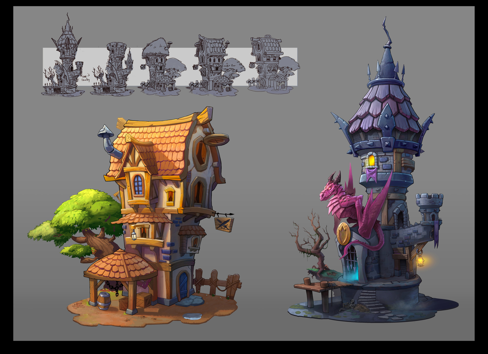
Hand Painted/Stylized Building WIP
Hello Polycounters!
Its been a long time since I last posted here and worked on a personal project. Wanted to share current WIP and open up for critiques early on before doing something that can take me way too long to fix. Give me those fresh set of eyes!

I will do my best to update this thread anytime there are updates.
Currently I am working on a small environment piece based on the concept by Lloyd Hoshide. (the one of the left)

Recently finished blocking everything and am currently working on prepping everything for the high res. Trying to break it down to the most essentials and reusing as much as i can.
Note, I have decided to leave the tree for last because, reasons.


Any comments/critiques would be very much appreciated.
Cheers,
KS
Its been a long time since I last posted here and worked on a personal project. Wanted to share current WIP and open up for critiques early on before doing something that can take me way too long to fix. Give me those fresh set of eyes!

I will do my best to update this thread anytime there are updates.
Currently I am working on a small environment piece based on the concept by Lloyd Hoshide. (the one of the left)

Recently finished blocking everything and am currently working on prepping everything for the high res. Trying to break it down to the most essentials and reusing as much as i can.
Note, I have decided to leave the tree for last because, reasons.


Any comments/critiques would be very much appreciated.
Cheers,
KS

Replies
The original art is really fun and wonky, you could go even more with the curves.
Don't worry about the wonkyness and curves too much at the block out stage, most of that could be achieved using effectively using FFD's