Retopo vs Decimation Boulders for platform.
So I'm making Large Reusable rocks/Boulders, (The player will walk and jump on these)
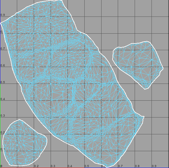
going for a stylized look, like SoT. Iv Retopoed by hand and ended up with 4000 tris, While the decimate ended up with 3000, below are some pics and possible issues. What is wrong or should change.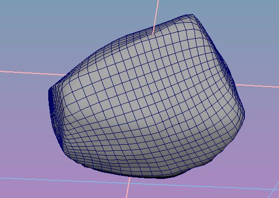
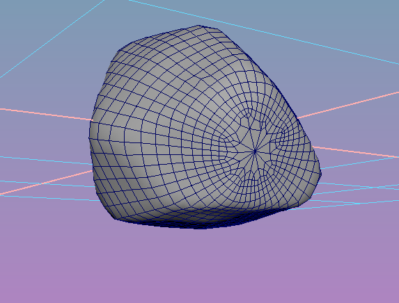
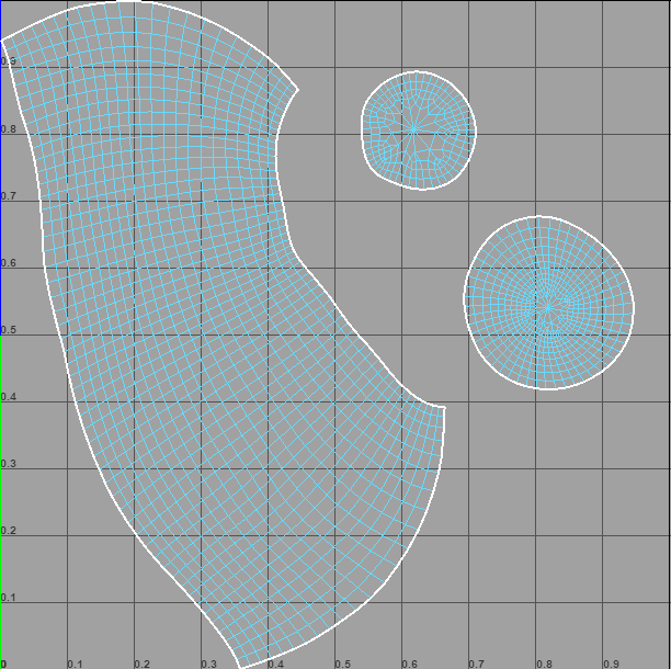
this is 1000 more tris then decimation. UV is even and no stretching to be seen. unclean caps had some engons i fixed by hand with multi cut.
-------------------------------------------------------------------------------------
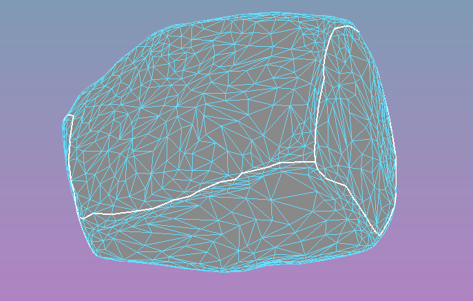
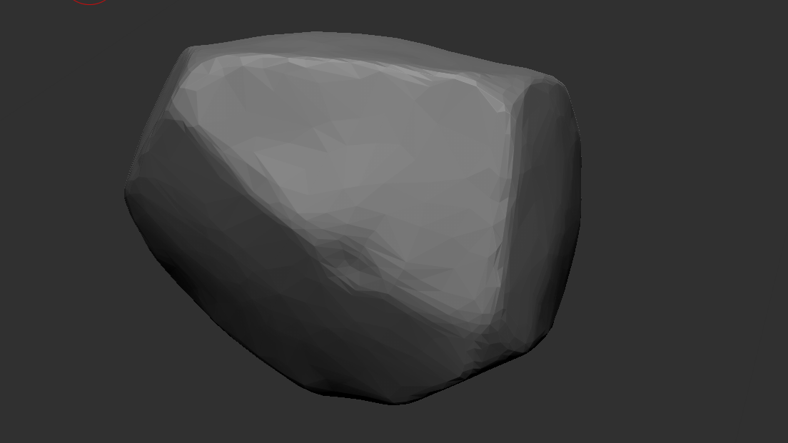
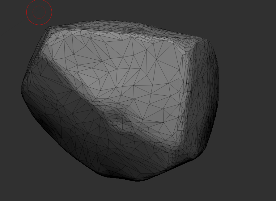
Here is the decimated version. 1000 less than above ^
---------------------------------
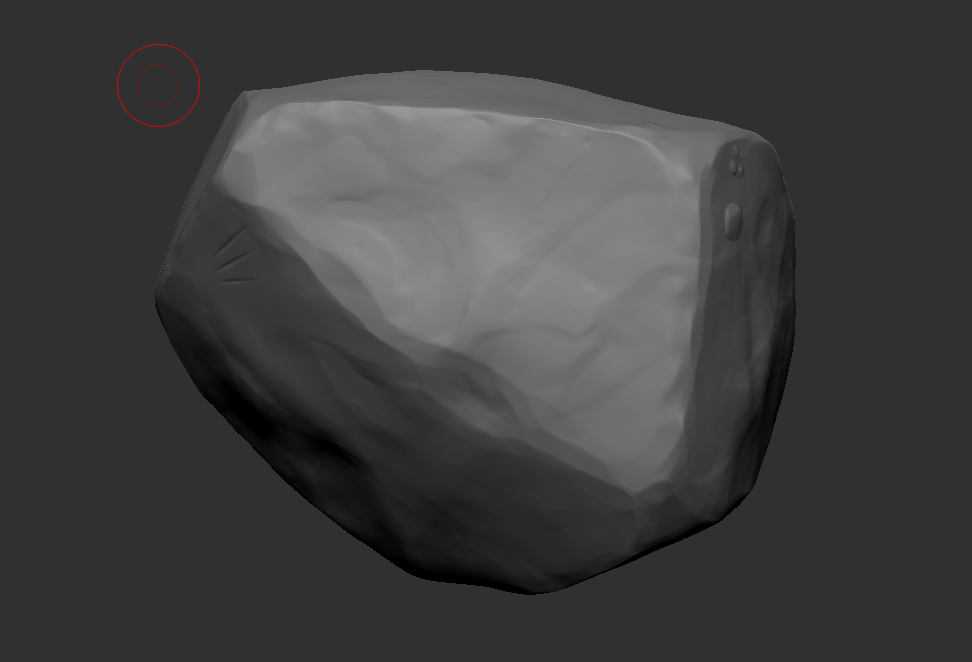
Here is my high poly 2.1mill
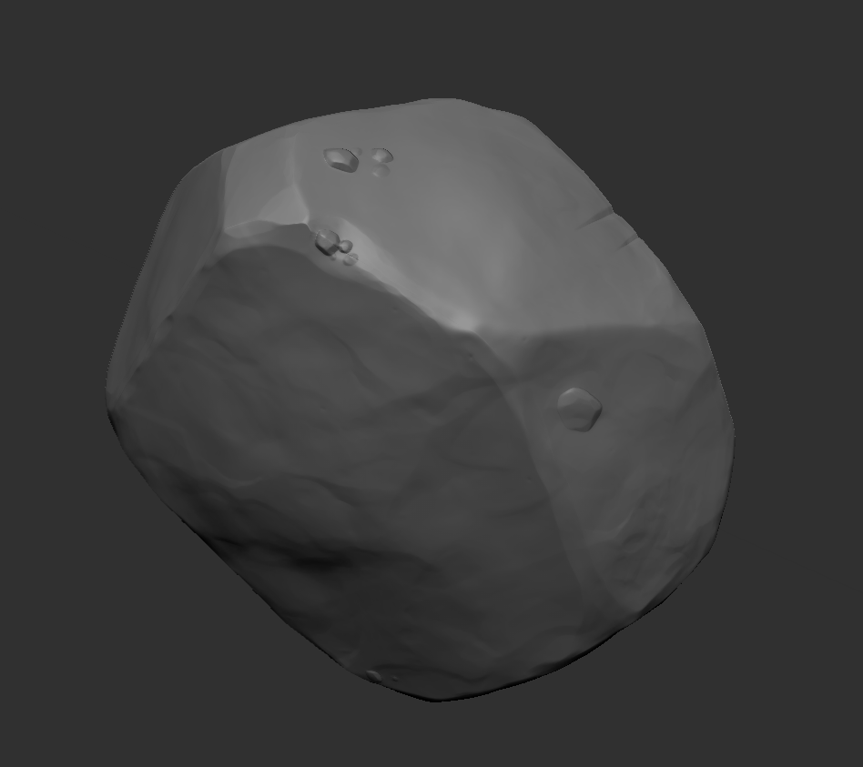
Any advice, for anything you can see! I just feel something is off.
Going to bake highs to lows than head-on with the decimated one for now, into mixer 2020 than into ue4.
going for a stylized look, like SoT. Iv Retopoed by hand and ended up with 4000 tris, While the decimate ended up with 3000, below are some pics and possible issues. What is wrong or should change.


this is 1000 more tris then decimation. UV is even and no stretching to be seen. unclean caps had some engons i fixed by hand with multi cut.

-------------------------------------------------------------------------------------
Here is the decimated version. 1000 less than above ^


---------------------------------
Here is my high poly 2.1mill


Any advice, for anything you can see! I just feel something is off.
Going to bake highs to lows than head-on with the decimated one for now, into mixer 2020 than into ue4.

Replies
I guess it doesn't matter for such an simple object as long as it looks good. With a decimated version you save some time. But you might have to fix some too thin triangles if they cause shading issues
It really depends on your needs.
And dont waste that much UV Space.
Here is a more used UV space what do you think.
seams are along the edges for the most part.
Edit*
I'm getting way too many seams since this will be viewed a lot and up close, iv tried to fill up UV space and reduce seams.
this is what iv come up with to reduce seams and keep textile density consistent.
and thoughts?
The white-wireframe UV is a good use of space, but you need more space between the shells, for padding.
What kind of real-time maps are you using, and how are you baking them?
Ah, I see I'm not baking properly that why I see seams?. I'm not sure what real-time maps are.
but here my workflow for this Boulder. ( Zbrush FBX export, Maya Retopo and UV, Toolbag3 Baking, Mixer 2020 Texturing, then import into UE4 )
Here is a picture of my toolbag bake
Texturing in mixer vvv
ps. thank you all I really appreciate the help
might be more noticeable with a different texture, am I being too picky?
Make sure you;re being smart about order of operations. Make your gameplay blockout first. Play for awhile, adjusting the space until the gameplay feels good. Then once the gameplay is all ironed out, put in the nice meshes. Before fixing any seams, play the level and do a detail pass, see if they're noticeable at that point. Wasted work otherwise.
and again thank you for the help!
- for unreal, make sure the tangentspace of your baker is set to mikkt
- for better baking inspection, turn off your sky in marmoset, create directional light with shadows off, which has the same orientation as the camera, link it to the camera. now you have the light always aw you need it, no more rotating, no more distracting reflections. use a grey not too dull material with a high but not full metallic value. with this lighting full metallic would go full black. so i usually use something around 60-75% metalness.
- for better lodding, i would suggest to straighten the perimeter edges of the uv shells. this doesn't have to be 90°, diagonal is fine. but the longer and straighter lines you have, the better it can be reduced without many visual artifacts. any dent in an optimized edge might mean a more visible seam.