Gestoryscht - Art Dump
Hi guys,
in the past I created several topics about projects of mine but I never finished these, so I want now to start as many others my own little art dump thread for posting all kind of work in progress pictures. No matter how much I work on projects, you'll get updates and I hope for a lot of critique and advice
So let me start with my latest, finished little project.
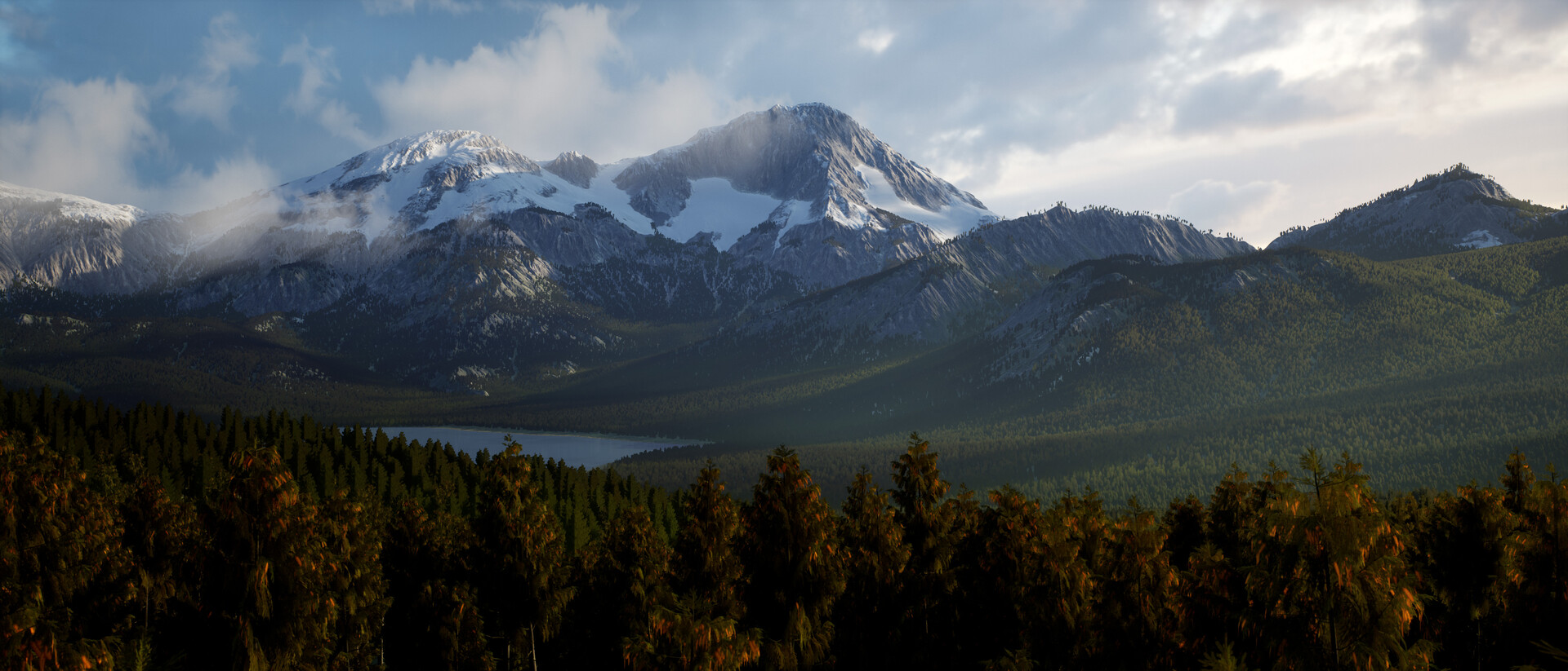
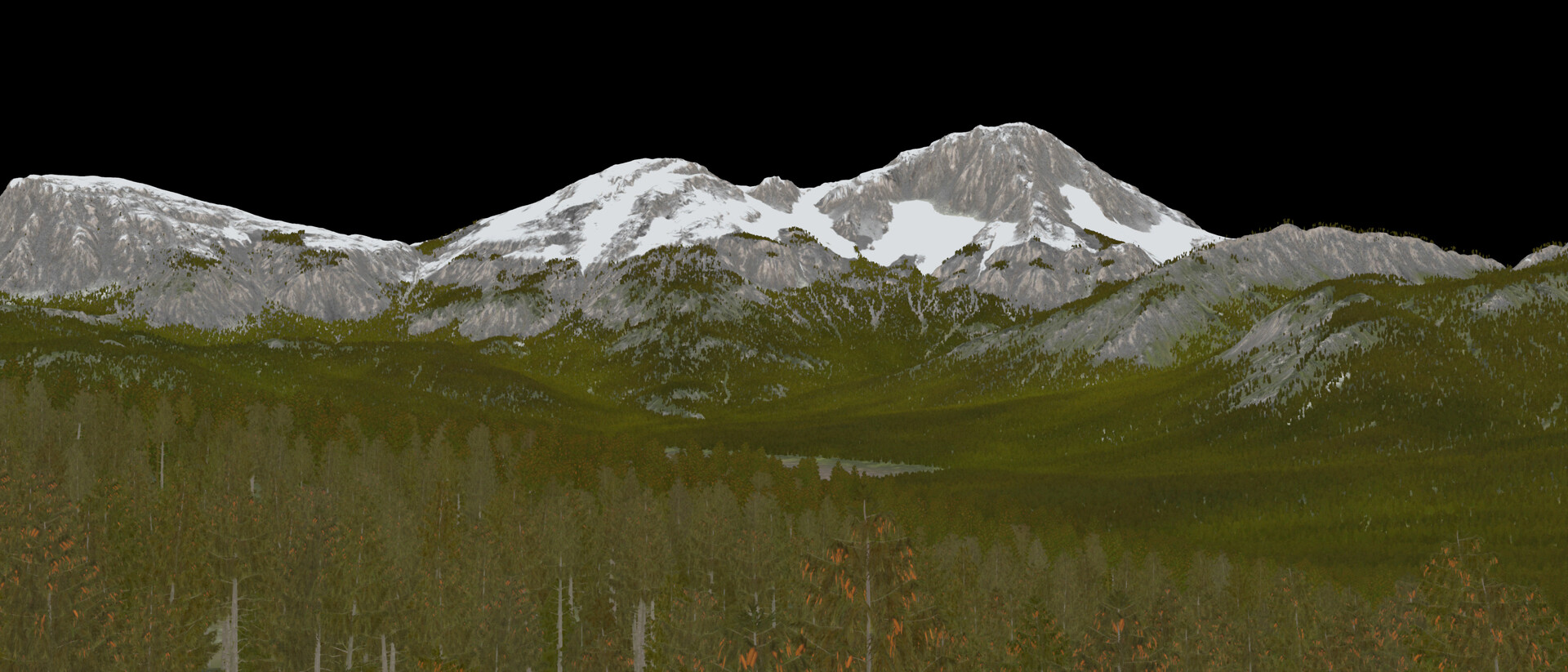
A color variation test for large scale forests/worlds.


Now I am working on something else - an environment with no vegetation at all. The blockout is kind of done .. well, at least for the major parts.
My goal with this landscape isn't to have the most fancy landscape of all, but I want to learn some more about ambient vfx.
Like snow drifiting, auroras (I am not sure about that, because it can be a bit over the top here), a flapping tent and sounds.
...and doing all of these (expect the sound) procedurally inside houdini ~


in the past I created several topics about projects of mine but I never finished these, so I want now to start as many others my own little art dump thread for posting all kind of work in progress pictures. No matter how much I work on projects, you'll get updates and I hope for a lot of critique and advice
So let me start with my latest, finished little project.
A color variation test for large scale forests/worlds.


My goal with this landscape isn't to have the most fancy landscape of all, but I want to learn some more about ambient vfx.
Like snow drifiting, auroras (I am not sure about that, because it can be a bit over the top here), a flapping tent and sounds.
...and doing all of these (expect the sound) procedurally inside houdini ~


Replies
Changed the camera position and added a small plateu for the tent ... oh and maxed out the blue slider
Or maybe I do model a proper tent. Let's see.
I removed the second tent and added some other stuff.
To the next steps ...
After modelling the real tent, I plan to add a person, too. He/She sits in front of a small campping fire and is cooking some stuff and above him/her, on the rocky tower, is sitting an animal companion. Maybe a dog? Maybe not, but this part of the image is predestined for an element that's tells more about this person.
Anyway - actually I am working on the ground shader to simulate the blowing wind.
Later I add some particle wind + I want to try to create a custom skybox. Never did this before
Recently I get a lot of Daz3D adverts on youtube and I always disliked this program. Not the program itself, but the userbase seems kind of 'special'... but it seems it is pretty good for blocking out poses.
After some fiddeling around with this application I see some use for this software, but gosh it is really unstable and ugly. Anyway.
I like the mood and the snow wavy-ness. But i think the ambient light is a bit too high. Its night time after all. Maybe lower the skylight contribution...
I think I'll darken it a bit later when I have the right HDRi. I downloaded Terragen for this ... yeeeah a new program to learn ... :P
Anyway - it didn't changed a lot, but here you go:
...and the first draft of the tent. Actually this one is really hard to model for me.
The fabric is way to loose at the moment, but I didn't get it right
Tomorrow I give it another try.
As you can see, this has nothing to do with zelda at the moment, but this is just a prototype.
The zelda project is meant to be as a learning session for Houdini - building the whole thing procedurally.
When you know Zelda Breath of the wild, you may remember the oasis, where you get the female look-alike dress. This is what I want to achieve ... realistically.
As you can see, there is still a lot to do, but it gets to look like something
Only thing I'd say is that moonlight is very hard to replicate since cameras aren't good at capturing how it looks to the naked eye so you can't find reference online. You have to go out and personally observe moonlight and just make notes and work off memory. I think your scene is doing a good job!
I am glad you like it
Thanks for your kind words!
@Akash283
Yep, I always try to illustrate the light intensity of our inner eye. Usually, when you walk up in a full moon landscape, it's pretty bright actually. Of course that is because our eyes are adapting to it, but overall when I think about nighttime it's not about darkness. More about some kind of strange brightness. That's my feeling. But that could be just me, because I do really like the night and the silence that brighten up my mind
That's the feeling I wanted to show the viewer and it seems it works for some ^^
Anyway ... during waiting on my access to Terragen, more about my desert/procedural project.
It does now have spline support - Hurai!
...but as you can see, I have a lot of problems with some technical stuff. Dark splotches in the foliage (caused by DFAO), a super shabby looking water shader and strangely bright grass + water overlapping issues.
A lot do do, but I am pretty motivated to get it done!
...and when everything works, I am going to the art department and do the nice looking things. These screenshots are just my R&D playground ^^
Thanks - I am glad you like it. It's indeed really moody and I almost destryoed it - look below
So guys,
I added the sky and I was wrong. In my imagination, I thought having an epic sky would be awesome but no. It looks bad and it's destroying totally the mood. But the concept does work. Got now Terragen and from now on I'll render all of my skydomes. It's really cool to get exactly what you want.
Anyway ... here my first attempt. The cloudy sky.
It's way to noisy and it kills the composition completly You'll get a good focus to the center, but it's not a sky you would like to rest under. It looks kind of stormy.
...so I decided, to change that and disabled the first two layers of cumulus and it's back. The right mood. Now I have to add the stars, maybe some loose clouds and it should be good to go. What do you think?
EDIT: This version got to bright.
But I am reading too much into that)
Anyway, really great project!
I also thought about adding northern lights, but it was time to end this one
Here is the end result. It doesn't changed to much, but I want to post the end result here:
Initially I also wanted to make a short fly through, but Unreal decided to crash every time when I wanted to render. So no animation ^^
...but talking about storm and thunderclouds.
I always wanted to make something like the iconic clouds of ghibli movies.
So I started a new scene and the following is a heavily work in progress shot and for now it doesn't look anything like in my imagination, but I also want to share my mistakes.
In the last few weeks I was about re-watching all of the Ghibli movies and I wanted to created something that is based in the world of Chihiro.
Combining this with my plan to make an awesome cloud ... and after some research ... here and there ... I want to create a scene fully driven by reflections with a uncommon perspective.
So I decided to go for the water surface scene, placed a train station and added a planar reflection capture ... and you see almost nothing.
Okay, that's a bummer. of course this is just the blockout of the major elements, but the main attraction, the cloud, is barley visible
My vision is to see these super nice (stormy) clouds in the reflection, with slightly turbulent water and rich colors like here in a sunset scene.
As said, I have a long way to go ^^
Changed the ratio aspect ratio to the obvious, upright and added some more love to the scenery.
Due to the circumstance to whatever I did, I moved the cloud inspiration to the next image, because I couldn't get the right reflections.
So this is what I came up today.
...and what to do beside the work on details...
Because of the top down view, I am a bit limited to get depth in the scene. Any help and tips are really recommended!
I canceled the tree on the right, because it became way to noisy, but I do like really the colors
I also want to place some fog in it, because for two reasons.
The values (light & shadows) are getting toned down so hopefully it'll be less noisy and on the second hand, I want to achieve a morning feeling.
What do you think?
PS: Oh, and I did the most beautiful looking fishes ever
So started a new one.
Still in the blockout phase, but you get the overall idea.
Maybe you recognize my inspiration here
set dressing the foreground with megascans and self modelled assets.
planing to also add some chains, coffins and stuff like that.
watched a let's play of bloodborne lately and I really like this mood
Next time, I think I'll tackle the ruins. For now, these are the Megascan ruins, scaled by 3. Not what I want ^^
But I also got a problem with the candles now. With wax they are way to bright and distracting.
I'll see what I can do with these. Anyway - what do you guys think? Any help is appreciated!
Ohhh ... and one thing is really killing me. You see this little branch on the left tree. Argh.
Next time I also want to add some displacement to the trees so they get more depth.
Also the scene is very empty outside of the main area. Maybe add a tower or some ruins in the background.
Call it done by now!
Hope you guys like it.
You can find the progress gif on my artstation.
I would be glad, when you visit my page
https://www.artstation.com/artwork/Poe6z8
Vertical cliffs. For this task I took references of the Dolomites and came up with this.
Super rough by now, but it's still the blockout phase.
I started several projects in the past without publishing these, because they all ended the same. Unfinished - like the one you can see abovve. After a certain amount of time, these pictures/ projects were dead to my and I couldn't find any motivation to finish them in my free time. So I decided to go on with smaller projects like this here. I hope you like it and I am happy about every critic
Here you have, as always, a little work in progress gif.
...and when you are interested in a small dolly shot with the animated fire, you have to visit my artstation page
https://www.artstation.com/artwork/kDOk6y
Thanks - have a great day!