Hello, I'm a third year student studying game development, specializing in Environment art. I have recently started a new personal project for my portfolio with specific goals behind it.
Realistic PBR rendered scene
Environmental storytelling in aid of coherent narrative
Focus on atmosphere, ambience and interior lighting
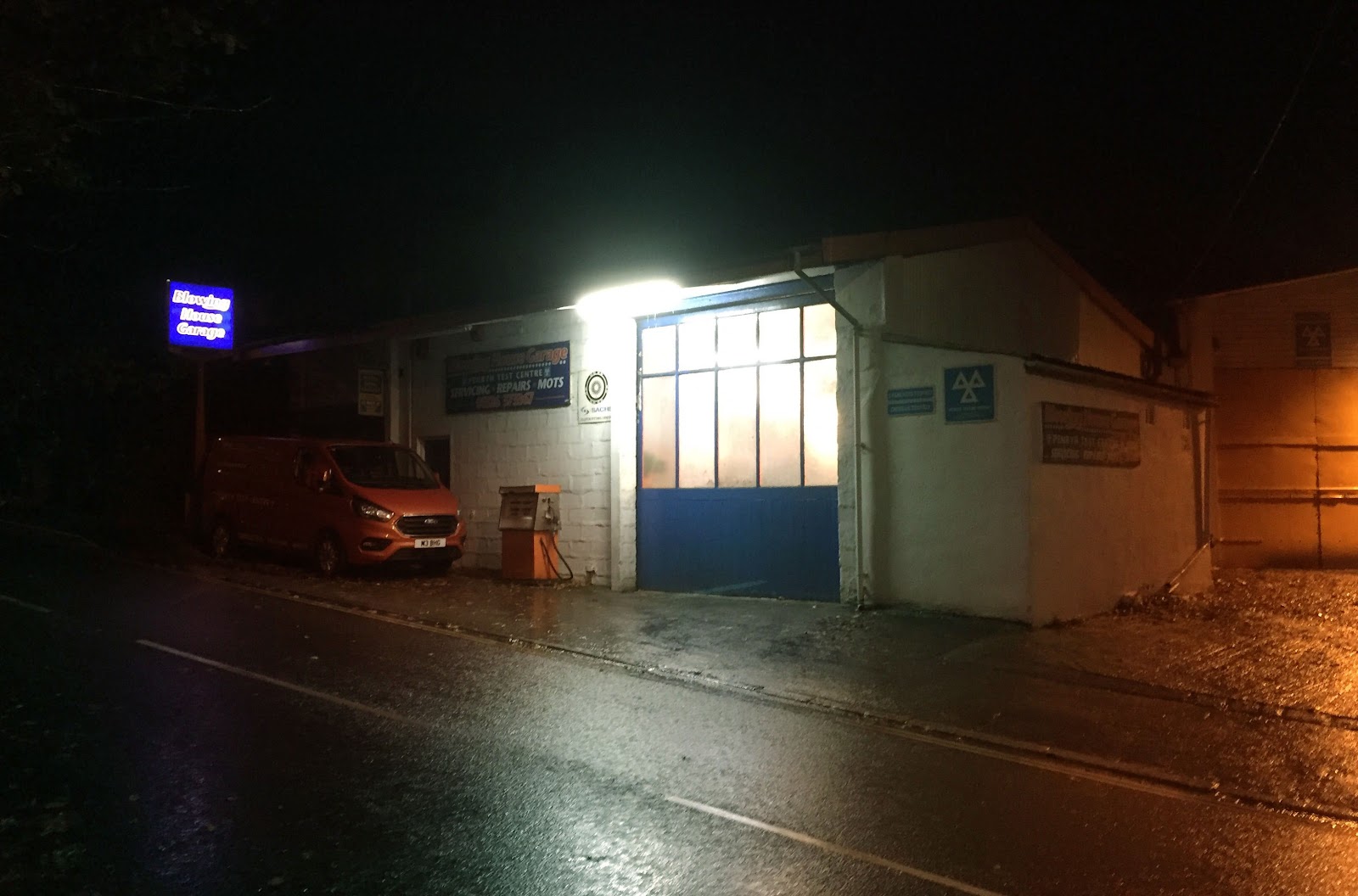
I live in Falmouth, and many stormy nights I walk past a small town garage in the pouring rain. I really liked the atmosphere and aesthetic of this garage at night, and ended up deciding to base my next project over it. The idea of taking the mundane and making it intriguing was really interesting to me. I looked around on artstation, and found Clinton Crumpler’s ‘King Wash Laundromat’ was a good example of taking something everyday and using atmosphere and subtle storytelling to coat it in intrigue.

I then played with the colour balance of a photo of the garage to get the colour contrast and vibe I wanted, and sampled a colour palette for it.


This is an initial BSP blockout of the environment, focused on the exterior. This was mainly to look at composition, and a very rudimentary lighting pass. I went back to the garage and took some more reference photos, this time focusing on scale, size and measurements instead of overall mood. I brought my girlfriend along and used her as a measuring stick to get accurate measurements relative to her height.

I then went to gather reference for the inside of the garage, as I wanted to use environmental storytelling in there to suggest that this garage is actually a front for criminal activity. Things like suspiciously nice cars covered up, a shady room in the back where questionable things happen etc.


I really liked the composition of the interior space, and started blocking it out more in detail with props and a basic colour pass. It was around this time that I got crit from Jonjo Hemmens who said I basically had to choose between the exterior and the interior, as I am aiming to submit this project for the Rookies. He's had experience with overscoped projects before, so I took his advice very seriously. After some thought, I decided to focus on the interior. I think the interior space is more interesting, and gives more opportunities for me to focus on the aims of this project: storytelling, atmosphere, and high detail PBR assets.


So this is where the project is now! I will post a follow up detailing the process and reasoning for the plastic "spray booth" room at the back soon. Any crit is appreciated. Specifically at this stage: composition, lighting, and moving forward with modelling and telling the story of a garage which is a criminal front.
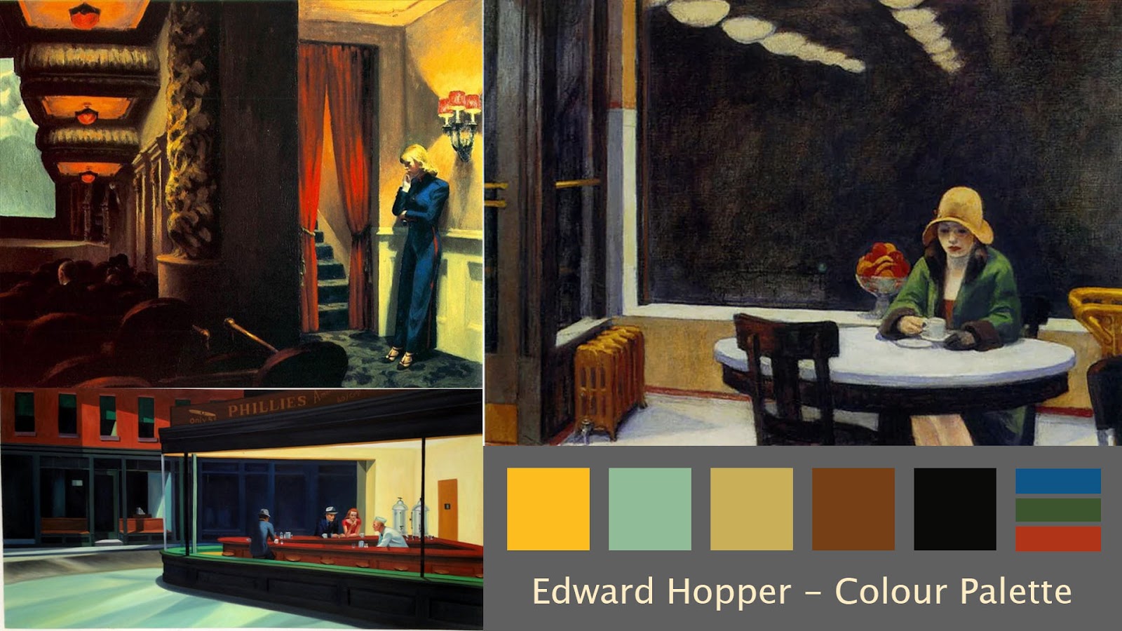
The most important thing with mood and tone in a night-time scene is the colour palette, and lighting. Colour vibrance, saturation and contrast range are so thought about in films, art, and games, so before I even started my project I wanted to plan this out to get the mood of the piece nailed.
I looked at Edward Hopper's colour palette, as he is a master of story-telling, and evocative, lonely environments.

I then played with the colour balance of a photo of the garage to get the colour contrast and vibe I wanted, and sampled a colour palette for it.


This is an initial BSP blockout of the environment, focused on the exterior. This was mainly to look at composition, and a very rudimentary lighting pass. I went back to the garage and took some more reference photos, this time focusing on scale, size and measurements instead of overall mood. I brought my girlfriend along and used her as a measuring stick to get accurate measurements relative to her height.

I then went to gather reference for the inside of the garage, as I wanted to use environmental storytelling in there to suggest that this garage is actually a front for criminal activity. Things like suspiciously nice cars covered up, a shady room in the back where questionable things happen etc.


I really liked the composition of the interior space, and started blocking it out more in detail with props and a basic colour pass. It was around this time that I got crit from Jonjo Hemmens who said I basically had to choose between the exterior and the interior, as I am aiming to submit this project for the Rookies. He's had experience with overscoped projects before, so I took his advice very seriously. After some thought, I decided to focus on the interior. I think the interior space is more interesting, and gives more opportunities for me to focus on the aims of this project: storytelling, atmosphere, and high detail PBR assets.


So this is where the project is now! I will post a follow up detailing the process and reasoning for the plastic "spray booth" room at the back soon. Any crit is appreciated. Specifically at this stage: composition, lighting, and moving forward with modelling and telling the story of a garage which is a criminal front.
Replies
Given that this garage is just a front, I wanted to take this idea and adapt it a bit. The spray booth room in my garage is actually where the more shady things happen. Initial ideas are things like torture and body disposal, maybe with barrels of acid present and suspicious tools (bonesaw etc).
So, firstly I made the frame mesh, imported it into Marvelous Designer, and simulated some cloth on it for the plastic.
I wanted this to feel like it's been thrown up, so the plastic is very roughly put on. I also really liked the visuals of those plastic curtains made from lots of thin parts hanging down, like the ones you see in kitchens and butchers. I thought it would give the feel that something about this garage is off, and would be a cool dynamic if I got wind to blow them about in scene. I made a simple curtain mesh with a fair amount of sub-Ds so it would simulate well, and imported it into Unreal as a skeletal mesh. I then used Unreal's clothing data tool to paint the areas I wanted to simulate. Unreal also has a "Wind Direction" Actor, which I used to test the simulation. However, the wind was constant, so it didn't feel believable as small gusts of wind that would blow round the garage from open doors. To fix this, I used Unreal's Blueprint programming system to make the wind more natural with a timeline graph.
With this done the wind feels much more natural. I also added some simulation on the larger cloth piece I made in Marvelous, so it felt consistent. Finally, I set up a master material for all materials in my scene. I currently have 2, one for opaque textures, and one for transparent ones. I then used this transparent material for the plastic drapes on the spray booth, and after some playing around I found using masked transparency with dithered temporal AA to be the best looking method.
What do you guys think? Do you have any feedback on the master material or spray booth? It's all appreciated:)
I went into marvelous designer with the car and simulated some cloth over it. However, there were some issues with my first pass. The cloth's properties were too much like cloth instead of plastic tarpaulin, and the way I retopologised the mesh gave some artifacts where it rests on the windscreen
So I went back to marvellous and changed the cloth attributes to be firmer, like tarpaulin. To then sell this, I took the cloth mesh into ZBrush and manually sculpted the folds, as well as folds that you get from when the tarpaulin is folded up before being put on the car.