Home 3D Art Showcase & Critiques

The Bi-Monthly ENVIRONMENT ART Challenge | March - April (65)

1
interpolator
Offline / Send Message
alytlebird interpolator


Welcome, all! Time to kick off the second Monthly Environment & Prop Challenge for 2020! Special thanks to @zachagreg and @icegodofhungary for suggesting many of the concepts that wound up being included this challenge cycle! :+1:

This challenge cycle marks the introduction of the Wildcard category. This will be a standalone concept unrelated to the other four concepts, and it could be anything! Any style, any subject, etc. Enjoy!

Remember if you don't finish in the time allotted, just keep plugging away and post when your work is finished. There's always some good progress that falls off the radar - we want to see your work! So keep going and finish those pieces!

Without further ado, here are our official options for Challenge 65:


- ENVIRONMENTS -

HARD SURFACE:
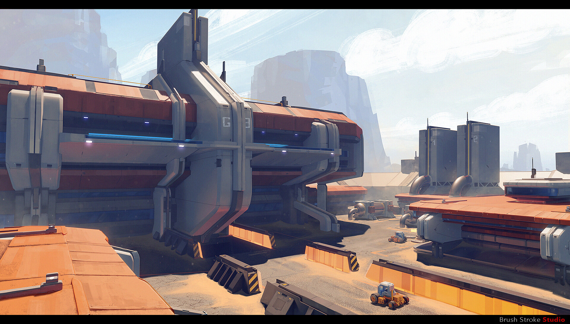

Artist: https://www.artstation.com/marchidan


STYLIZED:
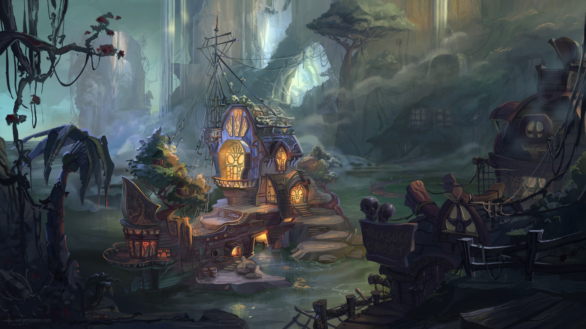

Artist: https://www.artstation.com/evf


- PROPS -

STYLIZED:
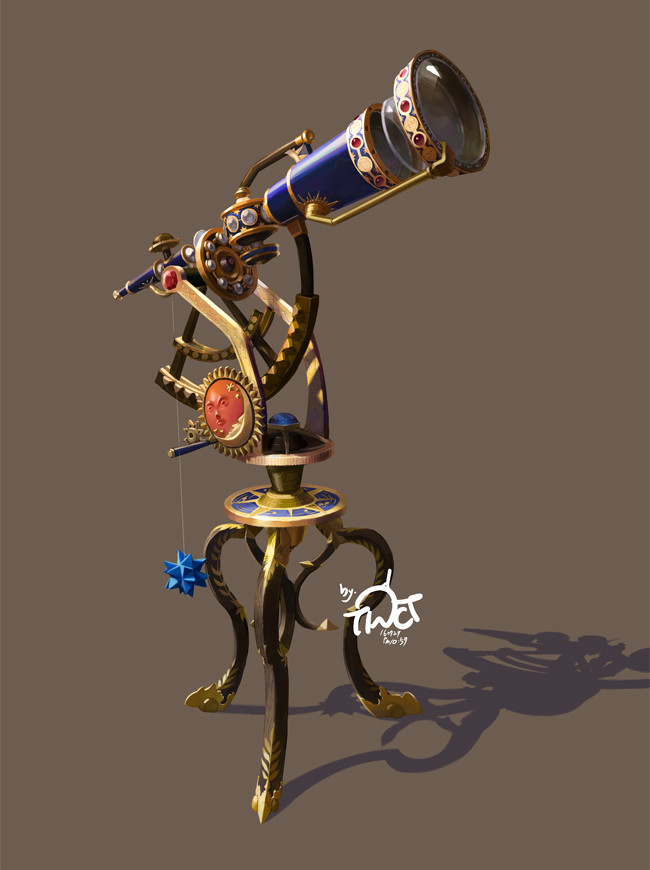

Artist: https://www.artstation.com/tinct


HARD SURFACE:
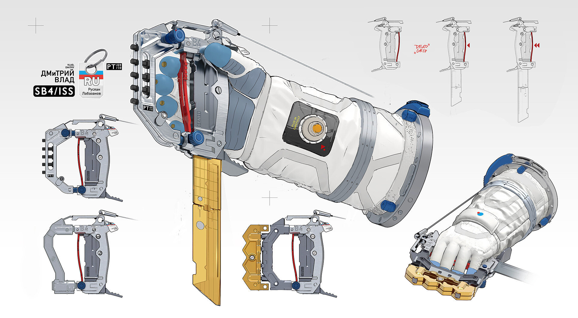

Artist: 

https://www.artstation.com/sowig

- WILDCARD -

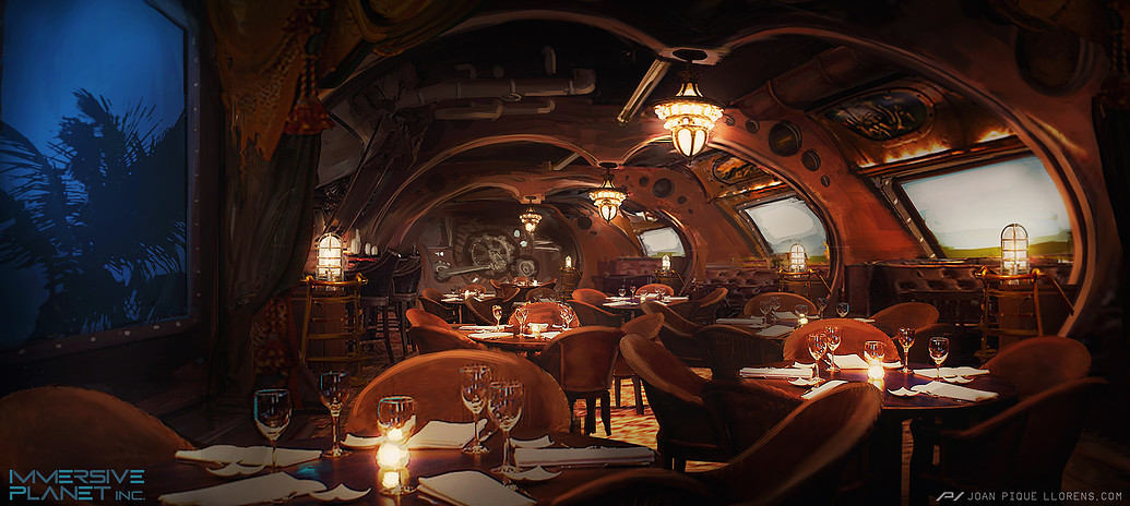
HARD SURFACE INTERIOR:


Artist: https://www.artstation.com/joanpiquellorens

Since we had two exterior environment concepts this cycle, I decided to throw in the interior concept that @zachagreg suggested. :)

If you want to change up your chosen concept a bit, then feel free! Interpret these concepts to your liking, especially if your aim is to add storytelling elements.


Please read all the rules before starting.

When you are just starting out making a scene, it can seem complicated or imposing, so take the time to break it down. 

Think about how you can re-use assets, re-use textures, break it down as simple as possible and plan it out. A lot of people will break it down in their own way when they start out their challenge. Gather some reference images as well for different parts of the scene, maybe gather some refs and make it your own.

Take your time planning and blocking out, it will set you up for success later on.

Here are some specifics.

  • Try to post one critique for every post that you make. This will make for a better learning environment and help us all grow as artists.

  • It is recommended to use a game engine to present your work. Unreal Engine and CryEngine are very common engines that can be used but feel free to use any alternatives that you want. (Marmoset Toolbag is allowed as well)

  • Try your best and finish as much as you can in the time frame provided.

  • Post what you are working on in this thread so that way it's a more centralized place for advice and critique. We don't need to have 1000 disjointed threads littering the forums. 

  • I would strongly encourage you to go and look at other games and see how they make their assets as well as get concept art to give it your own feel, but it must stay very close to the concept, if not super close. 

  • Well, that's about it. If you think that any rules should be changed, or there should be new additions to the rules, please let me know. As always, please feel free to provide feedback / suggestions in this thread or by messaging me directly.

All that matters is that you learn while being able to effectively critique others, as well as accept critiques on your own work. Remember to have fun!

Game on!

Replies

  • zachagreg
    Offline / Send Message
    zachagreg ngon master
    Sweet glad to see some of these in there. Going to be an interesting challenge. :)
  • teodar23
    Offline / Send Message
    teodar23 sublime tool
    can't wait to start on the hardsurface enviro... also i hope i get some good competition :P
  • Klawd
    Offline / Send Message
    Klawd polycounter lvl 8
    Really liking both hard surface scenes! Nice choice of concepts.
  • AndySC
    Offline / Send Message
    AndySC polycounter lvl 5
    I'll be giving the Telescope a shot. Started working on this at the weekend to get a head start on the modeling. I've applied some basic coloured materials to help fill in before I get onto the UVs/texturing.
    I currently have a rough shape blocked in for the legs, but I'll need to go back to them to get the right shape. They're currently a beveled curve, converted to mesh with a little cleanup and arrayed in a circle.


  • teodar23
    Offline / Send Message
    teodar23 sublime tool
    started the blockout for the main building.
    not sure about the proportions tho...
  • icegodofhungary
    Offline / Send Message
    icegodofhungary interpolator
    I know the vehicle isn't the focus but I feel like I have enough time to do both since the buildings will be mostly tiling materials and a decal sheet. I'm going to use the deferred decal technique for this project. Not too much to show yet.


  • jntucson
    I'm gonna attempt the hard surface environment. Hopefully can finish within the timeframe. 
  • jntucson
    teodar23 said:
    started the blockout for the main building.
    not sure about the proportions tho...
    I'm digging the pieces but yeah the proportions seem off idk cause looking at this one the person scale is an ant! 
  • teodar23
    Offline / Send Message
    teodar23 sublime tool
    jntucson said:
    I'm digging the pieces but yeah the proportions seem off idk cause looking at this one the person scale is an ant! 
    I've made some changes right after posting that. The distance between the white protruding pillars was off. I tried different scales in unreal and walked around to see how it feels. This is the scale that i think works best but that might change later when i add more pieces.
  • teodar23
    Offline / Send Message
    teodar23 sublime tool
    I know the vehicle isn't the focus but I feel like I have enough time to do both since the buildings will be mostly tiling materials and a decal sheet. I'm going to use the deferred decal technique for this project. Not too much to show yet.


    Good start. I was thinking of starting with the vehicle since it will give me a better way of judjing the scale of everythig but im afraid to spend too much time on it and then not finishing the more important bits in time...
  • Dinka
    Offline / Send Message
    Dinka keyframe
    So excited for this one! Was looking for something to make and this seems perfect :) I think I'm going for the pirate cove... Pray for me
  • teodar23
    Offline / Send Message
    teodar23 sublime tool
    still struggling with proportions but i think i'm almost there


  • soggyj
    Offline / Send Message
    soggyj polycounter lvl 4
    Thought I'd try to make time for this one, just getting back into it, we'll see where this goes lol.
    If I can get my screens attached I'll share...  keeps failing

    ah here we go
    thanks @teodar23
    Should have realized they were too big.

  • jntucson
    My BSP level so far. I'm feeling good about proportions but open for suggestions. 

  • jntucson
    For some reason my images won’t post :(
  • alytlebird
    Offline / Send Message
    alytlebird interpolator
    jntucson said:
    For some reason my images won’t post :(
    If you're having a hard time posting images, maybe try uploading them to a third-party site like imgur and then posting a link in this thread. Or linking the image using the image tool here. :)
  • teodar23
    Offline / Send Message
    teodar23 sublime tool
    jntucson said:
    For some reason my images won’t post :(
    Make sure you are using jpegs and at a reasonable size (max 2k)
  • PaulJChris
    Offline / Send Message
    PaulJChris polycounter lvl 4
    My blockout attempt on the main building using perspective match in 3DSMax  to get the correct proportions after my 1st MK1 eyeball attempt was a disaster.  More challenging than I initially  thought.  This has a lot of subtle shape changes.

  • Logoded
    Offline / Send Message
    Logoded polycounter lvl 4
    Hey guys, i have a question since im new to polycount. can anyone join this challenge or are there some pre-requisites? Also, is the deadline end of april or beginning? Thank you all in advance.
  • teodar23
    Offline / Send Message
    teodar23 sublime tool
    anyone can join, just make it known here, end is end of april but its not really fixed, just try to finish and make it as close as possible.
  • teodar23
    Offline / Send Message
    teodar23 sublime tool
    almost done with the blockout, still not content with dimensions...

  • teodar23
    Offline / Send Message
    teodar23 sublime tool
    My blockout attempt on the main building using perspective match in 3DSMax  to get the correct proportions after my 1st MK1 eyeball attempt was a disaster.  More challenging than I initially  thought.  This has a lot of subtle shape changes.


    looks good so far.
    i thought about doing the same but since it is concept art i figured it wouldn't produce good results. after blocking out most of the scene i realized that the concept has a really odd perspective and most likely it is composed of multiple shots...
  • RomainD
    Hi everyone! 
    I'm new on polycount and I think the challenge is very interesting. So I chose to work on the Hard surface interior and I finished the blockout.
  • RomainD
  • Dinka
    Offline / Send Message
    Dinka keyframe
    What I've managed to get done, blockout and some smaller shapes :) Really struggling with proportions as well, and connecting pieces that in the concept dont make sense. Really enjoying the challenge though! :)
  • jntucson
    Ok here's my blockout so far

  • Dinka
    Offline / Send Message
    Dinka keyframe
    How much am I allowed to change the original concept? If i would keep the composition, but change the style of the buildings, colors, etc, and do it in my own style but with a different sort of theme and feel to it. I'm feeling creative but im afraid of taking it too far
  • alytlebird
    Offline / Send Message
    alytlebird interpolator
    Dinka said:
    How much am I allowed to change the original concept? If i would keep the composition, but change the style of the buildings, colors, etc, and do it in my own style but with a different sort of theme and feel to it. I'm feeling creative but im afraid of taking it too far
    Ultimately, as much as you'd like. :) This is your project and an opportunity to take something in a creative direction! My first time doing this challenge, I changed the layout of my chosen concept and added some additional elements that would bring out more of a solid story. If you want to make your piece in a different art style, different proportions, etc., by all means go for it. We don't really have any hard and fast "rules", as these projects are really more for improving your skills rather than competing with one another.
  • jntucson
    teodar23 said:
    almost done with the blockout, still not content with dimensions...

    Here's my notes, otherwise the proportions look great! 

  • itstimetoh0sh
    I guess im going to try my luck at the Hard Surface Prop. Pretty excited for this challenge.
  • Dinka
    Offline / Send Message
    Dinka keyframe
    Dinka said:
    How much am I allowed to change the original concept? If i would keep the composition, but change the style of the buildings, colors, etc, and do it in my own style but with a different sort of theme and feel to it. I'm feeling creative but im afraid of taking it too far
    Ultimately, as much as you'd like. :) This is your project and an opportunity to take something in a creative direction! My first time doing this challenge, I changed the layout of my chosen concept and added some additional elements that would bring out more of a solid story. If you want to make your piece in a different art style, different proportions, etc., by all means go for it. We don't really have any hard and fast "rules", as these projects are really more for improving your skills rather than competing with one another.
    Thank you for the response! This idea of an icy, rough environment with viking styled details popped into my head, but then again... it would actually just change the entire concept...

    Might just make a separate, different piece of the idea after this one, since it probably would change absolutely everything about the concept artists idea.
  • teodar23
    Offline / Send Message
    teodar23 sublime tool
    @jntucson - i'll do that in the modelling phase, thanks!

    @dinka - i thought you were going to do the sci-fi base and when i read icy and viking at first i was like nooo, but then i was like hmm... thanks for the tip :)
  • Dinka
    Offline / Send Message
    Dinka keyframe
  • PaulJChris
    Offline / Send Message
    PaulJChris polycounter lvl 4
    Further progress.  This building is huge. I think I now have about the correct scale,the grid size on the max screenshot is 10m  making the main building around 150m wide.  My idea was to model the main building , then look to break it into  modular parts and then build the other buildings from these pieces.  

  • teodar23
    Offline / Send Message
    teodar23 sublime tool
    My idea was to model the main building , then look to break it into  modular parts and then build the other buildings from these pieces. 

    that's what the concept artist did, you can see a lot of rescaled meshes repeated all over. and it makes sense to save time by reusing meshes, but i don't want to go that route personally because the repetition is noticeable and also its more of a portfolio piece so i would reuse some meshes but most of the big shapes and buildings will be unique.
  • Will_Maccabe
    Offline / Send Message
    Will_Maccabe polycounter lvl 3
    Keep going guys, looking good so far... I like the huge scale of the building.

    I chose the steampunk restaurant. Am using Blender and for this challenge will be using the Eevee real-time renderer as I can't currently get Unreal (i don't have 32 GB space on my laptop). It says I can use alternatives to the engines mentioned in the rules, so hope this is okay?

    I started to do the block out, set up some lighting and model some props.  


  • alytlebird
    Offline / Send Message
    alytlebird interpolator
    I chose the steampunk restaurant. Am using Blender and for this challenge will be using the Eevee real-time renderer as I can't currently get Unreal (i don't have 32 GB space on my laptop). It says I can use alternatives to the engines mentioned in the rules, so hope this is okay?
    Absolutely! The engine you choose to use is completely up to you. :) Unreal tends to be the standard as it usually provides the best visual results for the least amount of effort, but we've seen alternatives like Unity, Marmoset, and Eevee. Personally I love seeing variety in presentation methods.

    You're looking good so far, best of luck!
  • Will_Maccabe
    Offline / Send Message
    Will_Maccabe polycounter lvl 3
    Thanks a lot alytlebird, the info is much appreciated.  B)

    I really like the concept art for this scene. In today's session I wondered what the bar area would look like on the left, as it is hinted with bar stools but out of view in the concept. So i did a blockout of what I could see in the concept, then a 1 hour paint-over with my idea for the bar (maybe it doesn't need the sign) and then I was able to more easily blockout the bar in 3D. The drapes will need a sculpting. Just a few more things to blockout in the environment, and then I will address each asset and start to build a high poly model where needed for the baking, and begin the big task of uv mapping and texturing the assets.     


    Another shot of the bar...


    Viewport... 309K Triangles so far. Everything is lo-poly at the moment.
     
    I have a question?  What is a decent triangle count on a scene in an environment these days?  I know it depends on art style.
    I read characters go from 20k to 150k triangles so I am guessing up to a million triangles would be fine for a scene like this?   


  • alytlebird
    Offline / Send Message
    alytlebird interpolator
     I have a question?  What is a decent triangle count on a scene in an environment these days?  I know it depends on art style.
    I read characters go from 20k to 150k triangles so I am guessing up to a million triangles would be fine for a scene like this?   
    The best triangle count for any scene is exactly the amount of triangles it needs. :tongue: I'm partially sarcastic and partially serious.

    As artists working from concept art, our first goal should be to recreate what we see and make it look good in 3D space, and our secondary goal is to make it run well in-engine. It's a better approach to use all the polygons you need to make the forms, then scale back if the performance requires it. A lot of people run into the mistake of over-optimizing early in the process and compromising their forms, i.e. faceted surfaces that should be smooth curves.

    Especially nowadays where we're approaching next-gen, we can afford to be a bit more liberal with our polys. Of course, don't go overboard; no need for one of those chairs to have multiple-millions of polys. Basically, if it runs in your engine at a reasonable framerate, you're probably good. :)
  • Decordova360
  • AdrianR
    Offline / Send Message
    AdrianR polycounter lvl 5
    Hi guys, this is my blockout at the moment. I don't know how much time I will have for the challenge these months so I decided focus on the main part of the concept. I still to fix some volumes but I am content with the result
  • teodar23
    Offline / Send Message
    teodar23 sublime tool
    not much progress just created a sort of map:
    next is doing the actual models but i'm struggling to plan out a modular approach
    cheers!

  • Will_Maccabe
    Offline / Send Message
    Will_Maccabe polycounter lvl 3
    @alytlebird and @Decordova360, Thanks for the information guys! Appreciated.
    @teodar23, that's looking really good. The scale is immense. Keep on.
    @AdrianR, good start with the blockout. It will be interesting to see how you tackle the background forest.
      
    I uv mapped a lot of the assets and put in some placeholder textures. I also modelled out a steampunk door. I am not finished with the furniture modelling yet. And the drapes/curtains need work. The bottles should be fun and might take a while to get the variation i'd like.


  • PaulJChris
    Offline / Send Message
    PaulJChris polycounter lvl 4
    Just starting to model the detailed meshes and put down some basic textures.  Basically just chopping manageable bits off my blockout  mesh  in Max and adding more details  and trying to  break it down as I go.   Experimenting with the Substance Painter to UE4 bridge workflow for the  first time and I must say I am impressed ,it saves a lot of time particularly when the  front of the main subject is in heavy shadow as with this piece as you do not need to 2nd guess, just texture away in Painter  then see the results immediately in the engine.  Anyway a long way to go yet....
    @teodar23,  good progress indeed
    Will_Maccabe .  very nice colour composition, you have captured  the  mood very well.  


  • MagicAnton
    Offline / Send Message
    MagicAnton polycounter lvl 3
    Start the project with the low poly 
  • teodar23
    Offline / Send Message
    teodar23 sublime tool
    @PaulJChris that vertical middle piece on the main building is a bit wider in the concept. other than that, looks good.
    @MagicAnton good start, love the details on that.

    as for me i started modeling on the more easy parts:

    looking to add some hoses in those once i figure out spline meshes...
  • Dinka
    Offline / Send Message
    Dinka keyframe
    @MagicAnton your project is looking super nice!

    Here's what ive done so far:
    Still trying to decide how to do the background in the best looking, most efficient way.


    Also took a look at the space blade as a side project, since ive been feeling held back by my lack of skills in hard surface modeling as well.

  • Will_Maccabe
    Offline / Send Message
    Will_Maccabe polycounter lvl 3
    @Dinka, that looks dope! I love the textures so far and the trees are amazing.

    I did some props for my scene today...


    And the restaurant as I have it now...

  • Dinka
    Offline / Send Message
    Dinka keyframe
    Testing some lights and working on details, avoiding tackling the background :) Light, transparency and scattering is working weirdly in Eevee, need to figure that out as well


    Progress on space blade as well


  • Will_Maccabe
    Offline / Send Message
    Will_Maccabe polycounter lvl 3
    @Dinka If you goto "show overlays" in top right of viewport (is icon with 2 circles) you can tick to remove grid and axis and 3d cursor.


     I pushed onwards as I only have a few more days to commit to this challenge. I have other projects to do as well.

    There is a another concept sheet on Joan Piquelloren's artstation https://www.artstation.com/artwork/wPx59 so i decided to use some shapes from that to make metallic carvings and give the restaurant a more steampunk feel, in how I personally imagine the steampunk genre to be.  I envision lots of cogs and metallic patterns to be part of the genre.

    Here is the table and chair props in low poly as wires and texture flat....


    Here is the bar in low poly as wires and texture flats.  I am still working on the bar area.


    Here is a go at a beauty shot of the scene, where I have set up the lighting to more how I want it.


    I am seriously thinking of making a steampunk bar man next. So him and the bar and some "tweaking" to complete.

1
Sign In or Register to comment.