The BRAWL² Tournament Challenge has been announced!
It starts May 12, and ends Oct 17. Let's see what you got!
https://polycount.com/discussion/237047/the-brawl²-tournament
It starts May 12, and ends Oct 17. Let's see what you got!
https://polycount.com/discussion/237047/the-brawl²-tournament
Looking for feedback to remake old project
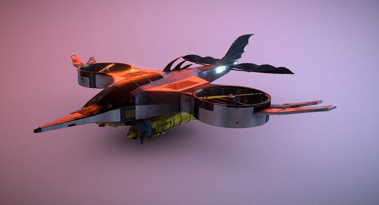
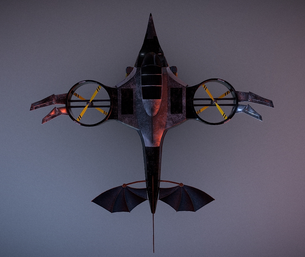
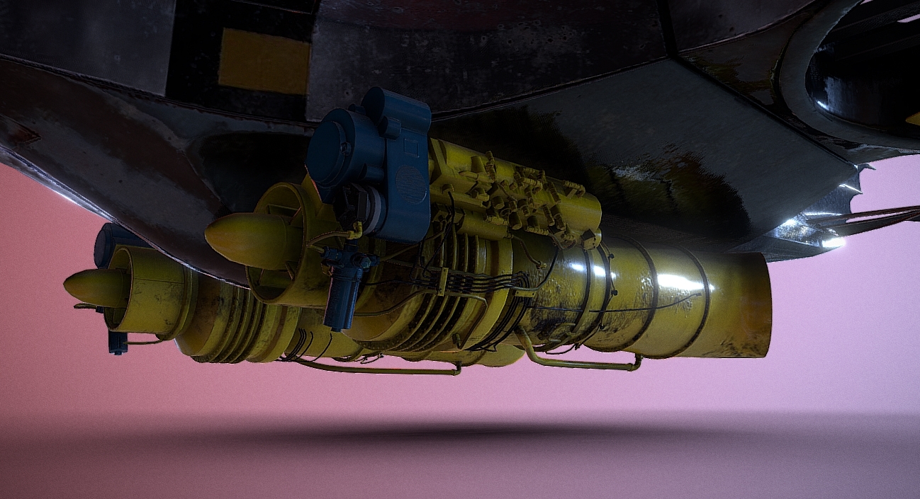
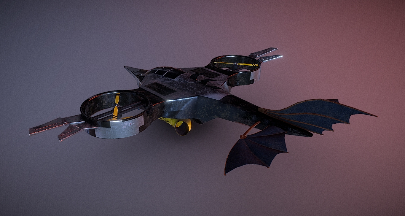
Hello everyone! So, I did this project a few years ago and I was quite happy with it back then. It obviously has a lot of issues, not only technical (bad normal maps, bad bakes, bad UV's and so on...), but also artistic issues (color, shape...). I wanted to redo it with the knowledge I have today, as I think it is an interesting idea that died in the end because of the bad execution.
I'd love to have some feedback regarding anything from colors to shape, details, materials, interesting references that you think would fit the theme... And ways it could be improved.
I'm redoing this from scratch so any feedback is welcome, even if it is a very big change over the original.
Here are some screenshots (from sketchfab), and the sketchfab viewer in case you want to have a better look: https://skfb.ly/6QtqJ
