[WIP] [UE4] Emerald Hills
Hey all, my name is Cam and I'm trying to make an environment piece every 2 weeks that would be considered game ready. I've been trying to meet deadlines along the way to simulate an actual studio environment, so I when I get a job within the games industry I'm not blindsided by the pace. I'm seeking critique as I go so I can improve my art.
Today I started this weeks sprint to be completed by 2/19. I plan on updating this thread daily with my progress. So what am I doing in these two weeks?
I'm taking Emerald Hill Zone from Sonic 2 and turning it into a stylized 3d environment that sticks to the sonic conventions and looks as if it's a proper part of a level. So checkboard cliffs and grass, sparking sea and vistas overlooking some surreal geometry.

I spent the morning looking at what I would need to create based off of how Sonic Generations did Green Hill Zone. So I went around artstation and in game finding pieces that either matched the style I was after, or would help me further inform my scene and composition. I have compiled a list of them here for your viewing pleasure.
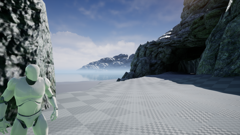
I then went about blocking out the scene in unreal using some stock unreal assets just to feel out the flow. I know I wanted to show off the sea, a little bit of hills, and then room enough for some in the back geometry. What use is speed without some sights?

One of my biggest issues with my last project is I didn't use a model for scale and it really showed. I also didn't play with/understand enough about how Unreal Engine's lighting worked. So I've spent some time trying to make a nice bright vibrant scene that has enough variation in its shades and forms. I'm planning on using world aligned materials and some fun tricks with normals to unify all the rocks I'll be making tomorrow to create a unified looking wall.

I followed Alysson Soares' amazing stylized cliff video to inform the initial shapes of this, and then started to apply a more angular and crass look to it. This is still a work in progress and needs to be tidied up, it looks more like failed realism than intentional stylization. I'll also be assembling the ground grass texture so I can start to import the rocks.

The initial test rock came out a bit overcooked if I'm being honest with myself. Those normal details + my rock texture are going to be too much visual noise on the normals. I have to go back tomorrow and start the rock over again but that's okay, I have a really fast workflow for rocks, especially now that I know more of what not to do.
Hit me with some good critique so I can iterate and improve, and thank you for reading my thread.

Replies
I think the best part of your rock design journey so far has been the substance designer cube. The texture is fun, readable, and fits very well with the cubism aesthetic of the retro Sonic level. I think what you could do is literally model some cubes to fit that texture, with the all of the fissures and formations built into the model to give it a more detailed silhouette. It would be like using that texture almost like a trim sheet. Then build the cliff-side in Unreal out of 'cube rocks'.
Or you could look to the sonic movie for inspiration. Love or hate the character designs, you've got to admit the environments are pretty good. And clever in their mash up 8bit 2D design with realistic 3D landscape renders (To me it looks closest to the design and style of the 'For Honor' cliffs but with more flattened on the camera side and cubes pushed into the face).
They must have spent a good amount of time creating and discussing different concept art during the look-development phase of that environment. And I think that might be what you're missing with your environment. In your haste to complete the project in two weeks, you may have rushed past the concept and planning phase too quickly. Instead, opting to just gather inspirational images, that. . . don't really fit together. It might be worth doing like the Sonic Movie's Character design team, and take a step back, delay the deadline, and spend the time you need deciding how you want the finished product to look.
And I hope when you're done, it looks awesome. Whatever direction you decide to go.
I did play around with using default unreal cubes like you suggested with the texture right now and it does look much better than a lot of the lumpier, more granite like shapes I had used. I'll probably use it in tandem with some squarer, more cuboidal rocks.
I'll scout some more reference from Spyro and Crash, it was some rocks from the CTR remaster that actually inspired this project so it makes sense to get more reference off them. I had forgotten that the Spyro remaster happened when I was looking at reference. Which is a bit of a goof on my end.
Today was a lot of refinement, I adjusted the lights, corrected a bunch of normals, redid the tree mesh to not have incorrect texture bugs, and made some foliage based off the initial games screenshots. The grass lost its hue when the image is viewed on another monitor so I need to up the contrast on the lighter grass. I'm starting to really enjoy how this is coming out though, it's slowly coming together!
Thank you