Skin looks really bad in Marmoset
Hello everyone,
I'm doing some lookdev in Marmoset for my new character I'm working on and I've been trying to figure out a way to make my skin look good in Marmoset.
The thing I'm having the most issues with is the diffuse of the material.
This is what it looks like in Marmoset:
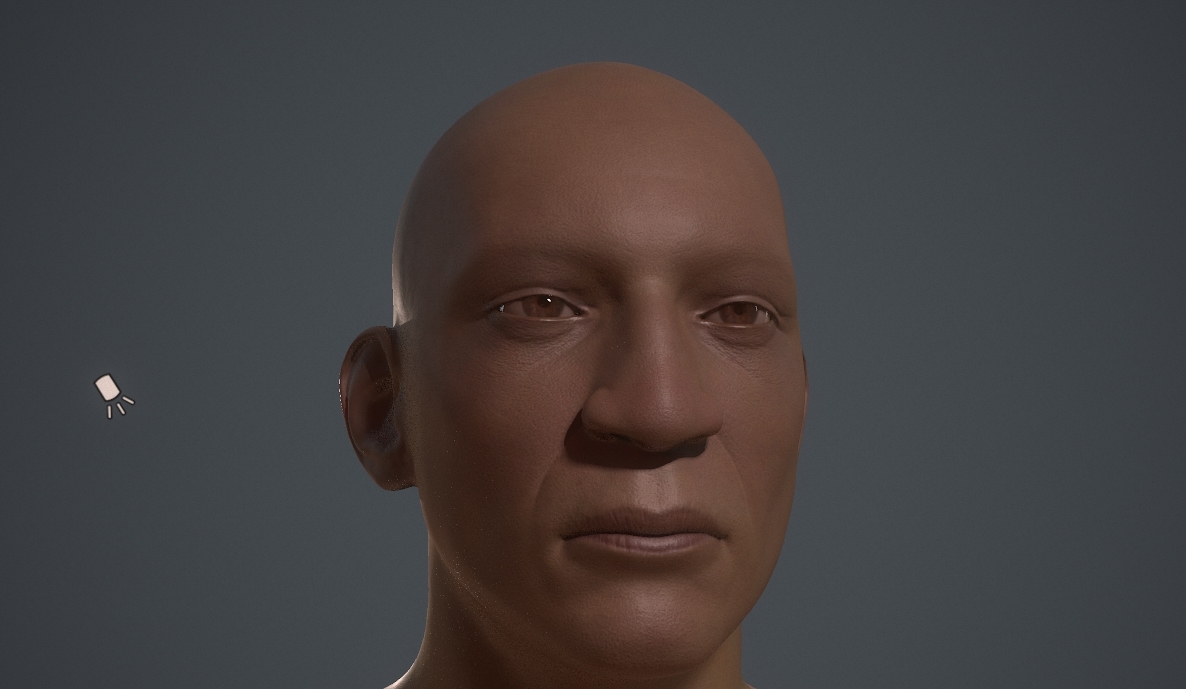
And this is what it looks like in ZBrush:
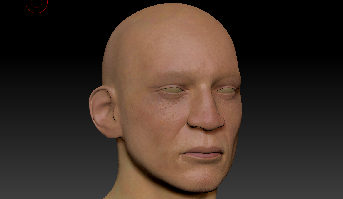
I've look at multiple tutorials and looked at different ways to shade skin, but nothing seems to help. The above image from Marmoset was the best I could achieve from the tutorials I followed.
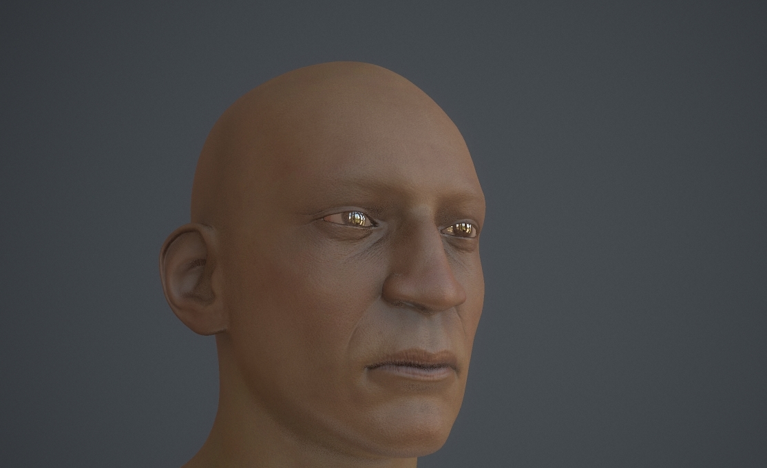
I know that my lighting in Marmoset isn't the best, but I've tried multiple lighting setups, even without any additional lights (only the sky light) and it looks absolutely terrible, no matter which sky I pick. For example, here's the one I use right now (Ennis House) without any additional lights, only the sky:
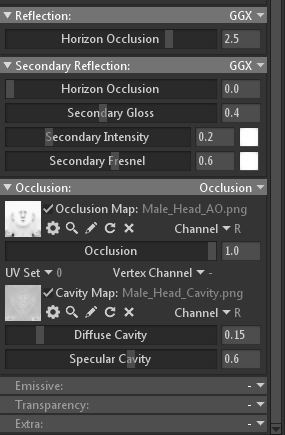
And here's also an image of my material properties:
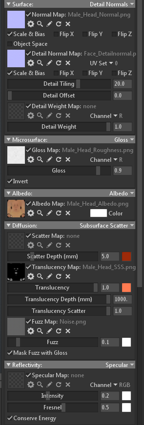
What am I doing wrong here? All help is very much appreciated. Thank you!
I'm doing some lookdev in Marmoset for my new character I'm working on and I've been trying to figure out a way to make my skin look good in Marmoset.
The thing I'm having the most issues with is the diffuse of the material.
This is what it looks like in Marmoset:

And this is what it looks like in ZBrush:

I've look at multiple tutorials and looked at different ways to shade skin, but nothing seems to help. The above image from Marmoset was the best I could achieve from the tutorials I followed.
I know that my lighting in Marmoset isn't the best, but I've tried multiple lighting setups, even without any additional lights (only the sky light) and it looks absolutely terrible, no matter which sky I pick. For example, here's the one I use right now (Ennis House) without any additional lights, only the sky:

And here's also an image of my material properties:


What am I doing wrong here? All help is very much appreciated. Thank you!

Replies