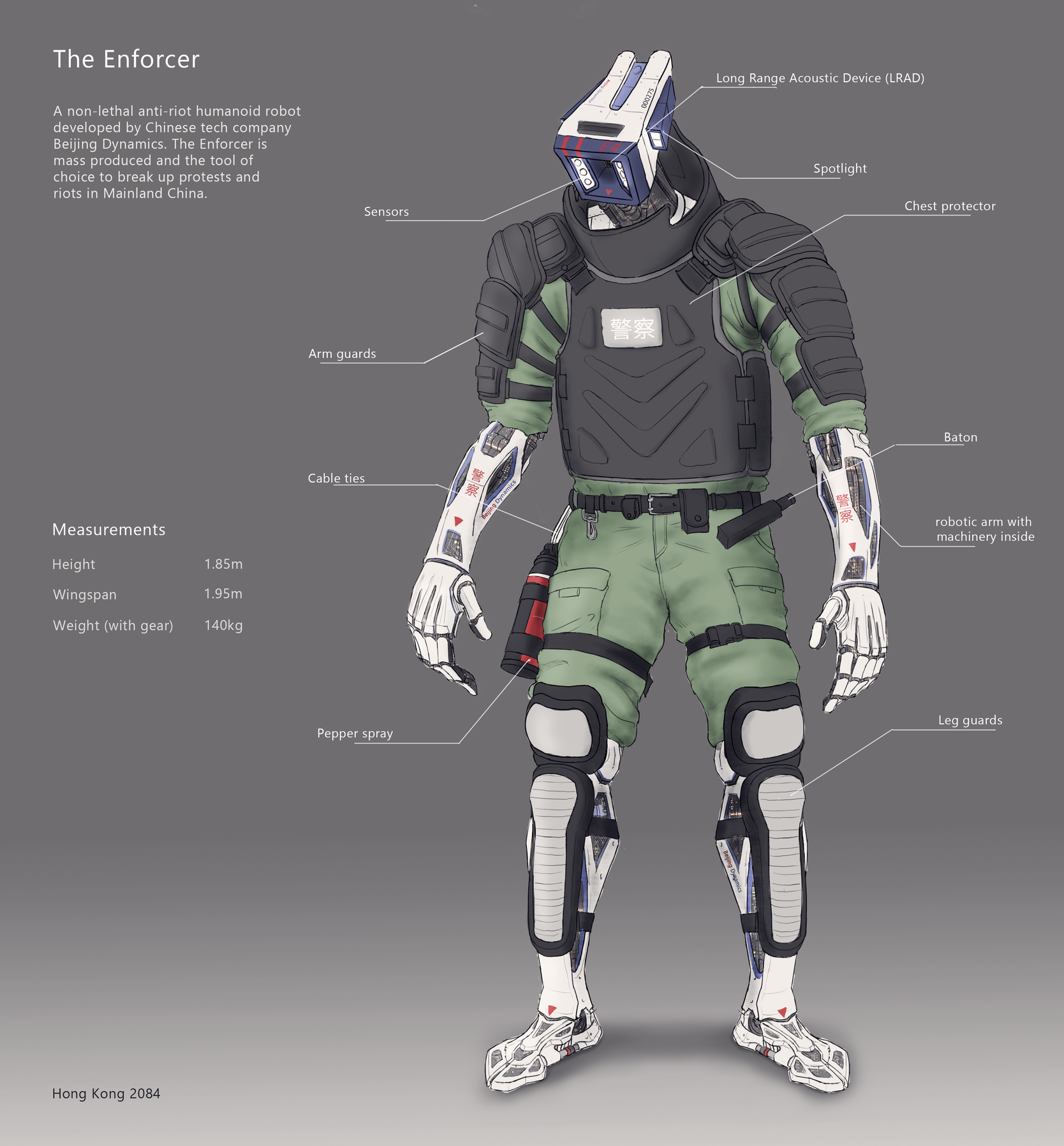
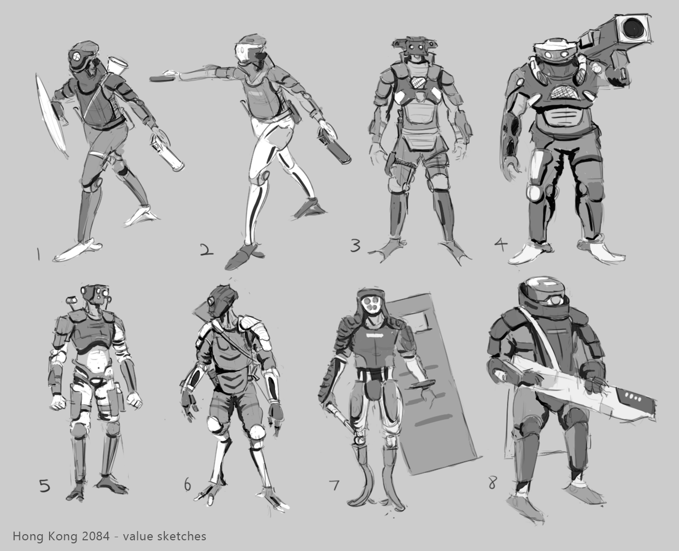
Hong Kong 2084
Hi all, I've been taking Alex Figini's concepting in ZBrush over on LearnSquared and I thought I would post my WIPs here. I hope I won't abandon this thread like my previous one.
The world is set in Hong Kong, year 2084, where the Hong Kongers are fighting for freedom against China who have sent in legions of robotic riot police to enforce order.
The idea is to create a cyberpunk character concept using ZBrush, Marvelous Designer and Keyshot.
Lesson 1: 2D design
Final designs:


Sketches:


Let me know what you think. I have some internal qualms about having a fully robotic character wear padded body armour but I reasoned that having a contrast of hard surface and softer elements (of the clothing and body armour) would work well. Also makes it more indicative that it is a riot police. Design of graphics and decals will still have to be figured out.
The world is set in Hong Kong, year 2084, where the Hong Kongers are fighting for freedom against China who have sent in legions of robotic riot police to enforce order.
The idea is to create a cyberpunk character concept using ZBrush, Marvelous Designer and Keyshot.
Lesson 1: 2D design
Final designs:


Sketches:


Let me know what you think.
Replies
The Director at the company where I work at was kind enough to spend some time doing paintovers of my previous 2D design.
An issue he pointed out was the weird presence of clothing, unusual for a robot. Also the entire design seemed to be geared more towards being menacing rather than being something for peackeeping. These were points in which I agreed with.
His name is Ronald Fong and you can check him out here: https://www.ronald-fong.com/
Paint overs by Ronald:
My own scrappy attempt at drawing over. I wanted to see how I could incorporate clothing elements to balance out the hard surface forms. I thought to move away from the design being a pure robot but rather something of a cyborg. This would let me place clothing onto the design.
Taking the 2D design into zbrush, I went ahead and blocked out the forms, trying to get a consistent visual language down. I also tried to figure out the mechanics of how the character would move. I kept quite close to the 2D paintover by Ronald. There was a heavy focus on design. I think it's at a stage where it's rather ok, but things like silhouette, the head could definitely be improved on.
- Adjustments to functionality of joints.
- Head reworked.
- More design adjustments.
- Refinement of several elements.
Will probably move into incorporating kit bash elements and refining more elements. Also MD for the clothing as well.Credits to Ronald for another draw over again!
Older head sketches. Didn't sit well with me.
This one felt too unoriginal. oof.
Was a bit plain for my liking. Not enough detail to be the main attention draw.
Went ahead and refined the design sketch to something will give a nicer finish in the render. Some elements are not yet at the final stage of refinement (chest armor, pepper spray, baton, pouches and clothing). Still plenty left to do
Worked on paneling elements that were clearly visible. Made a model for a non-lethal pistol, slightly modified from Pepperball's TCP.
Big thanks to everyone who provided me with feedback this time round, Miguel Nogueira, the guys on the Jonas Ronnegard discord and some of my friends.
Finalized the sculpting on this guy, going into Marvelous Designer to get some folds down. Posed him up as well. Rendered out a turnaround. I did material work and lighting on the gun. Now that I'm looking back at it the yellow materials aren't working so well, but I probably will leave that be. (I might relight the shot since it was so fun to work on)
I've been working on my lighting skills as well, working through Alex Senechal's lighting teachings, giving me a good base of fundamental ideas and techniques to do good lighting. Had some fun with the presentation of the gun, referencing Alex's graphical presentation with the info sheet.
Again, big thanks to my friends and mentors who have given me valuable feedback thus far on this!
A little update on the material work thus far. I'm feeling pretty good about the progress, but I see a lot of things I would have gone back and done differently. That being said, art's never done, it's just due. Next update will probably be with the keyframes all done! Excited to finally see this baby get finished. Lighting on the turnaround is pretty bad, but nothing final yet so.... First two renders just to play around a little bit.
Anyway are you planning to make different riot gears too? A schielded version or a bot with a water cannon could be a nice design.
What are your plans for the final presentation?
Looking forward to see the progress!
Hey man, thanks for the feedback! I did think this guy could have used some patterns, clothing was looking a bit dull to me.
No plans to make different variants of this guy however, just wanted a one off Hong Kong inspired riot police, inspired by the ahem, recent Hong Kong riots.
Since you mentioned a shielded version or a water cannon thing, I thought I would mention some of the anti-riot equipment on this guy, such as the baton (clipped on the pants in the first image) and pepper spray (right side of first image), as well as the non-lethal pistol holstered up on the side of the leg. And the facial plate under the main one with the eyes (first image) with the sort of mesh pattern; that is a mobile variant of the LRAD (Long Range Acoustic Device Launcher) used to deter riots today, I thought that was pretty cool.
As for the presentation, I was thinking of just doing 2 keyframes, nicely posed up in an environment and all, turnaround and sort of details sheets explaining what's what. That plus all the gun stuff.
Thanks again dude, stay safe!
I'm feeling that the presentation could be stronger for sure, I'm awful at this graphic design stuff; I can do simple lines but... that's about it. I definitely see some things that I could improve on the design as well, mostly related to functionality and having a more consistent shape language overall.
Since I posted previously I went ahead to do some material tweaks as per some feedback I received, posed this guy up once more, rendered and comped some keyframes.
It's been a really good experience, learning about visual design and the 3D concept art workflow for sure.
For the full project check it out on artstation: https://www.artstation.com/artwork/Kaqdyo