Home 3D Art Showcase & Critiques

Horror Game Environment - Gameplay

triangle
Offline / Send Message
Evren01 triangle
Hi,

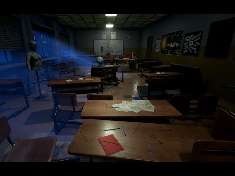
I completed my horror environment and I made a very basic gameplay video to show this. I created some simple events for the gameplay to make it more interesting to watch, but my only focus was to create an Environment.


THIS IS GAMEPLAY VIDEO PART 1 AND PART 2:
https://www.youtube.com/watch?v=9naWsN4KHck https://www.youtube.com/watch?v=JzJCCSih0So
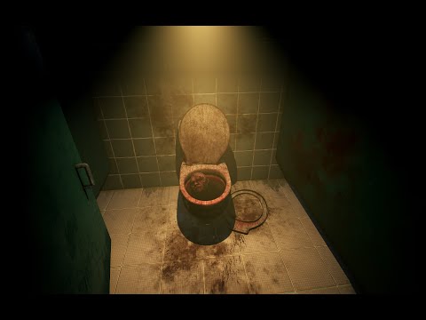

Since there are too many ScreenShots for this work, I want you to visit Artstation topic to see Assets and other things, if you want.

https://www.artstation.com/artwork/Kam8BB

https://www.artstation.com/artwork/lVkee5


Replies

  • Evren01
  • JohannesAg
    Offline / Send Message
    JohannesAg greentooth
    Looks really cool man. Though when you finish and make your final presentation I would try to make better compositions in the screenshots, because everything looks really nice in the video but the screen grabs aren´t as exciting and not everybody is going to watch the video. If you end up with something playable i´d love to try it out 
  • Evren01
    Offline / Send Message
    Evren01 triangle
    Looks really cool man. Though when you finish and make your final presentation I would try to make better compositions in the screenshots, because everything looks really nice in the video but the screen grabs aren´t as exciting and not everybody is going to watch the video. If you end up with something playable i´d love to try it out 

    Thanks for feedback, I really needed something to here.  :) Okay that's a good opinion. I'll try to take screenshots with different angles, maybe this can solve the problem you mentioned? Gameplay makes this environment more believable, probably because of actions and sounds. So I'm not sure how can I catch the same atmosphere with screenshots.
  • PolyPushr
    Offline / Send Message
    PolyPushr polycounter lvl 2
    I just looked through your screenshots because they were enough to freak me out so well done there, your assets are spooky :P 

    In the enviro shots however something does seem a little off to me, I think its your lighting, how are the scenes lit and are you using refection captures? If not you should take a look into baking down some of your static lighting if your using UE4 and adding in some reflection captures, you have loads of really nice reflective tiles and these would make them really pop .
  • Evren01
    Offline / Send Message
    Evren01 triangle
    PolyPushr said:
    I just looked through your screenshots because they were enough to freak me out so well done there, your assets are spooky :P 

    In the enviro shots however something does seem a little off to me, I think its your lighting, how are the scenes lit and are you using refection captures? If not you should take a look into baking down some of your static lighting if your using UE4 and adding in some reflection captures, you have loads of really nice reflective tiles and these would make them really pop .
    Thanks! Yes I usually use Stationary lights for this scene. There are reflection capture probs too plus screen space reflections, according to your opinion maybe their brightness values are insufficient. I'll try higher values and see the result.
  • PolyPushr
    Offline / Send Message
    PolyPushr polycounter lvl 2
    Evren01 said:
    PolyPushr said:
    I just looked through your screenshots because they were enough to freak me out so well done there, your assets are spooky :P 

    In the enviro shots however something does seem a little off to me, I think its your lighting, how are the scenes lit and are you using refection captures? If not you should take a look into baking down some of your static lighting if your using UE4 and adding in some reflection captures, you have loads of really nice reflective tiles and these would make them really pop .
    Thanks! Yes I usually use Stationary lights for this scene. There are reflection capture probs too plus screen space reflections, according to your opinion maybe their brightness values are insufficient. I'll try higher values and see the result.
    Ah okay yeah I think you could just push the lighting a little more to really sell the scene. For example the bathroom area is a really strong scene that just needs some lighting tweaks to boost it. Its jarring to me how bright the room is yet no light is bouncing back up the the ceiling, playing about with the world settings for your bakes should help with this massively but beware of ramping everything up as it will hammer your lighting build times :) 
  • Evren01
    Offline / Send Message
    Evren01 triangle
    PolyPushr said:
    Evren01 said:
    PolyPushr said:
    I just looked through your screenshots because they were enough to freak me out so well done there, your assets are spooky :P 

    In the enviro shots however something does seem a little off to me, I think its your lighting, how are the scenes lit and are you using refection captures? If not you should take a look into baking down some of your static lighting if your using UE4 and adding in some reflection captures, you have loads of really nice reflective tiles and these would make them really pop .
    Thanks! Yes I usually use Stationary lights for this scene. There are reflection capture probs too plus screen space reflections, according to your opinion maybe their brightness values are insufficient. I'll try higher values and see the result.
    Ah okay yeah I think you could just push the lighting a little more to really sell the scene. For example the bathroom area is a really strong scene that just needs some lighting tweaks to boost it. Its jarring to me how bright the room is yet no light is bouncing back up the the ceiling, playing about with the world settings for your bakes should help with this massively but beware of ramping everything up as it will hammer your lighting build times :) 
    Hi, I completed my work and I  did some changes about lighting as well. Could you check and feedback when you have some time?

    https://www.artstation.com/artwork/lVkee5

    Sorry there are too many images to share, I already created a topic for it on Artstation. I also shared gameplay videos in the first post.
Sign In or Register to comment.