Hardsurface concept Presentation help [WIP]
Hi Artists,
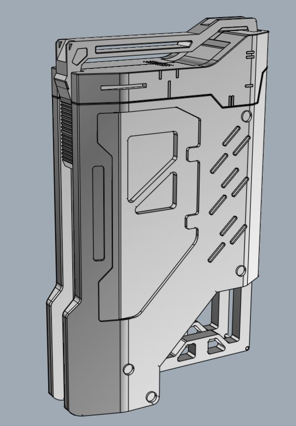
As the year started I thought to take up another challenge and start learning moi 3D as I find it very handy and useful for hardsurfaces so I started with something simple as below. But to put it into my portfolio I would like to know how to present it better as I am not satisfied with what I got and am not able to recognize what is wrong and what to fix.
It looks cool in Moi3D application itself, but after texturing and getting it to Marmoset I don't feel the same way.
I feel I need better textures and better lighting. But how to get to that point. If I know how to present these types of small concepts I would love to make more. Or should I just keep them as grey renders and not texture them just to show them as concepts? That is one reason was trying to keep the textures relatively clean with less dirt.
So any critiques and advice will be very helpful. Please let me know what and how to get better at it as I do intend to show the progress on the forum before uploading it into my portfolio.
Marmoset View

Moi3D View


Grey Renders

As the year started I thought to take up another challenge and start learning moi 3D as I find it very handy and useful for hardsurfaces so I started with something simple as below. But to put it into my portfolio I would like to know how to present it better as I am not satisfied with what I got and am not able to recognize what is wrong and what to fix.
It looks cool in Moi3D application itself, but after texturing and getting it to Marmoset I don't feel the same way.
I feel I need better textures and better lighting. But how to get to that point. If I know how to present these types of small concepts I would love to make more. Or should I just keep them as grey renders and not texture them just to show them as concepts? That is one reason was trying to keep the textures relatively clean with less dirt.
So any critiques and advice will be very helpful. Please let me know what and how to get better at it as I do intend to show the progress on the forum before uploading it into my portfolio.
Marmoset View

Moi3D View


Grey Renders


Replies
And thank you for the advice. I think I will try using vray and keyshot since my intention was to present concepts using moi3d.
I will just create a new page in my artstation for these moi3d hard surface concepts and make the presentation good by trying to get the materials and lighting right and not much of texturing process.
Will keep this post updated once I get a hang of what im looking for with the rendering.
Keyshot Renders. Any advice or feedback ?
Check out more at https://www.artstation.com/artwork/v1oYqd
https://www.artstation.com/artwork/rR3k4L