Home Technical Talk

Maya to UE4 Lightmap Issues??

polycounter lvl 5
Offline / Send Message
Amank679 polycounter lvl 5
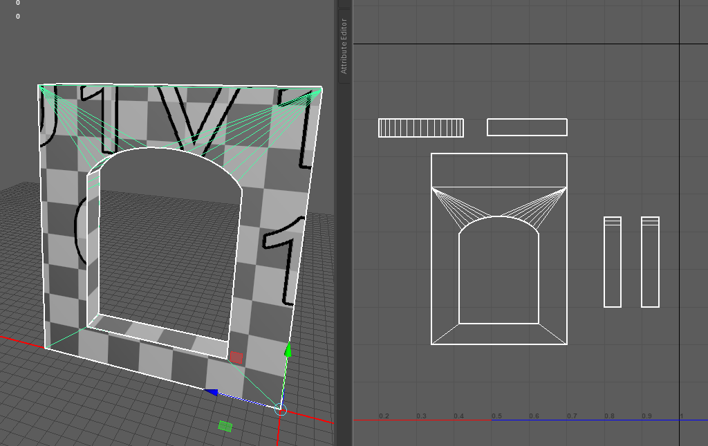
Hi all! I came across an Issue on my Daredevil Scene where I'm getting dark shadow lines on the places where my walls and other modular assets connect. I did use a lot of vertex snapping and boosted my indirect light intensity from 1 to 4 as well as tried adjusting the lightmap resolution, but the end result still gives me lines.

One thing I've seen some artists do is have their lightmap UVs snapped to the grid in the 0-1 space of whichever 3d software they UV with. I'm wondering if that's a necessary step or if Unreal would be able to figure out the lightmap just by having a lightmap Uv set without any different from the original UV set?

Lightmaps did help (the UE4 image is the updated image after handmade Lightmaps in Maya), but not eliminate my issue entirely. And as a test, I tried just creating an empty Uv set and baked. That didn't make a difference. Neither did trying UE's auto-generate Light map Uvs. Not sure If it's because I don't have sufficient padding between my UVs?

I thought that maybe production quality bakes would help, but that didn't help either.  The video I saw, the artist was able to snap individual verts and edges to the grid. In Maya though, If you select an edge or vert, it'll select the corresponding edge/vert if there is one. I've been trying to find a way to disable that double selection feature, but haven't found anything either, granted, he was using Maya 2015.


Any thoughts on this would be appreciated!


Replies

  • Kanni3d
    Offline / Send Message
    Kanni3d ngon master
    You'll most likely have to snap your islands to the grid/pixels. You probably have the UV shells in between pixels at whatever resolution the lightmap is, which is why you get the misaligned seam when the modules are snapped next to eachother.
  • Amank679
    Offline / Send Message
    Amank679 polycounter lvl 5
    Kanni3d said:
    You'll most likely have to snap your islands to the grid/pixels. You probably have the UV shells in between pixels at whatever resolution the lightmap is, which is why you get the misaligned seam when the modules are snapped next to eachother.

    The Image above in Maya has the Uvs snapped to the grid though. Is there a more precise way of going about it?
    I just use the vert and grid snap tools to allign the UVs for both diffuse and lightmaps.
  • sprunghunt
    Offline / Send Message
    sprunghunt polycounter
    don't have so much blank space in your lightmap. Snap the edges of the UVs to the 0-1 uv space. 

    https://docs.unrealengine.com/en-US/Engine/Content/Types/StaticMeshes/LightmapUnwrapping/index.html
  • Amank679
    Offline / Send Message
    Amank679 polycounter lvl 5
    don't have so much blank space in your lightmap. Snap the edges of the UVs to the 0-1 uv space. 

    https://docs.unrealengine.com/en-US/Engine/Content/Types/StaticMeshes/LightmapUnwrapping/index.html

    Sorry, I'm having a hard time wrapping my head around this concept. My Uvs are snapped to the grid, but I thought if I keep more space between each Uv shell, It'll prevent light bleeding. What I was thinking was just hitting layout and then adjust the Uv's slightly so there's more balanced space between the Uvs.
  • icegodofhungary
    Offline / Send Message
    icegodofhungary interpolator

    Changing your static lighting scale in conjunction with increasing your light build quality to medium or production can eliminate this. Watch the above video from 18:53 to 24:15. A good method is to adjust your Static Lighting Level Scale and Indirect Lighting Quality so that their product = 1. It is helpful to make small adjustments until you get the result you want, so that you may also optimize build times. At first, set your Static Lighting Level Scale to 0.5 and your Indirect Lighting Quality to 2, (0.5 * 2 = 1). See if that fixes it with our Light Build Quality on Medium. If not, try Static Lighting Level Scale of 0.2 and Indirect Lighting Quality to 5 (0.2 * 5 = 1). This should knock it out for the most part. The extreme is Static Lighting Level Scale to 0.1 and Indirect Lighting Quality to 10 (you get it by now). But your build time even on Medium Light Build Quality will be high.

    I suggest watching the entire video above sometime, but this small section should help. I used to have problems like yours a lot and lining up light map UVs with grids never helped. It was the lightmass settings in unreal that fixed it.


  • sprunghunt
    Offline / Send Message
    sprunghunt polycounter
    Amank679 said:
    don't have so much blank space in your lightmap. Snap the edges of the UVs to the 0-1 uv space. 

    https://docs.unrealengine.com/en-US/Engine/Content/Types/StaticMeshes/LightmapUnwrapping/index.html

    Sorry, I'm having a hard time wrapping my head around this concept. My Uvs are snapped to the grid, but I thought if I keep more space between each Uv shell, It'll prevent light bleeding. What I was thinking was just hitting layout and then adjust the Uv's slightly so there's more balanced space between the Uvs.
    A few points: 


    • A lightmap is a black and white image. All the areas around your UV islands are black. If you have large black areas when you downsample the image you get a darker result. It's better to completely cover the image as much as possible. This way you eliminate as much black space as possible. 
    • Also what grid are you snapping to? It looks like your grid is in 10ths (0.1, 0.2 etc). But an image is in 16ths (0.0625, 0.125 etc). If you want to snap to the grid you need to change this setting to something closer to what a real image is. 
    • The edge of the image does not bleed. So if you make your UV island fit the entire image you won't get bleeding from the edge of the image. 

    This is closer to how I would unwrap this for lightmaps


    The geometry I don't care about - the outer sides- I've minimised. And the geometry I do care about fills the whole UV space. 
  • Amank679
    Offline / Send Message
    Amank679 polycounter lvl 5
    Amank679 said:
    don't have so much blank space in your lightmap. Snap the edges of the UVs to the 0-1 uv space. 

    https://docs.unrealengine.com/en-US/Engine/Content/Types/StaticMeshes/LightmapUnwrapping/index.html

    Sorry, I'm having a hard time wrapping my head around this concept. My Uvs are snapped to the grid, but I thought if I keep more space between each Uv shell, It'll prevent light bleeding. What I was thinking was just hitting layout and then adjust the Uv's slightly so there's more balanced space between the Uvs.
    A few points: 


    • A lightmap is a black and white image. All the areas around your UV islands are black. If you have large black areas when you downsample the image you get a darker result. It's better to completely cover the image as much as possible. This way you eliminate as much black space as possible. 
    • Also what grid are you snapping to? It looks like your grid is in 10ths (0.1, 0.2 etc). But an image is in 16ths (0.0625, 0.125 etc). If you want to snap to the grid you need to change this setting to something closer to what a real image is. 
    • The edge of the image does not bleed. So if you make your UV island fit the entire image you won't get bleeding from the edge of the image. 

    This is closer to how I would unwrap this for lightmaps


    The geometry I don't care about - the outer sides- I've minimised. And the geometry I do care about fills the whole UV space. 

    Thanks so much for the detailed explanation! I was adjusting those lightmap settings in UE, but the numbers weren't reaching 1. I'll play around with those settings more.

    Here are my current grid settings. I'm able to adjust the viewport grid but the Uv editor grid doesn't seem to update there. Is there a separate set of grid options for Uv editor? I haven't been able to find one if there is.

    Those lighmap Uvs make more sense. As far as the diffuse texture Uvs goes, would this be acceptable?


    As far as the diffuse texture Uvs goes, would this be acceptable? the textures I will add later needs to be consistent throughout each modular piece so there aren't any inconsistencies. It's why I've kept a certain texel density that applies to each wall piece that will snap together.


  • Kanni3d
    Offline / Send Message
    Kanni3d ngon master
    Yeah you got it, for your UV 1/diffuse texture, that's totally fine since that's respecting a certain dictated texel density, and doesn't need to consume all possible UV space. :smile:

Sign In or Register to comment.