Help, Desperate to understand these normal maps!
So I've accepted I need to remap most likely but, before doing so I need some clarity.
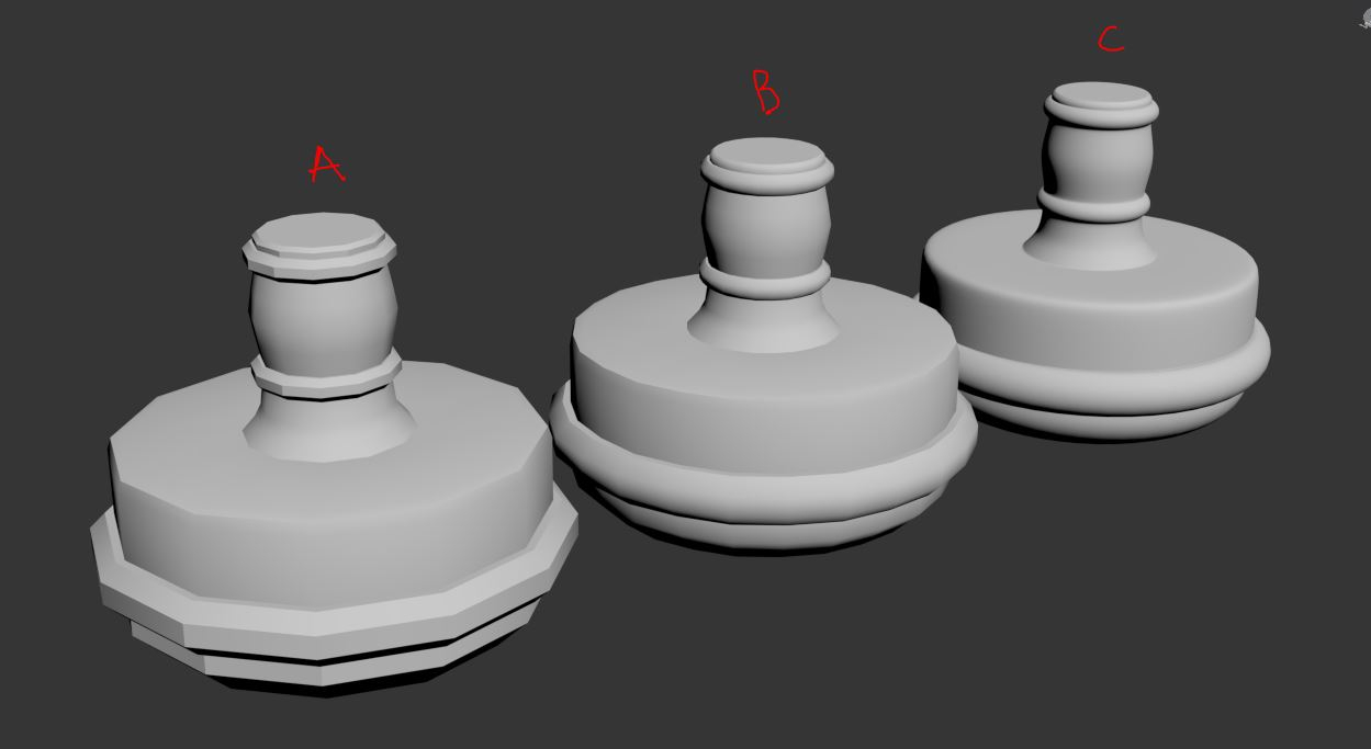
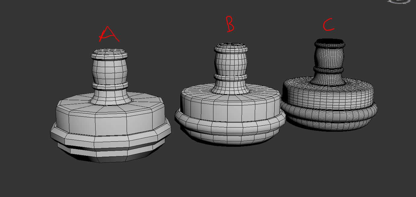
A- was my original low poly
B- is my "low" poly now
C- is the high poly
https://polycount.com/discussion/81154/understanding-averaged-normals-and-ray-projection-who-put-waviness-in-my-normal-map/p1
(this link is great and anyone with similar issue I recommend reading it, I mainly wanted to go ahead and post it before someone else does)
(B) I haven't refined any because I don't want to go through the process of lowering the tri count only to have to redo the whole thing because I'm missing something.
My process has been working on several models for my portfolio, modeling all of them, unwrapping, then texturing all at once. In the past my "portfolio" (lousy excuse of one) Only had models without texturing and thats why my portfolio had a massive delete in it. I just really want to do this right, If I have to rework everything so be it. I rather rework this and it stay in my portfolio for say a year than my next model blow it out of the water and have to remove it. This is just giving me a lot of anxiety. What if the poly count is to high, what if the maps dont look good, etc, etc. I'm not looking for any half a__ way of presenting this model. I want it and all of my models to look as professional as my current skill set allows.
Alright now on to the actual help part,
My main frustration is I wanted it smooth, I'm not wanting hard edges on this cylindrical shape. Im at a crossroads where my portfolio is geared towards games so do I worry about the polycount or do I up it more since this is for a portfolio.
Next would be the texture mapping, Putting everything on one map is ideal, but I could up the quality if I split it up, even though for a prop of this nature in game I doubt wasting resources like that would happen.
For the highpoly on these projects has been done in most part by utilizing 3ds max Turbo smooth, I would have that modifier on top of my stack and go back and fourth to see how its turning out. Looking at how normal are processed they go from the low poly and shoot outwards, Turbosmooth however tends to shrink my model.
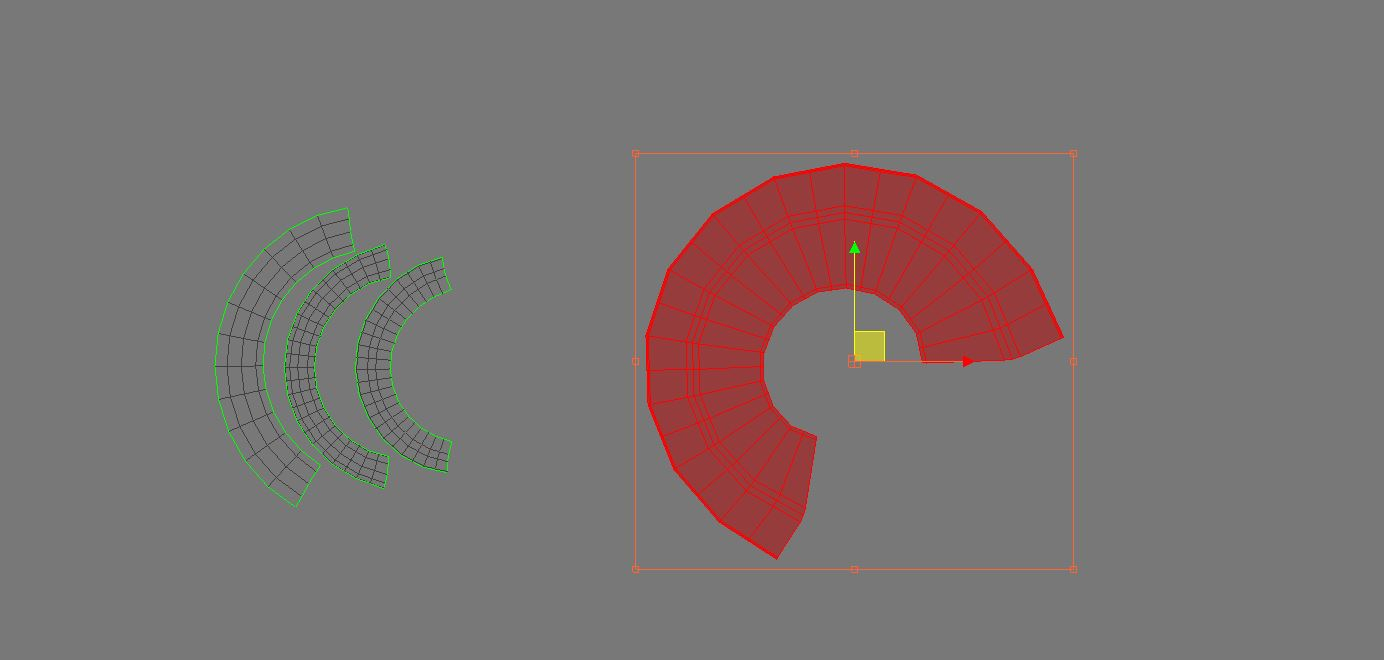
Next when a UV island looks like the one below mainly the one that red, is it better to just stitch it together or flatten it somehow?
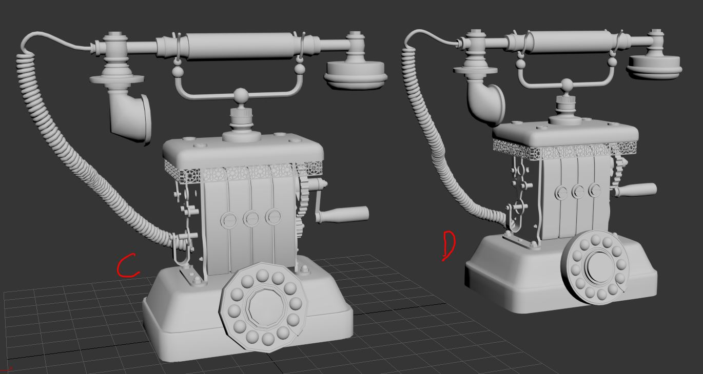
 The last picture is the low and high poly side by side (C-Low, D-High)
A- was my original low poly
B- is my "low" poly now
C- is the high poly
https://polycount.com/discussion/81154/understanding-averaged-normals-and-ray-projection-who-put-waviness-in-my-normal-map/p1
(this link is great and anyone with similar issue I recommend reading it, I mainly wanted to go ahead and post it before someone else does)
(B) I haven't refined any because I don't want to go through the process of lowering the tri count only to have to redo the whole thing because I'm missing something.
My process has been working on several models for my portfolio, modeling all of them, unwrapping, then texturing all at once. In the past my "portfolio" (lousy excuse of one) Only had models without texturing and thats why my portfolio had a massive delete in it. I just really want to do this right, If I have to rework everything so be it. I rather rework this and it stay in my portfolio for say a year than my next model blow it out of the water and have to remove it. This is just giving me a lot of anxiety. What if the poly count is to high, what if the maps dont look good, etc, etc. I'm not looking for any half a__ way of presenting this model. I want it and all of my models to look as professional as my current skill set allows.
Alright now on to the actual help part,
My main frustration is I wanted it smooth, I'm not wanting hard edges on this cylindrical shape. Im at a crossroads where my portfolio is geared towards games so do I worry about the polycount or do I up it more since this is for a portfolio.
Next would be the texture mapping, Putting everything on one map is ideal, but I could up the quality if I split it up, even though for a prop of this nature in game I doubt wasting resources like that would happen.
For the highpoly on these projects has been done in most part by utilizing 3ds max Turbo smooth, I would have that modifier on top of my stack and go back and fourth to see how its turning out. Looking at how normal are processed they go from the low poly and shoot outwards, Turbosmooth however tends to shrink my model.


Next when a UV island looks like the one below mainly the one that red, is it better to just stitch it together or flatten it somehow?
 The last picture is the low and high poly side by side (C-Low, D-High)

Replies
First, don't use the same base for both highpoly and low. You can't just add subdivision. You need extra detail in the highpoly basemesh to inform curvature and creases. These basemesh details should be removed entirely from the lowpoly.
So make the highpoly first, then when that's complete, copy the basemesh and wail away on it for a new lowpoly.
You can also use floaters on the highpoly to speed things up.
The coiled cord... on the lowpoly this should be a simple flat tube. The baked normal map will make the tube look like a coiled cord.
Similarly with the lace-like hanging metal trim. On the lowpoly this should be a flat plane. You'll bake a normal map for the bumpiness detailing, and an alpha map for the cutouts.
The big cylinder of the dial should get more curvature in the lowpoly. Too noticeably chunky. To keep overall tricount low, remove detail in the smaller diameter areas where the curvature is less noticeable.
On my phone so I can't do a decent paintover, sorry.
Please post a shaded wireframe of the lowpoly.
For the lace detail, I'm not sure how the alpha thing would work out. I get the idea of how it works since I use them with Zbrush but, I could model something complex a lot faster than I could go into gimp/photoshop and make an alpha representing the shape. I use substance painter/designer for most of my texturing stuff if that helps.
This might be a dumb question; but, would I need to unwrap both high and low poly and then get the high poly islands to stack on top of the low poly islands they are for?
EDIT: forgot to ask, what is a floater? And I should wait until I start posting for critique but, I’m to curious and having someone knowledgeable like you I have to ask. Overall even though it’s still a WIP, does this model look good enough for a JR modeling portfolio? I want to do Environment/Props, my art station I have VFX stuff but that’s seperate, I mainly have been learning that so I could add cool effects to my buildings and props.
And Im well aware of those walls lol, self taught method, this is the most frustrating since I feel so close to being finished but this isn’t even in the first 100 walls I’ve encountered. I didn’t leave a promising biology career only to back away due to something as little as this lol
(I attached high and low poly wireframes of them)
Alpha has a different meaning on real-time models. It's not a painting/sculpting technique like Zbrush. It's a way to make transparency with a black and white image. http://wiki.polycount.com/wiki/Transparency_map
You're doing the right thing, modeling the lace-like metal in the highpoly. However the lowpoly can be just a long flat plane, with a transparency map. You can bake the highpoly into a transparency texture, then use that on the lowpoly plane.
No, you only uv the lowpoly.
More later.
If I keep the plane simple, The normal maps capture the left point of the star but it acts as if the right side doesn't go in at all.
Second issue, If I add more edges (thought it might help give a cleaner map) that ugly thing pops up in the center of he stars, and now that I'm looking at it closer; its still running into the same problem as the normal picture on the top.
When you're baking the normal map, what software are you using? If you;re using 3ds Max's Render To Texture (RTT for short), you'll want to enable Supersampling to solve the jaggies.
RTT can't bake transparency, at least not on complex geo like you have there. You could copy the highpoly detail out, just a short 4-"star" strip on its own out in space, bake onto a simple plane, then tile the resulting texture on your full telephone low-poly model.
Transparency baking tips:
http://wiki.polycount.com/wiki/Texture_Baking#Transparency
For the left/right issue inside the star, make sure the highpoly geometry has slope inside the holes. Normal maps cannot capture perpendicular surfaces.
http://wiki.polycount.com/wiki/Normal_Map_Modeling#Sloped_Extrusions
Ive been using substance painter, I don't fully understand what some of the options mean (dilation width, etc.) But, I was going to try and use 3ds max render to texture. However, nothing pops up i'm thinking there must be some sort of issue with my version. Xnormals, gives me worst results than substance, If I can get a map with high contrast in either I figured I would refine in gimp to get that alpha for transparency.
With substance, I was experimenting with Making "Cages" however, I realized after many, and I mean many attempts; the overall quality of my normal bakes were doing better if I didn't Check mark the cage option.
I still need to look at those links you sent (may update this reply) but, overall; My idea was to Get a black and white outline of what geo I didn't want shown via Gimp; then, Use that to figure out how to make a transparency map. (I'm starting to fully understand the term "Zbrush Cowboy"
Cage right at the top of the sandwich and low poly at the bottom.
For the alpha, you could just use vert color or mat IDs to get the black and white. In that example sandwich I made a plane and stuck under the high poly geo, make that plane black, make the high poly white. So from the top down, what the rays see during the bake, it looks like this:
And just bake a matID or whatever to get the black and white mask into pixels to use as an alpha.
Note: make the highpoly strip longer than what you want to capture, so there is a segement on either end extending out past what you intend to capture in the bake. That's so there isn't seams there and it'll tile correctly
You should end up with some normal and alphas maps that look something like these
What should I do about the corners, If I just repeat those four stars I can see how it would work overall, But how is that going to translate into these chamfered styled corners? Also, another thing that has been bothering me about using 4 stars and tiling it, How do you go about that? Would you just put seams in the plane during unwrapping where each section of four meet? Or would you unwrap the entire section of the plane and try and line it up across it.
Overall the length of this segment has 10 star patterns, the width has 6 (if that helps)
@Eric Chadwick
after many iterations of experimenting with the low poly. I believe I’m starting to grasp what a normal map can and cannot do.
@Ghogiel
@FrankPolygon
Sorry Im addressing you both in one, but both of you are being a Phenomenal help with this star pattern. I figured how how to make the alpha (granted it came out red where the black should be, but that was easy to change via gimp)
I made a Four star Alpha and this is were I Start getting a little lost once more. I made the alpha on a plane just big enough to cover the four stars like ghogiel did. My next issue/question is how do I Translate that to the full piece
looking at franks I imagine it may be using something like other deform but, I have a few ideas how the workflow goes I’m just not sure which one is right, or a better away of approaching this.
1
Do I make the full plane around the model and use something like photoshop to manually place the alpha and normal.
2
Do I Take the small plane segment apply path deform (or spacing tool) and afterwards weld the vertices together
3
im not sure but I imagine there is another way Especially since frank mentioned to take advantage of modifiers
Three more quick questions,
just so I’m clear here I should be using a plane, not a box, not a plane that has a shell modifier (double sided) but a regular old plane?
on gear shapes would I be able to use the approach to cut out the inside of it and have the low poly looking similar to a cylinder? ( I’m not sure how far I can push the normal/alpha thing when it comes to thickness of an object)
i think this this has to do with pixel density. But, if say something is being cutout, is it better to line up the low poly edge to the high poly edges that the cut out would happen or does that even really matter?
(If I was at my house I would attach a picture to better show what I mean)
anyways thank you guys so much, I’m so lucky and thankful to have people like you answering these questions!
One more thing Kinda/Kinda not related so I’m making a seperate reply.
I may be overlooking it but in Customize UI, Where are all the UVW Unwrap options? I want to set up some hot keys for the align tools but, I can’t find them anywhere. At first I thought maybe they don’t give you the ability to customize those one but, There are so many features of 3ds max unwrapping that I’m not seeing in the customize UI that I think I may be looking in the wrong areas
One last question, then my next post on this thread should be the results of all this amazing help!
Its about that phone cord, Eric Chadwick mentioned that in a way similar to this star pattern I should be able to make a basic cylinder follow a spline path and have that swirly cord be the high poly. Other than just say I'm confused entirely I will try and break down my major concerns/Lack of knowledge on this.
Looking at its form in terms of a basic primitive wouldn't there need to be at least 2 cylinders or one that tapers at the very end? When it connects to the phone its unraveled, thus leading to a smaller shape versus the bulk of it were it's in that helix shape.
Also, That helix is stretchy and not tightly compacted, meaning you can see through it in a way I feel is complex in terms of alphas, etc (just stating my confusion)
I don't mind if it ends up looking compact Mainly I want the illusion its coiled and I don't want that single strand connecting to the phone to have the look it's being coiled.
It may be hard to see overall in previous pictures but I made a few mistakes when making the cord, It looks passable but trust there is some errors; so I planned for the final piece remodel that part anyways since I want to make a 3d turnaround when its done.
That's why I wanted to go ahead and ask, address some of these concerns of mine before redoing it so I don't mess up and have an idea what I should be looking for as the end result.
More Renders and details at his link-> (Artstation) https://jdellinger98.artstation.com/projects/Bmd1qr