[WIP] - Yet Another Alley Scene!
Hi Guys!
Still quite new around here and looking to get more involved. What better way than making a WIP thread!
I'd love some feedback and it's always appreciated. I thought this would also be a good way to really push myself and get involved with the community!
The concept comes from Shin jong hun ( https://www.artstation.com/huniartist ) who is an artist I found on art station. I absolutely love his work and the colours in this piece really caught me so I decided to try and turn it into my own thing and use it as a base for a scene!
I've gotten his permission of course, the main concept is below

Go take a look at his art station, it's awesome stuff!
https://www.artstation.com/huniartist
I'm pretty far through this scene but I'll be posting my WIP shots here
This was my initial blockout:

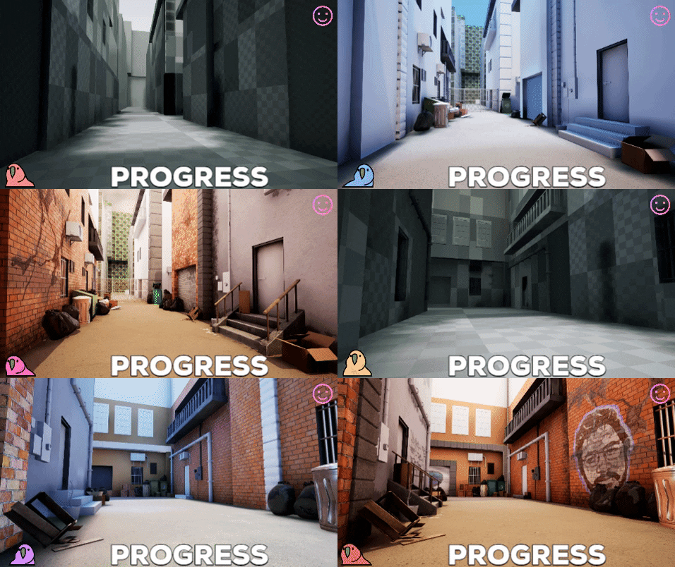
And here's a progress gif I made!

I know i've gone overboard with the graffiti and damage - These are being kept separate and used as a variation for the environment for my final presentation.
These are some of the props I've used in this scene.
I'm aiming for a texel desnity of 5.12 - These props below are using 2 2048x2048 maps.

I've just finished up my mesh for the dumpster so I'll post some updated pics tonight!
I'd also like to show off this bear, I think it looks cool!

I'll be updating this thread as much as possible with more WIP stuff till I'm done. Let me know what you think!
Still quite new around here and looking to get more involved. What better way than making a WIP thread!
I'd love some feedback and it's always appreciated. I thought this would also be a good way to really push myself and get involved with the community!
The concept comes from Shin jong hun ( https://www.artstation.com/huniartist ) who is an artist I found on art station. I absolutely love his work and the colours in this piece really caught me so I decided to try and turn it into my own thing and use it as a base for a scene!
I've gotten his permission of course, the main concept is below

Go take a look at his art station, it's awesome stuff!
https://www.artstation.com/huniartist
I'm pretty far through this scene but I'll be posting my WIP shots here
This was my initial blockout:

And here's a progress gif I made!

I know i've gone overboard with the graffiti and damage - These are being kept separate and used as a variation for the environment for my final presentation.
These are some of the props I've used in this scene.
I'm aiming for a texel desnity of 5.12 - These props below are using 2 2048x2048 maps.

I've just finished up my mesh for the dumpster so I'll post some updated pics tonight!
I'd also like to show off this bear, I think it looks cool!

I'll be updating this thread as much as possible with more WIP stuff till I'm done. Let me know what you think!
Replies
This is a little area in the corner from just before I got the wall textures in
Below I have one of the few remaining props, this is the low poly although the high doesn't differ much. Should be a fun texture pass!
And now for the fun exciting stuff!
This is my brother in graffiti form, say hi!
I hadn't done graffiti for at least 10 years before making this piece so it was quite fun to whip out the drawing tablet and go to town and relearn a bunch of things; for anything I struggled with photoshop was there to save the day!
This is the most recent texture I got in, hoping to do some more prop work next!
I'll clearly need something else here for the wall that isn't the bear!
Hope you like it so far and please leave any feedback, thanks!
Just another little update on where I am.
I've just gotten a bunch of feedback on this image and I have a bunch of self critique also.
I think the two biggest problems here is the lack of big colour gradients like in the ref, poor lighting (although lighting work is yet to properly happen) and overall the scene is just way too wide.
I'm hoping to address that this week, really tighten the scene up. The good thing is that I'll only need to adjust 1 prop which is the chainlink fence and gate at the back which is still it's blockout mesh anyway. Once that's done people have told me they don't see much direction or storytelling here and have offered some great solutions.
I'm going to remove some things I've done and stick closer to my ref. I image all that spiled paper maybe being about bin collection being delayed or possibly a strike. There's also some paper on a wall next to a door in the ref, maybe this could be a notice of that.
I'll definitely keep some of the graffiti but I know it's gone overboard. - It's quite likely I'll make 2 variations, 1 just using all the decals I've created thus far and 1 a more clean version.
One other thing I'd like to addresss is just how damn flat the ground is, this is super weird so once I've tightened the scene a bit I'll definitely be warping the ground.
In other news I got a little AC unit in which knocks yet another prop off the list!
Hope you like it and as always, I'm open to any and all feedback!
Working off of some feedback I've narrowed the alley way a lot!
I've also adjusted the angle of the lighting to match my reference and made a variation of my painted plaster material to go on one of the buildings. It really makes the whole scene feel warmer.
I also got some godrays from the Epic Games Blueprint Project which I put to use to get a nice volumetric effect.
I also actually shortened the alley way. It's a bit more compact which I think makes it feel a lot more real.
Next step is that final prop! then I can move onto a more wobbly floor and some breakup on the floor and eventually some garbage props!
Yes definitely, it's just kind of a soft shadow and lacks direction at the moment!
There's lots of work to do on the ground. It's so flat and "CG" at the moment, rubbish scatter is one of the last steps in my plan for this so that should break it up a lot. I'll definitely look at getting a harsher shadow on that box because now I see it too.
I appreciate the feedback!
There's not a whole lot to say other than I've adjusted a whole boatload of thing, finished some props off and more.
I still have a lot of texture work to do on this but I can see where it's going which is nice. I've made a ton of adjustments to the lighting and prop placement.
The biggest change is the addition of a bit of story telling. The graffiti on the wall looks quite new so I wanted to imply that someone had moved the trash bags, thrown a tarp down and got to work.
They clearly had to leave fast though and they've left their stuff there! I'll most likely change the chainlink fence a bit and leave it slightly open to imply that someone ran through.
The other big change is the background, I got rid of my horrid blockout model from Maya and replaced it using my modular pieces that I made the other buildings out of!. It looks a lot better now but might require some more prop scattering.
I've also added another camera angle. The right used to actually look out onto the street but this would have required a lot of additional work making the textures and building fronts. It's not what the project focuses on so I figured having another building there would make sense. I've been in alleys with similar layouts so it looks good to me.
Next steps are replacing the bear on the wall so I'm not repeating big things of grafitti and then all that's left prop wise is ground scatter assets.
Beer bottles, coke bottles, cigarette packs and so on. I'd like to get some ambient dust into the scene to and then do a proper lighting pass to start making this scene look really good.
I should be back for more in a week or two!
As always, any and all feedback is appreciated!
Long time no post! The scene has come a long way. and I think I've made a lot of progress. I started gathering feedback and making improvements wherever I could. The first big thing was the floor was just way too flat. The second thing was that the walls were just way too flat!
So I fixed it (and played with the lighting)
Clearly a huge improvement over the scene prevously! I darkened the lighting too to really boost the reds. This turned out to be a pretty bad idea. Any lighting artist looking at this is probably crying but luckily I went and got more feedback since I thought I was close to done.
I wasn't.
Thanks to some amazing folk I brightened the whole scene up, moved the sun and got a much better looking scene:
While this is a little cold looking I think it's a massive improvement. I've warmed the lighting up since but I think it acts as a really good reminder of just how important critique and feedback is. We get stuck in a feedback loop with ourselves. We get used to the way things look even if they look wrong. I also added some plaster damange around the door to make it a little more interesting. I need to generate a custom normal for it as i don't currently have one and the decal looks a bit flat.
You'll also notice to break up the floor I added a cheeky little manhole cover. The primary shots don't show it very well but some of the supporting shots do so I threw one together quickly in substance. Others could have done this a lot more efficiently and I probably would have been better modelling it but it's portfolio work so there's no better time for practice.
The material really needs some definition but honestly it looks perfect for it's use and is at a distance where the faults aren't visible. It's my first time building a substance like this so I think it turned out pretty good!
I really want to emphasise how good feedback and critique is.
Below is 9 hours of work. I started in the morning based on feedback and got feedback all throughout the day and it made such a difference.
My next step is to improve the lighting even more! Add some cigarettes on the ground and just improve the mood a bit more. You might see I've started this in the below progress GIF. I'll update here again soon with progress. Maybe I'll even get this finished soon!
Thanks guys! Any feedback or crit is welcome!
Unfortunately it's a bit too late in the project to adjust the primary conposition to resolve the verticle lines issue but I'll take it onboard for the next scene!
I've fixed the ground texture however and played around with the lighting a little more.
I'm really proud to say that the scene is complete now!
I'll make a separate post for the completed scene to keep things neat but if anyone wants to see the art station post it's here:
https://www.artstation.com/artwork/bakQzd
I really hope you like it!