Sword (stylized prop real time)
Hello guild.
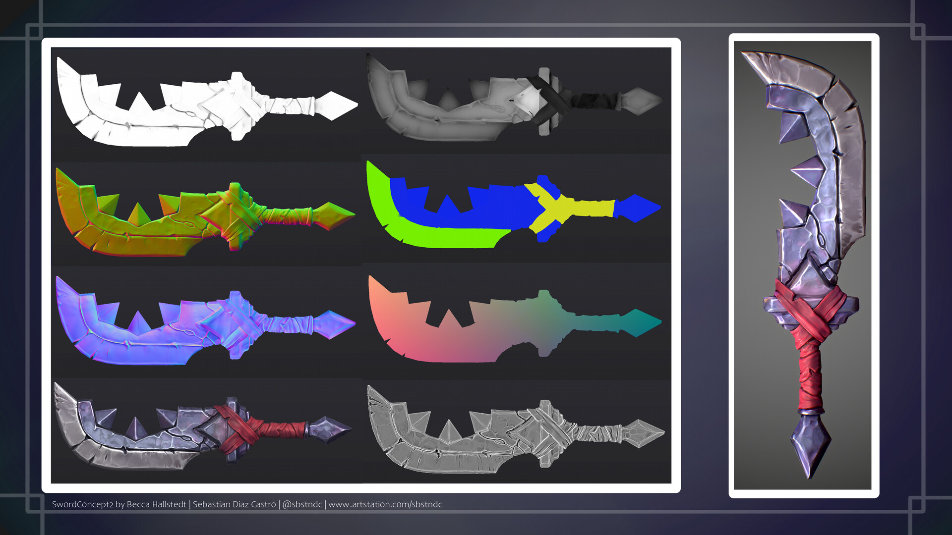
I was concepts in the artstation and then I found this one by Becca Hallstedt, I felt inspired so I produced it in pbr version.
Art of the Week#36 Blender Nation:https://www.blendernation.com/2019/09/02/my-favourite-blender-art-on-sketchfab-2019-week-36/
Concept: https://www.artstation.com/artwork/NYGLD
Greeting.

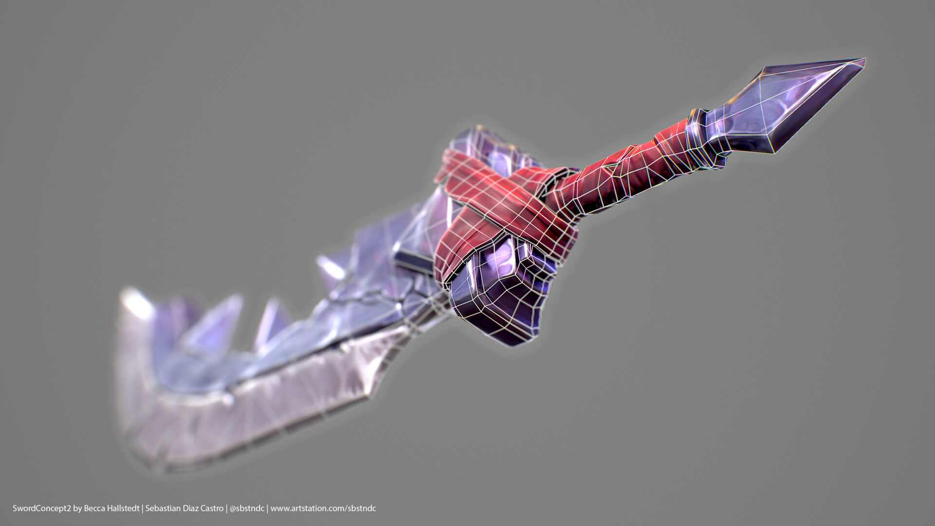

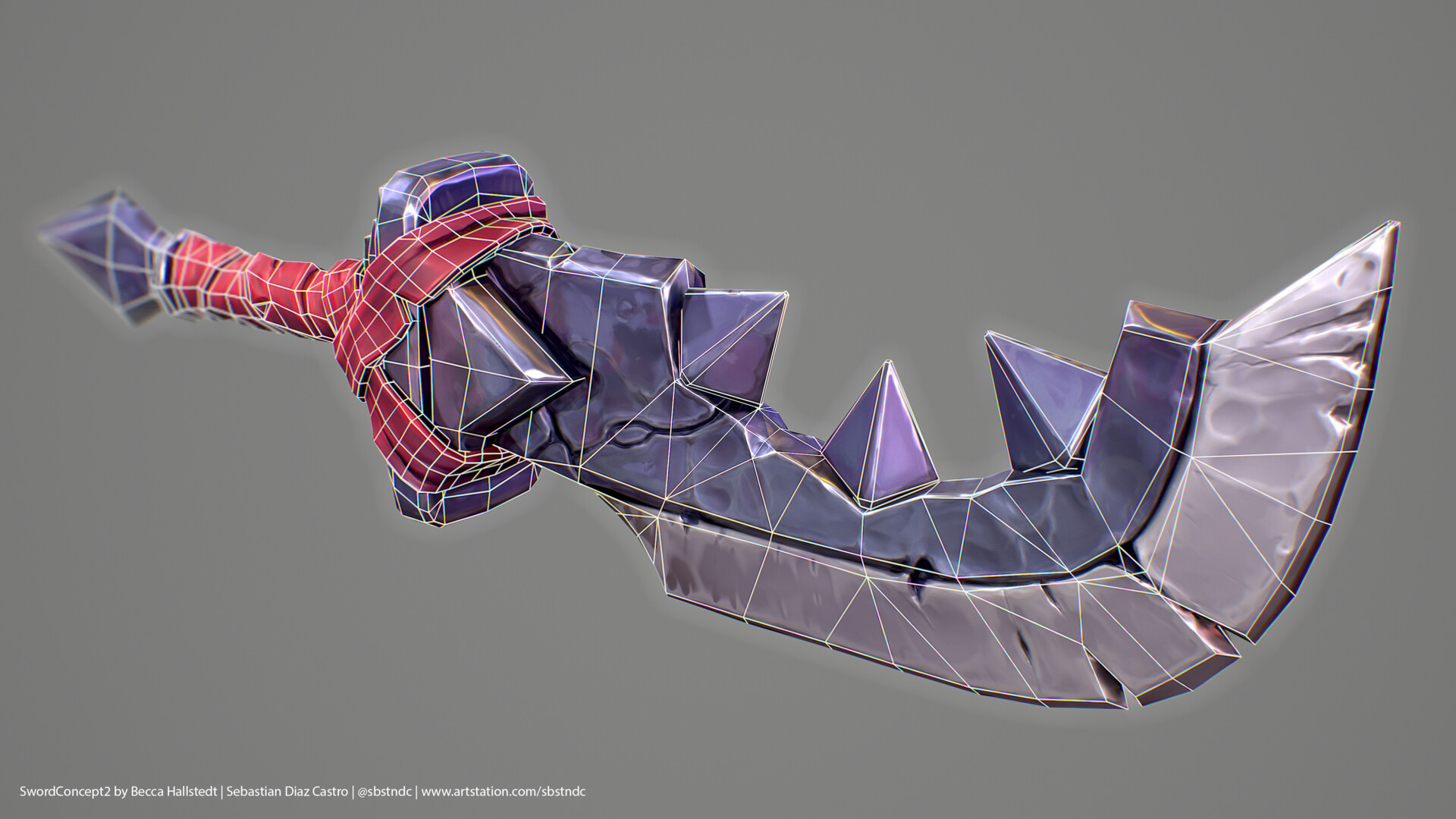
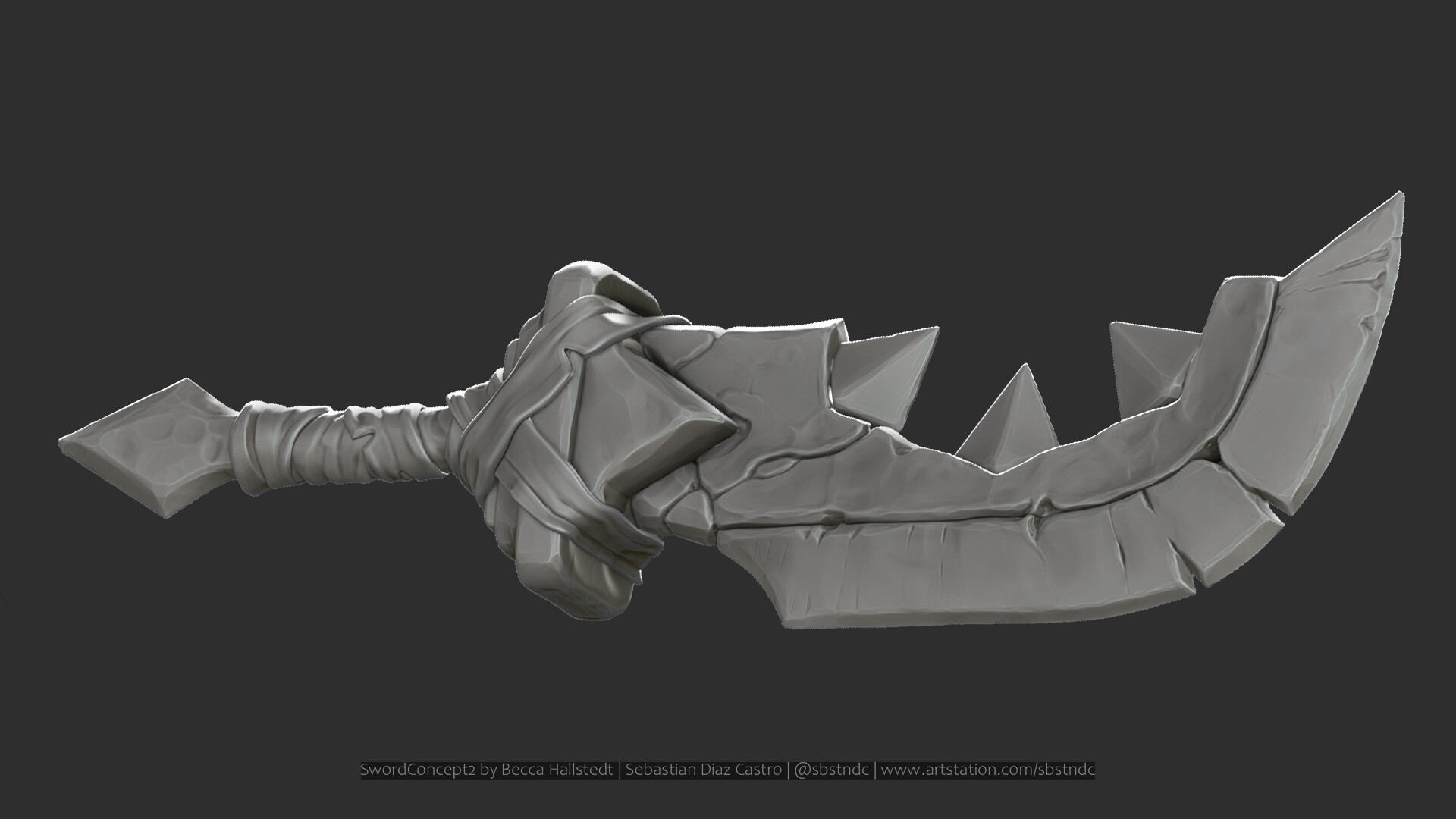
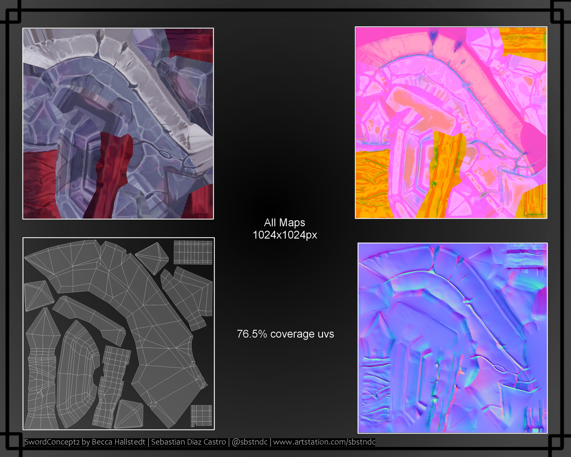
more HQ pics.: https://www.artstation.com/sbstndc

Replies
-----------------------
here part1:
What are the names of the different map passes, and what did you use them for? World-space normals, object space gradient, and SSS depth, these seem fairly useless, why include them in your orthographic renders? I'd rather see the important PBR maps.
It seems odd to me you painted shading into your albedo map. Also, it's better for the employer if you show Occlusion, Roughness, and Metalness maps as separate grayscale flats, rather than as packed because it's too hard to "read" them in packed color.
Keep going, these are great.
I have used support maps such as the normal map, wsn, ID curvature, position, the AO an thickness are 2 versions, with parts separated by name and without), because I paint with these generators separately each piece and then I reapply another effect to everything in general.
In marmoset render I do not use Tk, I use it in SP as if it were another AO, but the feature is that it tells me that part of the element is thinner and that part of it is thicker, and this information allows me to give it a more interesting tone for me combine it with a gradient for example.
The depth of the lens in render was something I was experiencing, I just wanted to give a touch of focus to certain parts but I think it was not subtle enough. I apologize if you don't understand.
On the pbr maps, I appreciate your feedback, I find reason, I will try to teach them separately in addition to the merger.
Albedo has no true shadows, i try to make them shadows. The AO map has the true shadows. I wanted to make variations, I will try to export with the AO separately. In the second version i used separate maps.
Thanks.
Game employers don't care about the layers that go into making the maps, we only care about the quality of the final maps. We only want to see Albedo, Occlusion, Roughness, Metalness, Bump, Emissive, Transparency, etc. Only the final maps that get used to render in the game engine.
Here is the shading baked into your albedo.
This is incorrect, and should be removed. Baked lighting fights with the realtime lighting from your dynamic lighting and IBL. The only baked lighting should be in the occlusion map, which only masks the ambient lighting from the IBL.
Anyhow, it's up to you want you want to do. Just trying to help, since I've been an employer for many years.
Though, labels would help. A bit hard to tell what's what.
Some ideas to think about:
Why are there grays in the Metalness? AO seems weak, not well defined? Roughness has brighter areas in the crevices, probably to reduce reflections in there, but if the AO was better it would handle this. Red cloth is a bit too glossy, looks rubbery. You could try adding weave in the normal map too.
Feel free to comment on your criticisms, because that's why I'm here, to improve and be a better artist.
Metal has variations of metal in some paints in which it is a bit metallic in some shades.
the red fabric, mmmm, yes, the truth is that it is a bit rubbery, T_T, I tried to give variations of brightness but it has not turned out as expected.
I think that adding a cloth pattern to the normal ones can cause it to break the aesthetics a little stylized or not?
Only add Metalness details if there is something occluding the metal, like chipped paint, or mud splatters, or blood stains.
Wherever Metalness is white, put the reflection color in the Albedo map. Gold for gold metal, bright gray for steel, etc.
Changing a 2d concept into a 3d model means you will have to translate, make decisions. Maybe fabric weave is one of them. You decide.