Magic House - 3D Environment Based off Veronika Firsova's Concept
Concept by Veronika Firsova:
First time posting here to Polycount!
I was browsing Art Station for inspiration and came across this amazing concept. I Decided to test my skills and work on a project that took longer than a day. I wanted to complete this before the new year, and managed to get most of it done, minus a few details. Overall, I am happy with how this turned out. Any CC is welcome!
Animation: https://vimeo.com/382244123
Artstation Project: https://www.artstation.com/artwork/Yal14Y
Instagram Post: https://www.instagram.com/p/B6wa0n9jP2S/
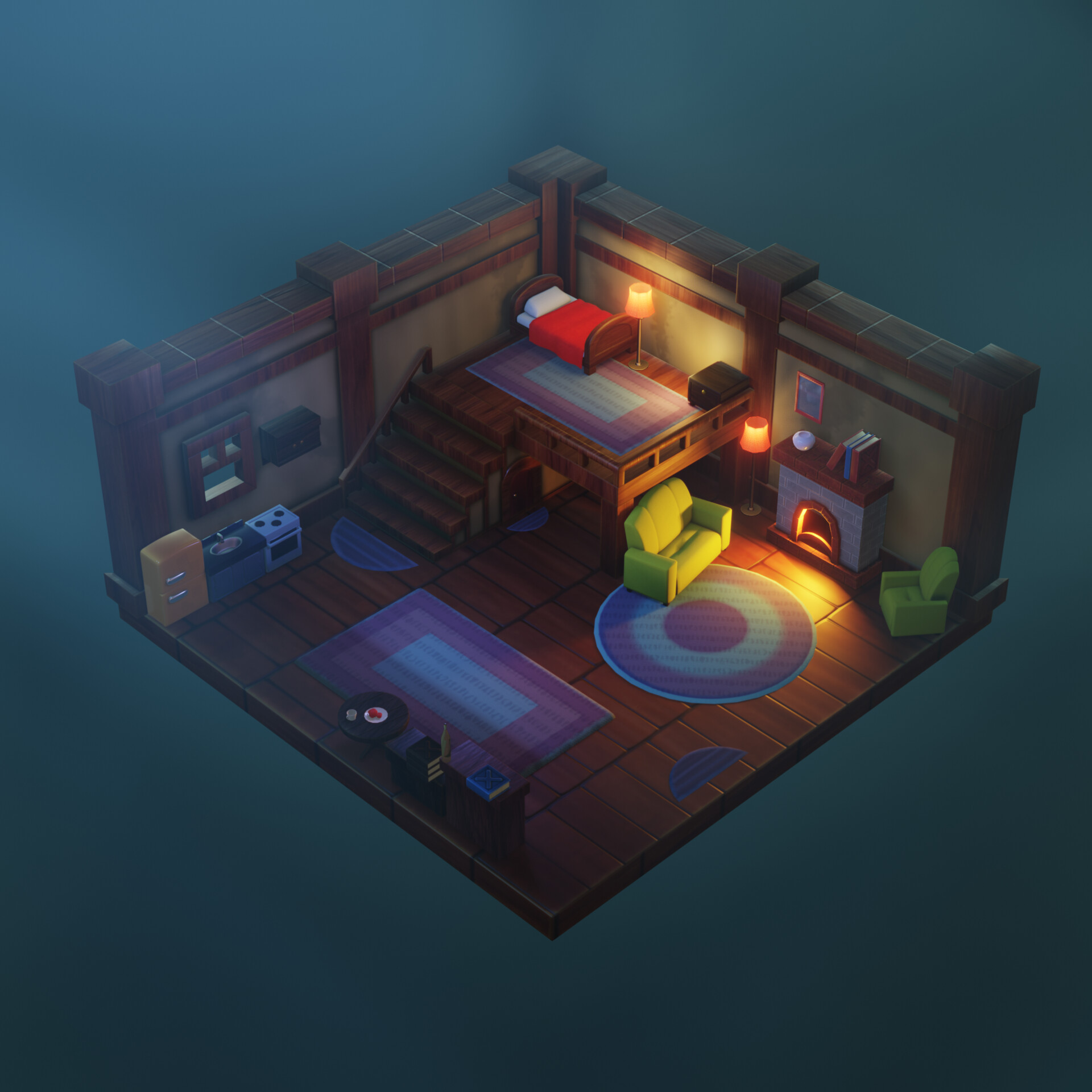
Modelled and UV'd entirely in Blender 2.8, textured in Substance Painter and rendered using Eevee. All the assets are optimised for a game engine, meaning this could be ported over to Unity or Unreal (maybe a future project). I used a lot of SSS to get the rubbery/bouncy feel of the room. http: This project took about a week of off and on work. Overall I am pleased with the result!
Any CC or advice will be greatly appreciated and considered in my next projects. I hope you like it!
Main Render
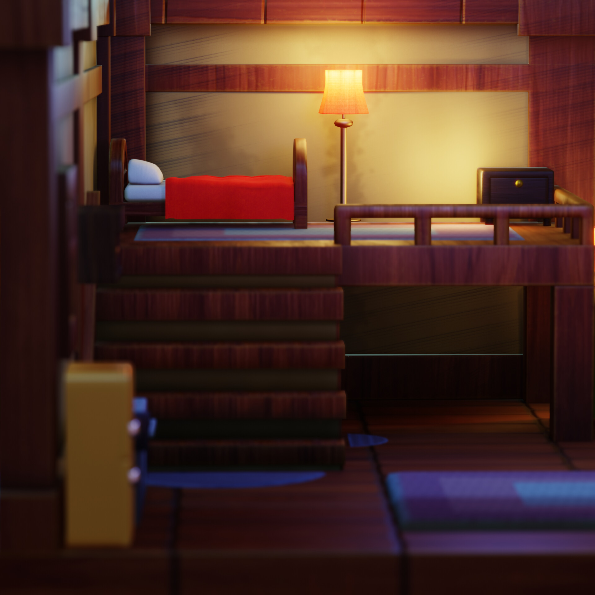
Alternate Angle 1
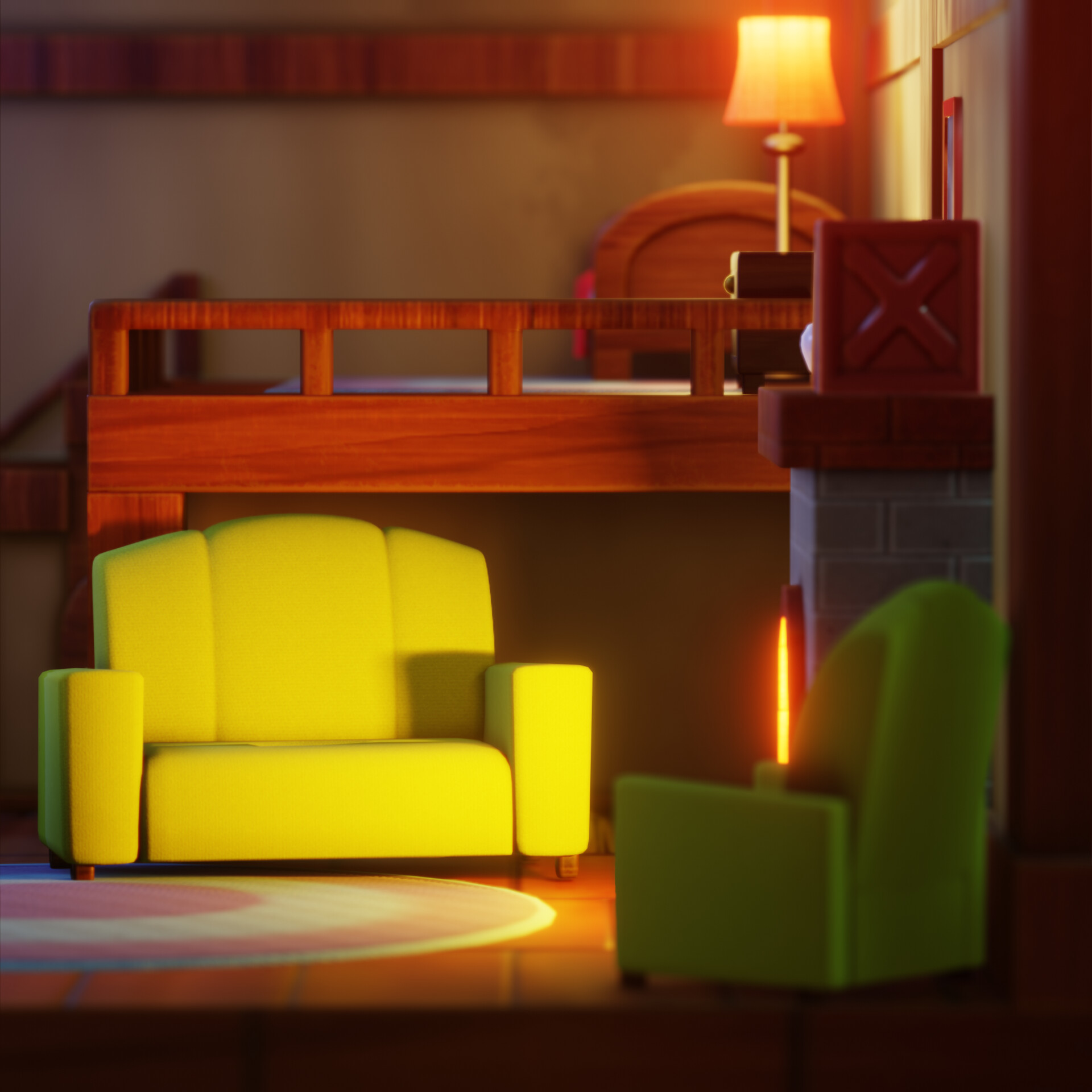
Alternate Angle 2
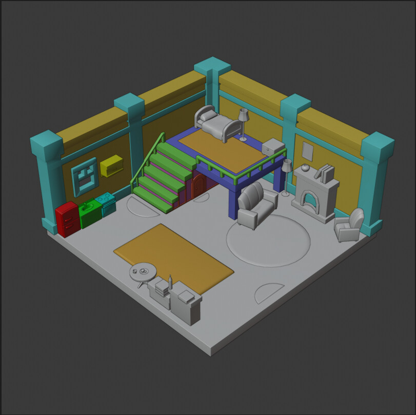
Viewport Screenshot
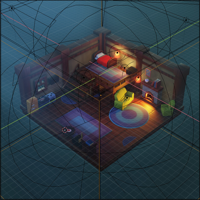
Scene View
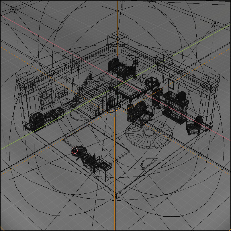
Wireframe
<a rel="nofollow" href="https://www.artstation.com/artwork/OyZwDg" title="Link: https://www.artstation.com/artwork/OyZwDg">https://www.artstation.com/artwork/OyZwDg</a>First time posting here to Polycount!
I was browsing Art Station for inspiration and came across this amazing concept. I Decided to test my skills and work on a project that took longer than a day. I wanted to complete this before the new year, and managed to get most of it done, minus a few details. Overall, I am happy with how this turned out. Any CC is welcome!
Animation: https://vimeo.com/382244123
Artstation Project: https://www.artstation.com/artwork/Yal14Y
Instagram Post: https://www.instagram.com/p/B6wa0n9jP2S/
Modelled and UV'd entirely in Blender 2.8, textured in Substance Painter and rendered using Eevee. All the assets are optimised for a game engine, meaning this could be ported over to Unity or Unreal (maybe a future project). I used a lot of SSS to get the rubbery/bouncy feel of the room. http: This project took about a week of off and on work. Overall I am pleased with the result!
Any CC or advice will be greatly appreciated and considered in my next projects. I hope you like it!
Main Render

Alternate Angle 1

Alternate Angle 2

Viewport Screenshot

Scene View

Wireframe


Replies
The only issue I have is with the render. The light coming from the left side is a little distracting. As soon as my eyes move to that corner everything suddenly feels blurry.
I think it could do with a little better light distribution. Currently it feels more like you want the viewer to focus on the right side of the room. Though that could be because of the two nicely lit lights placed in that area.
As for the brightly lit areas, I was using the concept I had as reference, but I felt that the contrast between the 'cold/dark' areas of the room and the brightly lit lamp near the bed, and the couches near the fireplace, would accentuate the feeling of being cosy. Cosiness to me is the feeling of being protected from the cold and dark. A room isn't as cosy if the whole area is lit, but a small, safe corner is more attractive I think. Those are just some personal thoughts.
Thank you for your feedback!