[Character] Hacker - Workflow Blog
Hi there!
I am currently taking part in the Search For A Star 2020 competition, as a side project from my last year in the game art university course. I will be documenting here my workflow, so any feedback shall be grateful!
REMINDER: This work will be produced in around 70 hours to follow the brief of the competition, and the deadline is 26th of January 2020.
-
PART 1 - Pre-Production
For my theme, I have decided to make a character based on the theme of a hacker. This was greatly inspired by my love for games like Watch Dogs 2 and Mirror's Edge.
Moodboard:

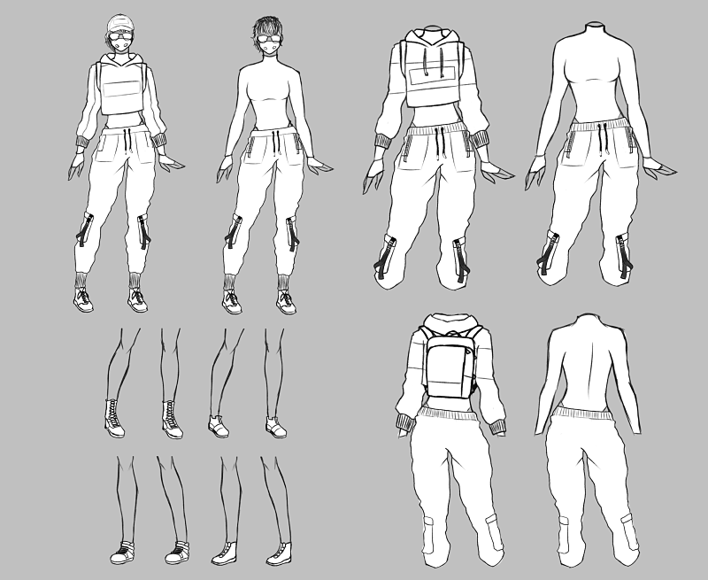
Concept sketch:

Colour palette tests:

I might mix and match colours from the colour palette tests, since I do not have any favourites right now... I will most likely explore it more later on.
Overall, I am planning to produce a female hacker character and the following props: laptop, bag, phone and earphones(?). And I will want to produce a small simplistic scene.
I am currently taking part in the Search For A Star 2020 competition, as a side project from my last year in the game art university course. I will be documenting here my workflow, so any feedback shall be grateful!
REMINDER: This work will be produced in around 70 hours to follow the brief of the competition, and the deadline is 26th of January 2020.
-
PART 1 - Pre-Production
For my theme, I have decided to make a character based on the theme of a hacker. This was greatly inspired by my love for games like Watch Dogs 2 and Mirror's Edge.
Moodboard:

Concept sketch:

Colour palette tests:

I might mix and match colours from the colour palette tests, since I do not have any favourites right now... I will most likely explore it more later on.
Overall, I am planning to produce a female hacker character and the following props: laptop, bag, phone and earphones(?). And I will want to produce a small simplistic scene.

Replies
This will be first time I am going for a realistic 3d character style, so there might be a few mistakes, but hopefully I can do a good job!
In general, I am planning to have a poly limit of around 100k and maybe an aditional 20-50k for the hair (I did some research and this seems like an appropriate amount)...
Blockout:
Body workflow:
Head:
I'll focus on the head, as that is what i'm best at the moment.
I have not realised that the ears were not the right proportion, it's easy to not see it when you dont check it properly I guess.
So I fixed up the ear placement as you advice. Here are front view, 3/4 view and side view of the head...