The BRAWL² Tournament Challenge has been announced!
It starts May 12, and ends Oct 17. Let's see what you got!
https://polycount.com/discussion/237047/the-brawl²-tournament
It starts May 12, and ends Oct 17. Let's see what you got!
https://polycount.com/discussion/237047/the-brawl²-tournament
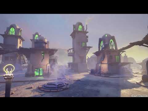
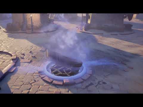
[UE4] Gadgetzan x Fortnite: Fan Art breakdown
Hi all,
I recently put this environment up on artstation and I'm planning on doing breakdowns that go a bit deeper than what makes sense for a portfolio website. For now, here's just what I've posted on artstation. I've also got a sketchbook thread that has some old images but I won't repost those here unless they help illustrate my process.
Here's what I've got. More to come soon!


 https://www.youtube.com/watch?v=u7G3SKL7Ens
 https://www.youtube.com/watch?v=vG2FELDKufY
I recently put this environment up on artstation and I'm planning on doing breakdowns that go a bit deeper than what makes sense for a portfolio website. For now, here's just what I've posted on artstation. I've also got a sketchbook thread that has some old images but I won't repost those here unless they help illustrate my process.
Here's what I've got. More to come soon!


 https://www.youtube.com/watch?v=u7G3SKL7Ens
 https://www.youtube.com/watch?v=vG2FELDKufY
Replies
You plug in a "damage height" and a matching "damage normal" and that dictates the blend, much like a traditional vertexpaint/heightmap combo. The difference is a little extra math with these if/then nodes, allowing a small sliver inbetween the two major materials where I combine the damage normal info to the top layer's normal to simulate thickness of it chipping off. This works for heavy layered materials like this plaster, but can be tuned to work with paint, metal, wood lacquer, etc. (also the "ground level damage for first floor exteriors, so I'm not painting over and over those models)
and here's a demo of the material function in action! Fully customizable!
Minor critique, the plaster on your blended material looks like it's flattening/going under the brick material instead of feeling like it is covering up and filling in the spaces between the bricks. (i hope that makes sense) Basically it looks like it's taking away the bricks instead of plastering on top of the bricks.
Looks good overall though, i really like where this is heading.
Hold on, let me just.....