Home 3D Art Showcase & Critiques

[WIP] (UE4) Research Center environment

Anthonr4g
polycounter lvl 4
Offline / Send Message
Anthonr4g polycounter lvl 4
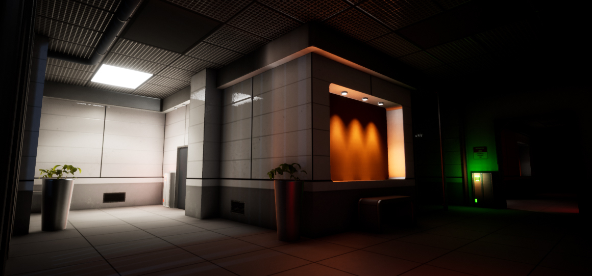
Hello, everyone!  Here are some pictures of an environment I started some time ago. The story behind this scene takes place in a research center. The idea is to give an abandoned but not necessarily destroyed side for this environment (like the entry of the NEST laboratory in resident evil 2.)

I used the modular building approach and the trimsheet technique a lot for the texturing process.

I started by focusing on the office part first. Of course there is still a lot to do and your feedback is appreciated!


Replies

  • icegodofhungary
    Offline / Send Message
    icegodofhungary interpolator
    I wonder if it would be more spooky if you used emergency lighting rather than the normal lighting of the office/lab. Like have it lit (or at least parts of it) lit by emergency flood lights and red-colored emergency lights. This would suggest some kind of lock-down or emergency that caused it to be abandoned. That may not be the kind of story you're trying to tell though.

    Other than that, the scale of the potted plants is weird. They look big enough to be trashcans but the plants are so small for the pot. I think the pots should be smaller or the plants bigger.
  • Anthonr4g
    Offline / Send Message
    Anthonr4g polycounter lvl 4
    Hey ! yes for plants there are still things to review in terms of proportion but thank you for pointing it out to me. This part of the research center is indeed a little more open and friendly than the others. But I intend to make some rooms slightly darker and closed. 

    I started working on the research / test room part. There are still things to review in terms of lighting and props but I think I'm getting closer to the result I was expecting.


  • Oxlander
    Wow great work! I can already imagine playing in a game with it, definitely going to start following how this continues. I agree with @icegodofhungrary that emergency lights would add a sense of urgency and abandonment to the office if that's what you're going for. In the last two pictures you definitely added that feeling with the different contrasts in lighting, I just wonder if it's not a bit too much in the last one? Perhaps raise the brightness and change the hue a bit so it's more moody, without having so much of the picture hidden. If you're going for the "not knowing what's in the shadows" feeling though, what you're doing is probably a better step in the right direction than what I'm saying.
Sign In or Register to comment.