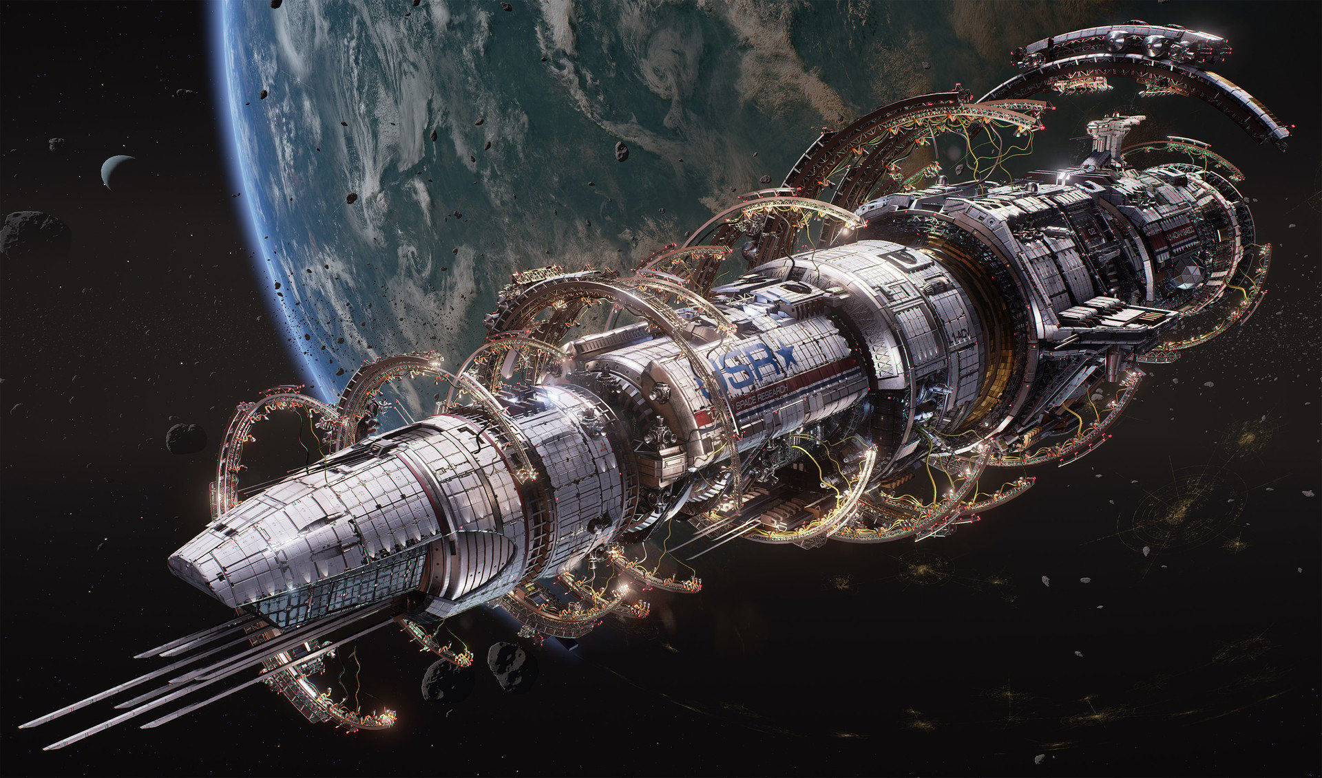
How to design 3d hard surface spaceships?
Hi polycounters!
Here I want to open the topic where we could discuss how it's possible to design complex spaceships, where to start and where we can find some inspirations? Also, It will be cool to know some tips from artists who already had experience in designing spaceships and other complex hard surface stuff. It's not about how to make correct topology, bla bla or something else.
Below I will attach some really great stuff that I found on Artstation. I wonder how have they planned everything?


So let's share our knowledge and learn with each other.
Here I want to open the topic where we could discuss how it's possible to design complex spaceships, where to start and where we can find some inspirations? Also, It will be cool to know some tips from artists who already had experience in designing spaceships and other complex hard surface stuff. It's not about how to make correct topology, bla bla or something else.
Below I will attach some really great stuff that I found on Artstation. I wonder how have they planned everything?


So let's share our knowledge and learn with each other.

Replies
http://www.youtube.com/watch?v=-n94ggmsVDg
http://www.youtube.com/watch?v=AkYnoaSB5xw
http://www.youtube.com/watch?v=crCZEQEgFZ0
In my opinion, the air brushy art/designs of traditional Sci-Fi illustrators such as Chris Foss, are still relevant today. For me 40yrs after leaving high school, when as a nerdy book worm reading a German pulp 900 issue serialised Sci-Fi publication "Perry Rhodan" I'd first clapped eyes on his book covers. He's also renown for his black and white line work for "The Joy of Sex, A Gourmet Guide to Love Making" in collaboration with Charles Raymond.
https://www.chrisfossart.com/
I have the book, really good stuff
IMO Hell no, first focus on modelling well, here we have a bit of a issue as space ships do not exist but really follow a reference until you are perfectly confident in your modelling and texturing skills, learning both at a time really makes things much harder and slower.
https://www.boredpanda.com/spaceship-design-everyday-objects-digital-art-eric-geusz/?utm_source=google&utm_medium=organic&utm_campaign=organic
Fictional spaceship design is about three things:
1) Silhouette. Your ship should have an angle(s) that it's immediately readable from. Eric's pieces start with the silhouette and go in from there. Guns typically make for great spaceship silhouettes. My one criticism of Eric's work is that he relies on gravity based design for his ships - he hardly ever has a strong vertical axis. For example, take any one of his ships and rotate them 90 degrees and they will immediately become more unique and interesting as a spaceship.
2) Function. The ship needs to be at least somewhat obvious in what it does. If it carries cargo, it needs containers or a big shipping bay or something like that. This ties in with realistic touches like engines that look like real engines, reaction control thrusters, etc. But of course think critically; as I mention in my next point, don't just add a fan or an intake to a spaceship unless it's also supposed to go in the atmosphere. If it's supposed to go into the atmosphere, you need streamlining etc. Don't just go "oh it floats with invisible thrusters/anti-grav", it's the lazy way out and one of the major problems I have with Star Citizen ships.
3) Scale. Spaceships in particular require this because there are no hard rules for their shape. Windows are a strong go-to. Airlocks, paneling, maintenance access, ladders (think about astronauts trying to move across the exterior in 0g) fans (avoid these unless you can say why you need a fan in space) - something that people can relate to and identify as a scale marker.