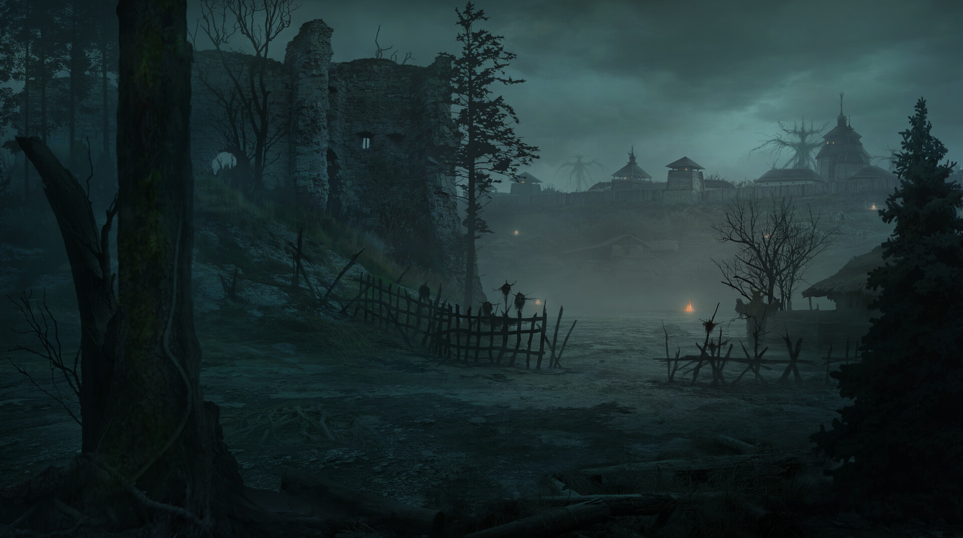
[WIP] UE4 Personal Project, Environment - 1663, Yuri Hill
I'm a technical artist I'm trying to get back into environment art in my free time. I decided to do an environment based on a concept by Yuri Hill. I really like the mood in his concepts and the strange influence of horror that he has in so many of his concepts - notice the being in the distance and the humanoid/scarecrow in the foreground, mid-right. https://www.artstation.com/hill

I started with the basics, a directional light, skylight, landscape, and exponential height fog. I tried to establish a similar mood without pushing so much blue (for now)

I have never been very good at really nailing down the views and matching perspective. Unfortunately it looks like some of my screenshots did not get saved.

Day3 - You can see the block out meshes in this shot
I took advantage of quixel's megascans for most of the textures as well as props and ground scatter.
I made my own grass mesh using a megascans texture and used a master material I made for all the props and tiling textures.
The landscape is using 4 layers and a single grass type. I'm also painting foliage but have not started.
The camera's view and perspective is really off at the moment and I will address that.
Any critiques or suggestions are welcome. I can show all the materials and textures/megascans I chose to use if anyone is interested.
My next steps:
Align camera to concept
Bring blockouts up to mid-level models (possible sculpts)

I started with the basics, a directional light, skylight, landscape, and exponential height fog. I tried to establish a similar mood without pushing so much blue (for now)

I have never been very good at really nailing down the views and matching perspective. Unfortunately it looks like some of my screenshots did not get saved.

Day3 - You can see the block out meshes in this shot
I took advantage of quixel's megascans for most of the textures as well as props and ground scatter.
I made my own grass mesh using a megascans texture and used a master material I made for all the props and tiling textures.
The landscape is using 4 layers and a single grass type. I'm also painting foliage but have not started.
The camera's view and perspective is really off at the moment and I will address that.
Any critiques or suggestions are welcome. I can show all the materials and textures/megascans I chose to use if anyone is interested.
My next steps:
Align camera to concept
Bring blockouts up to mid-level models (possible sculpts)

Replies
I started on the buildings. For distance buildings they're definitely a little too detailed. But I like that I can use them up close too, for future projects maybe?