WIP Gothic Horror Character - Blood Priestess
I started up a new piece recently! Right now I'm calling her the blood priestess, but that may change as I continue to figure out who or what she really is. I decided for this piece that I wanted to tackle my own design, since it's been a while since I've designed something from scratch. For inspiration I'm referencing a lot of Gothic horror elements, Diablo, Bloodborne, as well as the art of Bogdan Rezunenko and Maxim Verehin.
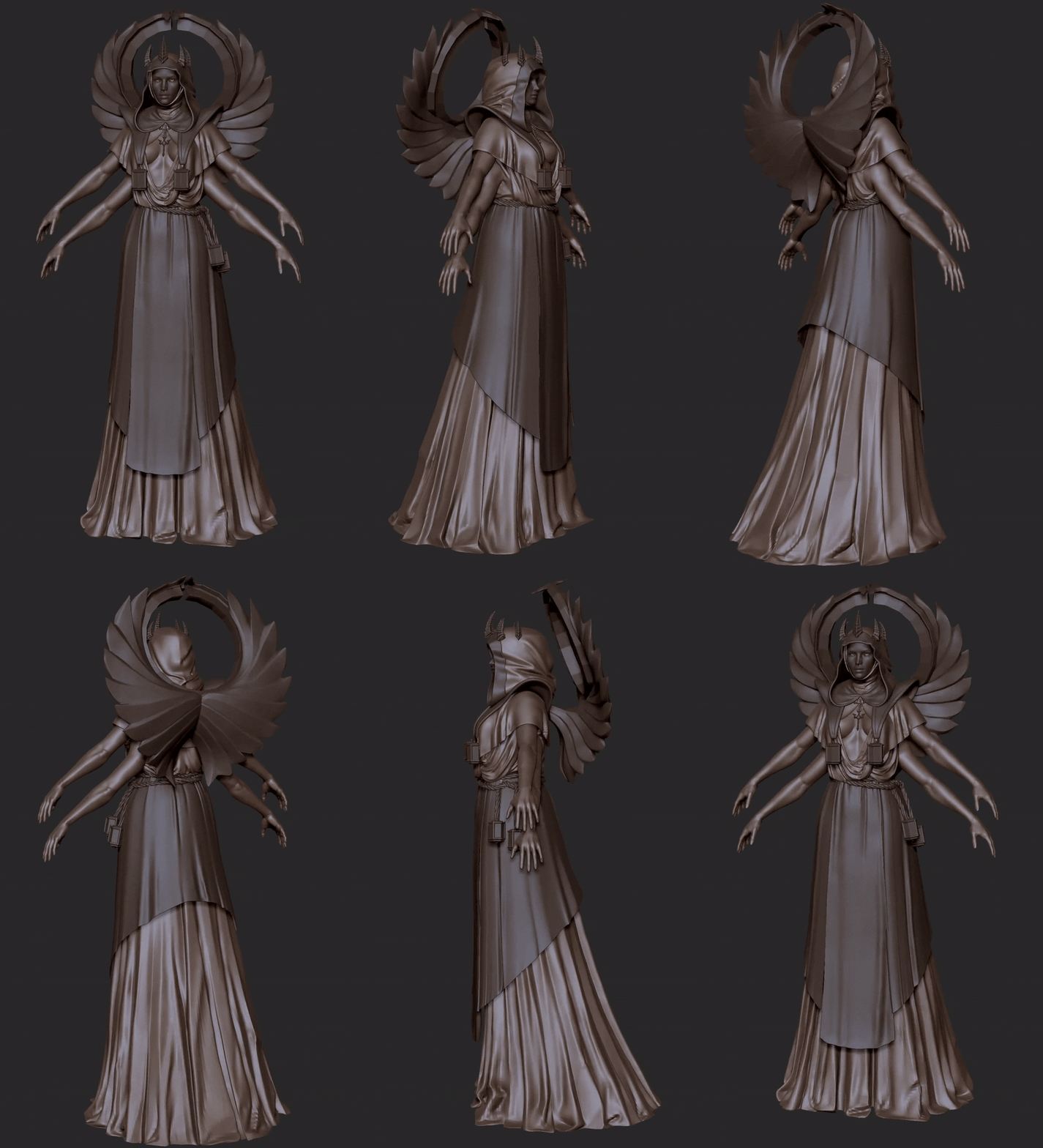
Here's her current block in, I'm keeping her pretty low poly so I can just focus on shapes and flow. I have a few more accessories and props I'm working on for her as well, that I'll show in a later post.

The face on the left will be a gold/metal mask that she wears to hide her true appearance on the right.


Comments and critiques are always welcome! I'm hoping to update this fairly frequently as I continue to work on her.
Here's her current block in, I'm keeping her pretty low poly so I can just focus on shapes and flow. I have a few more accessories and props I'm working on for her as well, that I'll show in a later post.

The face on the left will be a gold/metal mask that she wears to hide her true appearance on the right.


Comments and critiques are always welcome! I'm hoping to update this fairly frequently as I continue to work on her.

Replies
Meant to post this a while ago. I reworked a few of the elements and proportions, and figured out where I want to go with the design for some of her props and accessories. I'm currently working on cleaning everything up and doing some weathering and trim work.
Here's a close up shot of her face with/without the mask.
I ended up making her a bit taller, and I rebuilt the wings so I could have more control over the silhouette. Her hood was also reworked quite a bit from the original blockout.
This is her ceremonial blade.
Below are her blood canisters that she has hanging in front of her chest as well as from her rope belt. The idea is that this is where she stores blood she's collected for rituals.
Hope to post again soon once I've made some more progress. Thanks for looking!
Just a quick update. I started messing around with how I want her eyes to look. I ended up having a ton of fun with it and came up with this:
I'm gonna move on to other stuff and start retopo before I polish it up, but here's a quick mock-up of how it'll look in context:
Thanks for looking!
Finished retopo and bakes! I'm pretty happy with how well it baked. Gonna start figuring out the color palette and move on to more in-depth texturing.
bakes are super clean and the detailing on those metal parts looks so good!
Can't wait to see more!
@Tits Thank you so much! Glad you like it!
@JosephIV Thanks man! I'll have more to show soon.
@Orr_Malus I had considered having an indication of another set of pectorals at the front, but while it's technically more anatomically correct, I found it made that area really confusing to read.
@allmighty_thunder Thanks!!
For more renders plus marmoset viewer check her out on Artstation: https://www.artstation.com/artwork/v1vmQ3
She's finally done! Had a lot of fun with this project! It's been a while since I've designed a character entirely from scratch, it was a great experience and I learned a lot from it. Thanks everyone for following her progress!
This is stunning