I started a new sculpt, I took a look to Wei Feng designs and decided to choose this amazing concept and here is his work https://www.artstation.com/fengweic12
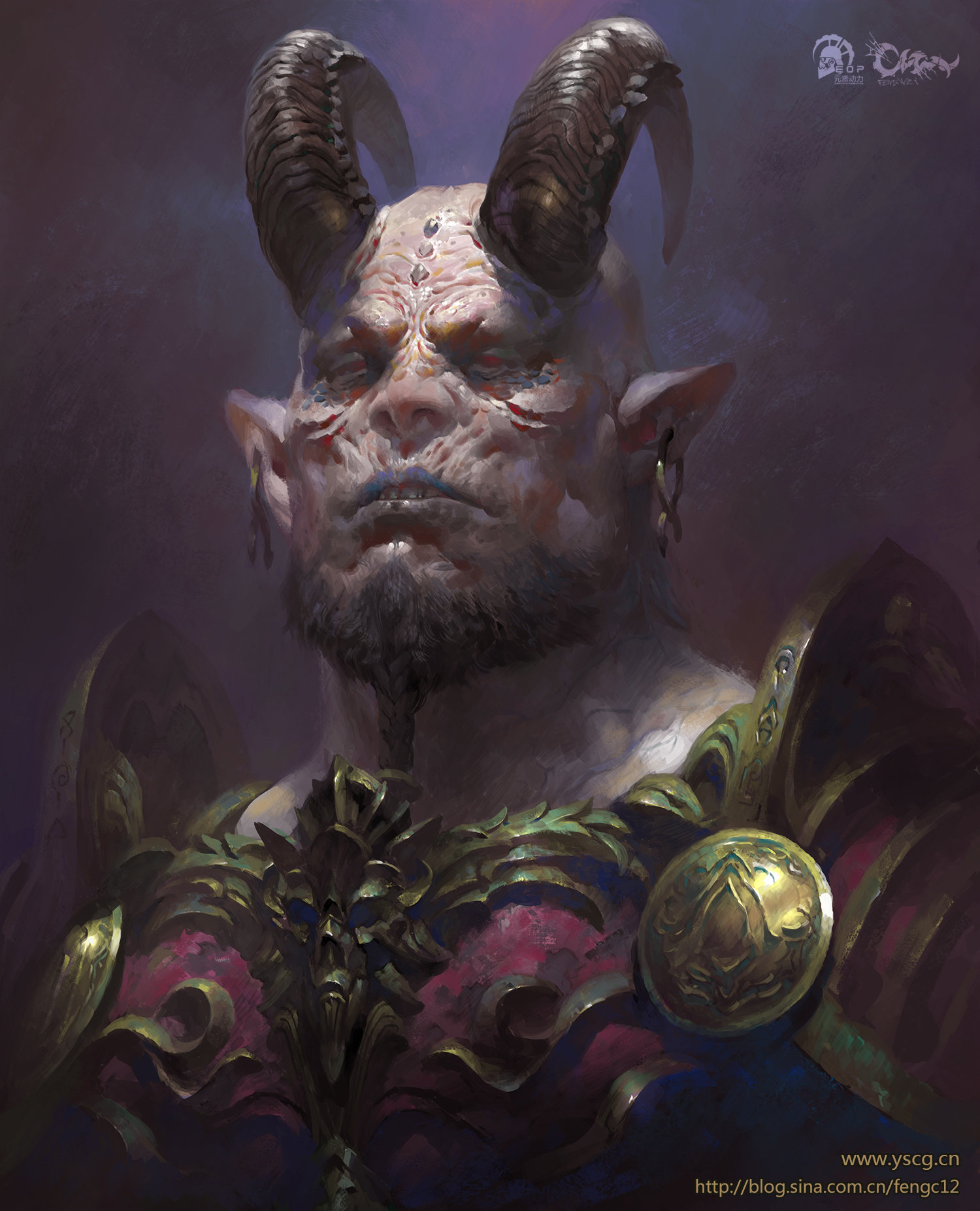
Nice choice of painting! I don't know if you're still working on this or how closely you wanted to work to the concept, but I've got a few tips about characters with things sticking out of their heads.
The sculpt looks neat, yet I feel you've got a small case of features sliding for jumping into the details before having nailed down the underlying structure. The face is too wide and missing a characterizing transition plane because you likely tried to compensate misplaced horns (they're too low, with the wrong base rotation and slightly too far apart); you also interpreted the cheekbones and the back of the head incorrectly.
When working on this type of head try to identify the main traits of the structure and keep appendages like horns as separate meshes for as long as possible so they don't interfere with the blockout. Don't bother with the skin-to-horn transition until you're absolutely sure proportions are good, otherwise you'll have to keep erasing and recreating these bumps every time you adjust the horns. Unless they're acting as landmarks leave features, wrinkles and other distractions to do last because they also obscure the underlying structure.
The main bony traits of this character imho are the quite delicate cheekbones (when compared to the rest of the features), the slightly conic shape of the head and the high inner section of the eyebrow arch, which makes the eye socket read as more delicate than the usual in evil buff characters.
In your sculpt all relevant plane transitions in the pink area were squeezed or erased by the wider frontal planes. It makes the head square-ish when it'd be more useful to think of it as an octagon, with pink planes bridging the frontal (green) and lateral (blue) planes.
Asaro's planes of the head is a fantastic blueprint to keep in mind when working out the major landmarks of a face:
Another detail off which won't matter in an artwork you'll be rendering only from the front but does matter anywhere you can rotate around the character like games and movies is his back. This character has a thick neck and likely an overly developed trapezius. Because you know the skull usually sticks out of the neck you enlarged it so it'd still show through the muscles—when the chances of the occipital bone showing this way in this case are incredibly slim. Over and over again I see artists giving little love to the trapezius section of the neck, so think about getting yours right as a way of standing out among a sea of artists.
The trapezius connection to the skull creates a characteristic hourglass shape. Its tail grabs at the T12.
The more developed it is more of the lower skull it'll obscure because bone may get covered by fat or muscles but will never grow to accompany bulging muscles. Eventually you get a cone-like silhouette, and if the skull happens to have a narrow top like this character has then this silhouette will incorporate the entire head. When studying throw away your preconceived notions and turn to references of real people to fill in the gaps left by a concept.
Thick trapezius:
Thicker...
Added to a narrow top of the head:
That's it. This turned out longer than I intended as usual, hah, but I hope it helps. Keep up the good work!
Wow, thanks a lot for the feedback! I appreciate that you took some time to review my work and give me notes, I really dig the paintovers. I agree with everything you are saying, there was something I was not liking about my sculpt but is good to have comments like this to get improvement and yeah, I'm still working on it since 2019 lol but also working on other characters at the same time, I'm not in a hurry to finish him fast and then not meeting a good quality level, thanks again. Will work through your feedbacks!
I know that feeling of having more things to do that time, haha! I'm looking forward to see what you'll come up when you get back to it.
So, the blend of smaller and bigger features in that facial structure is so interesting I couldn't get it out of my head. I ended up sculpting it last night to take a closer look. Here's two additional observations about traits I was vaguely aware of but didn't fully appreciate until shaping them myself. I hope it helps!
1.The eyebrows are sunken half-spheres. There's this relatively flat area "under" the eyes then there are the eyebrows sticking out of it—but never far enough they're projected beyond the cheekbones on either x or y axis.
2. The lower part of the chin is not only rather flat/sunken in for a chin edge but is also dimpled, almost as if he was about to cry. Though the base of the braid obscures it the only way to have room for this mass of hair + this shading on the upper chin is adding more noticeable plane changes from yellow to orange to take the dimples into account but still keep the lower area from projecting beyond the yellow area.
Interesting on how you viewed the profile of the chin, I really need to match the sculpt quite more to the concept,I think with this feedbacks really will help to get a better likeness with the ilustration, thanks a lot!
Replies
The sculpt looks neat, yet I feel you've got a small case of features sliding for jumping into the details before having nailed down the underlying structure. The face is too wide and missing a characterizing transition plane because you likely tried to compensate misplaced horns (they're too low, with the wrong base rotation and slightly too far apart); you also interpreted the cheekbones and the back of the head incorrectly.
When working on this type of head try to identify the main traits of the structure and keep appendages like horns as separate meshes for as long as possible so they don't interfere with the blockout. Don't bother with the skin-to-horn transition until you're absolutely sure proportions are good, otherwise you'll have to keep erasing and recreating these bumps every time you adjust the horns. Unless they're acting as landmarks leave features, wrinkles and other distractions to do last because they also obscure the underlying structure.
The main bony traits of this character imho are the quite delicate cheekbones (when compared to the rest of the features), the slightly conic shape of the head and the high inner section of the eyebrow arch, which makes the eye socket read as more delicate than the usual in evil buff characters.
In your sculpt all relevant plane transitions in the pink area were squeezed or erased by the wider frontal planes. It makes the head square-ish when it'd be more useful to think of it as an octagon, with pink planes bridging the frontal (green) and lateral (blue) planes.
Asaro's planes of the head is a fantastic blueprint to keep in mind when working out the major landmarks of a face:
Another detail off which won't matter in an artwork you'll be rendering only from the front but does matter anywhere you can rotate around the character like games and movies is his back. This character has a thick neck and likely an overly developed trapezius. Because you know the skull usually sticks out of the neck you enlarged it so it'd still show through the muscles—when the chances of the occipital bone showing this way in this case are incredibly slim. Over and over again I see artists giving little love to the trapezius section of the neck, so think about getting yours right as a way of standing out among a sea of artists.
The trapezius connection to the skull creates a characteristic hourglass shape. Its tail grabs at the T12.
The more developed it is more of the lower skull it'll obscure because bone may get covered by fat or muscles but will never grow to accompany bulging muscles. Eventually you get a cone-like silhouette, and if the skull happens to have a narrow top like this character has then this silhouette will incorporate the entire head. When studying throw away your preconceived notions and turn to references of real people to fill in the gaps left by a concept.
Thick trapezius:
Thicker...
Added to a narrow top of the head:
That's it. This turned out longer than I intended as usual, hah, but I hope it helps. Keep up the good work!
So, the blend of smaller and bigger features in that facial structure is so interesting I couldn't get it out of my head. I ended up sculpting it last night to take a closer look. Here's two additional observations about traits I was vaguely aware of but didn't fully appreciate until shaping them myself. I hope it helps!
1.The eyebrows are sunken half-spheres. There's this relatively flat area "under" the eyes then there are the eyebrows sticking out of it—but never far enough they're projected beyond the cheekbones on either x or y axis.
2. The lower part of the chin is not only rather flat/sunken in for a chin edge but is also dimpled, almost as if he was about to cry. Though the base of the braid obscures it the only way to have room for this mass of hair + this shading on the upper chin is adding more noticeable plane changes from yellow to orange to take the dimples into account but still keep the lower area from projecting beyond the yellow area.