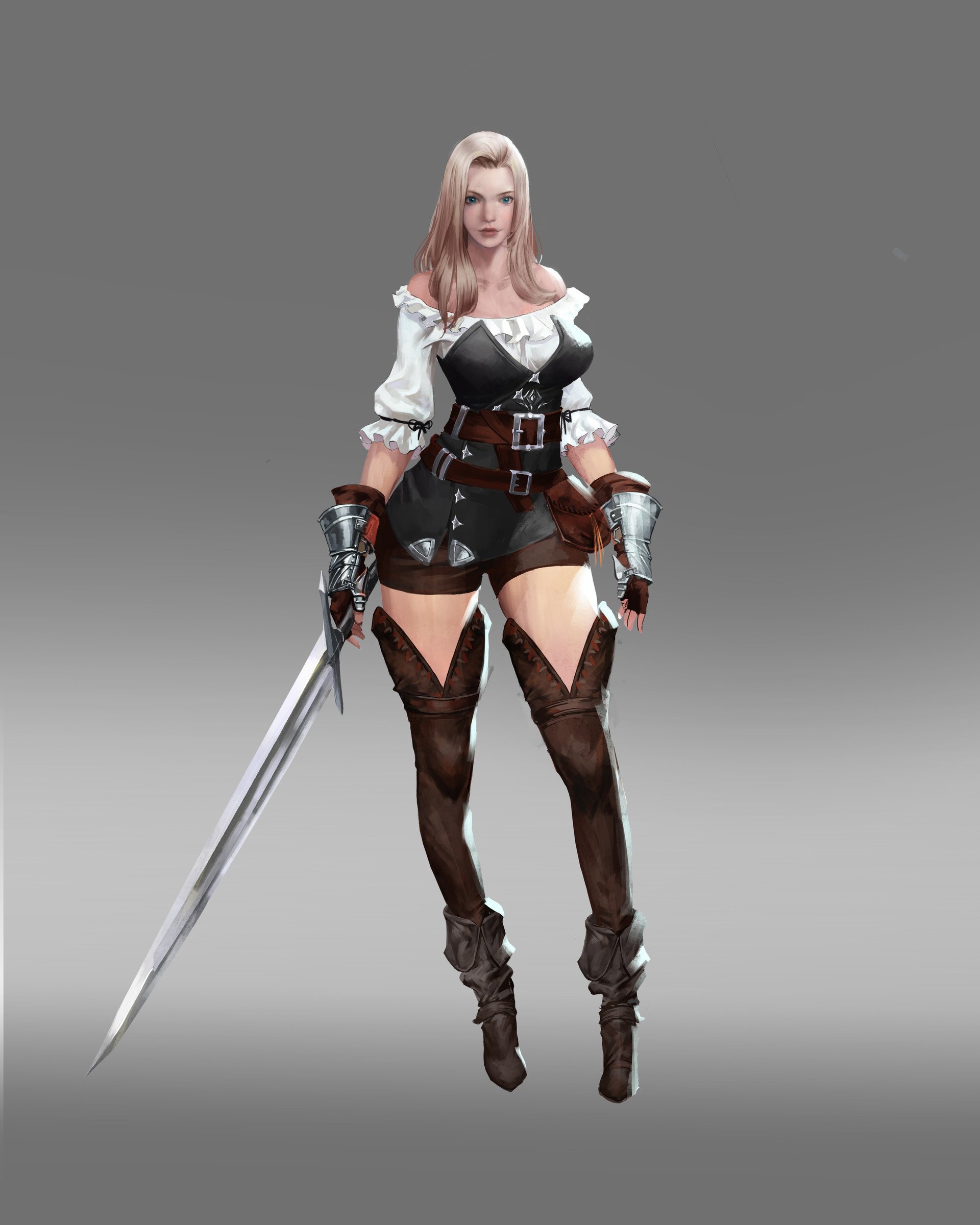
Female Rouge Character Model


This is a personal piece I'm starting to improve my character modeling skills. I typically go much more stylized, but realism seems to be what the industry is demanding. I wanted something a bit more challenging than what I usually do but not too challenging. This design/illustration from Hak Sun Kim fits the bill.

I plan on taking some creative liberties with the face, but I want to keep the overall style and design in tact. So far I just have a pretty developed head (perhaps too developed), roughed out anatomy, and hair block-out. I've been told to invite critique as early as possible. Normally, I'd never show work this early but i'm trying to grow.
Let me know if you spot any red flags with my proportions or overall gesture. Any feedback is valued.


P.S. This is also my first post on here. Don't really know if there is a standard when posting on here. Any feedback on that I'd appreciate too. I'll stop rambling now.

Replies
Thanks again for all the feedback.
Need to refine accessories and get better folds on the vest and shirt. Didn't notice the crinkled hair strand until I posted this. Which goes to show you exporting snaps out of Zbrush from time to time sure helps reveal things.