Need Critique Plz! - 3D student
Hi this is my first post on Polycount.
I just finished my second year of university, studying Game Design, and I would like get some critique and feedback on what I think are my best works that I have produced in this year.
Being new to this as well as being naturally biased towards my own work I find it hard to see my short comings sometimes and this is why I ask for your opinion :]
I would prefer straight forward answers instead of beating around the bush trying to not hurt my "feelings" or something.
My final university project - Tropical Temple:
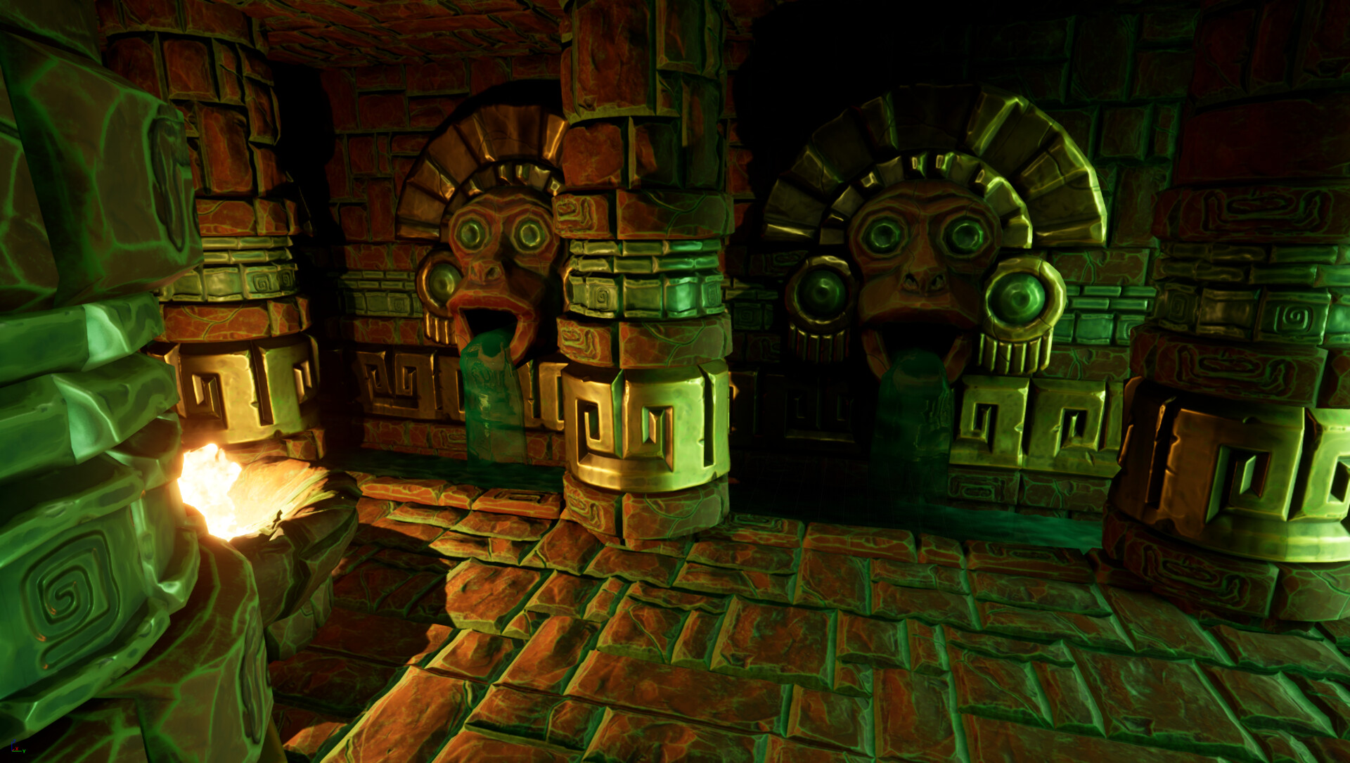
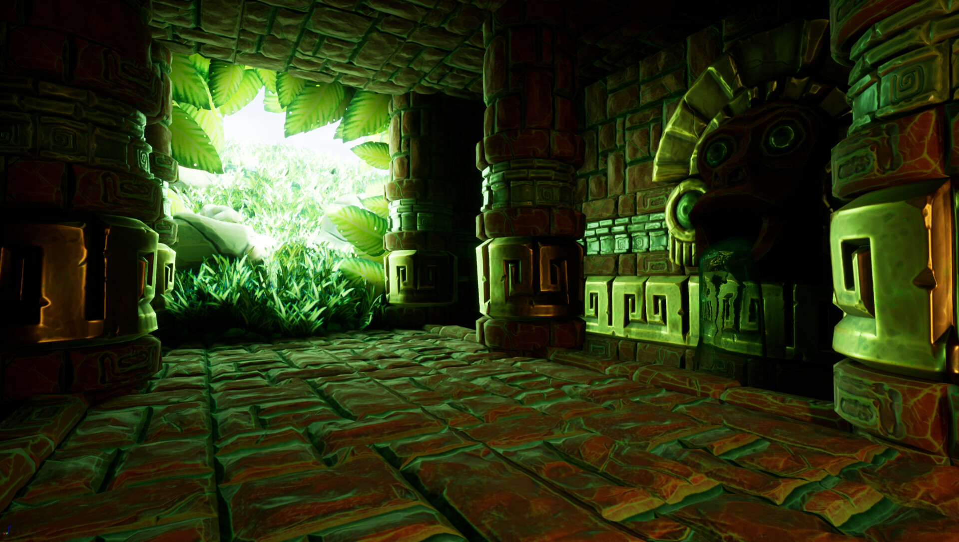

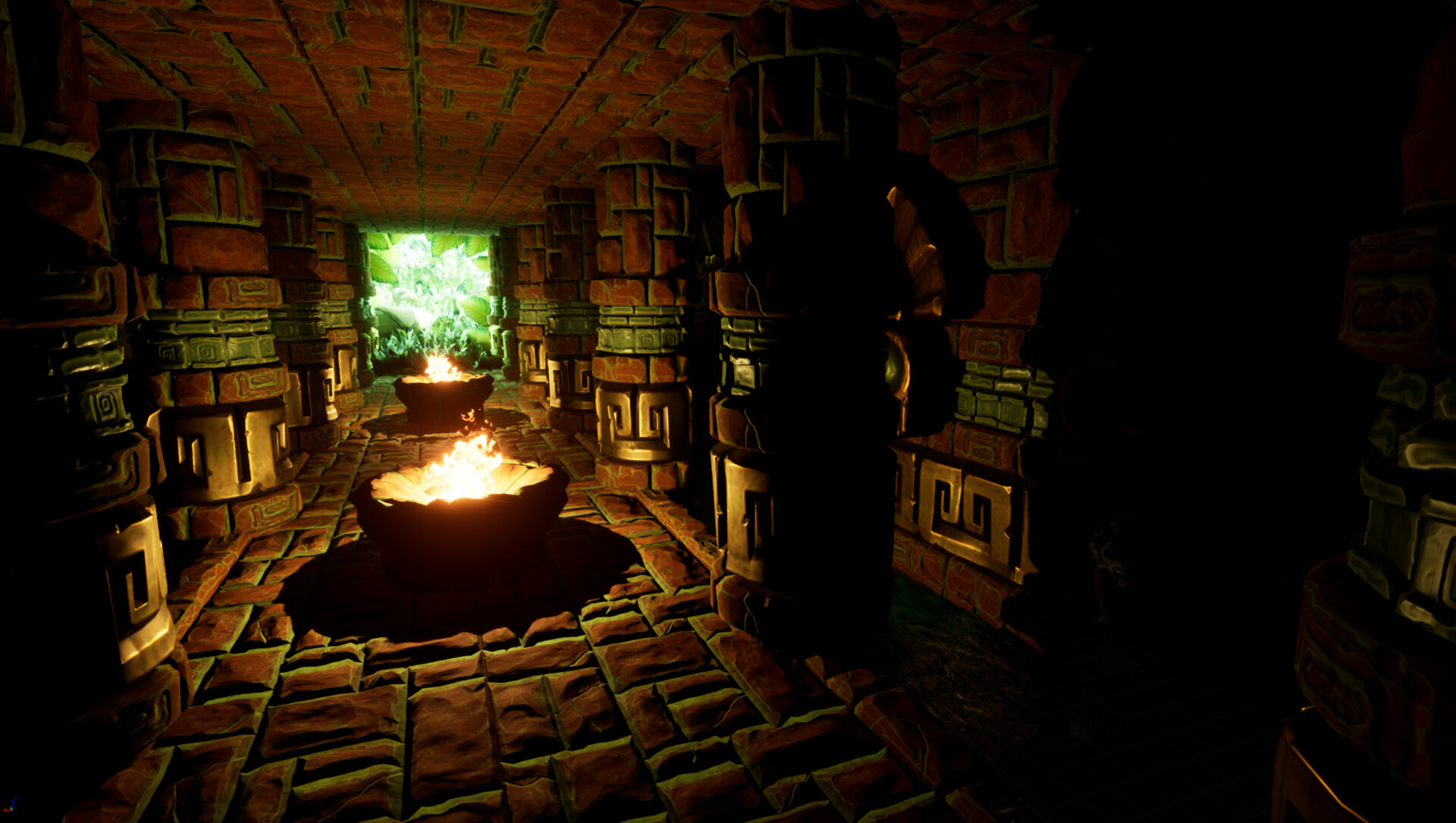
Fly through video of the scene:
https://youtu.be/B656LdOcZ4s
My earlier project from this year:
model
My Artstation:
https://medis.artstation.com/
These were done quite a while ago and since then I have moved on to create other things therefore I'm not looking to continue working on them - though I still am very interested in what are your opinions are.
Thanks for your time!
I just finished my second year of university, studying Game Design, and I would like get some critique and feedback on what I think are my best works that I have produced in this year.
Being new to this as well as being naturally biased towards my own work I find it hard to see my short comings sometimes and this is why I ask for your opinion :]
I would prefer straight forward answers instead of beating around the bush trying to not hurt my "feelings" or something.
My final university project - Tropical Temple:


Fly through video of the scene:
https://youtu.be/B656LdOcZ4s
My earlier project from this year:
model
My Artstation:
https://medis.artstation.com/
These were done quite a while ago and since then I have moved on to create other things therefore I'm not looking to continue working on them - though I still am very interested in what are your opinions are.
Thanks for your time!
Replies
You pointed out that I don't have beauty shots for my Perkunas piece which was an obvious oversight from me so I will change that soon. And as for the presentation of the maps I will change that too.
Thanks for your time in responding to this