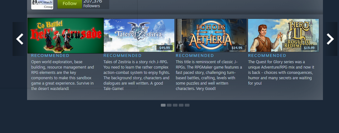
Critique/Suggestions for steam logo images
I'm trying to make the logo's you need to get your game on steam. I'm not very good at this and very slow. Don't have a ton of time left. I've been doing a 3d scene in marmoset cause i think it looks nicer than phtooshop image, and I'm quicker in 3d. That's the thing, I really need to get these done within a few days so anything extravagant is no-go.
I've overlayed my game in steam window here. I think it communicates the theme and genre well enough, but its kinda... I dunno, just looks amateur don't it? The big difficulty is fititng the big fat title in, keeping it legible, and also getting something else in to communicate the theme/genre/gameplay.

To Battle! Hell's Crusade is the one

some other ideas:


Replies
- make sure the styling of the text is consistent, no harsh gradients.
- try adding an background instead of flat color.
If you want to put characters before the logo here's one way to do it.
https://static.zerochan.net/KILL.la.KILL.full.1622658.jpg
Basically have flat color font, no shading or shadows