The BRAWL² Tournament Challenge has been announced!
It starts May 12, and ends Oct 17. Let's see what you got!
https://polycount.com/discussion/237047/the-brawl²-tournament
It starts May 12, and ends Oct 17. Let's see what you got!
https://polycount.com/discussion/237047/the-brawl²-tournament
UE4 / Old laundry room work in progress


just going to document what I am doing. So I can get feedback.
The aim of this project is to make a realistic scene.
started out with some basic block out.

Here am I make a basic mask in substance designer for tiles that i am creating using mixer

after I was done in the mixer I did take it back to substance designer.
to make better roughness map and so on.

I did end up using the original normal map from a mixer. but I was able to use the new roughness and metallic with super low values.
Next, I did make base concrete painted in a mixer but it was not so good to change the colour value too much because it made it look super unrealistic.
I wanted to get a blue-green painted wall

I did a basic window frame in substance painter. this is not the final version of the Window just starting out with this and then I will keep adding

creating the basic blend material. For now without roughness, metallic and Ao

Testing the blend.

Second block pass, just to get the main shapes in there with very basic primitives.

Removing details and add new ones.

I think this is super smart did not want to spend 100 hours make the drain inside of the bathtub so I used
substance Alchemist to create quick PBR decal from a single photo.

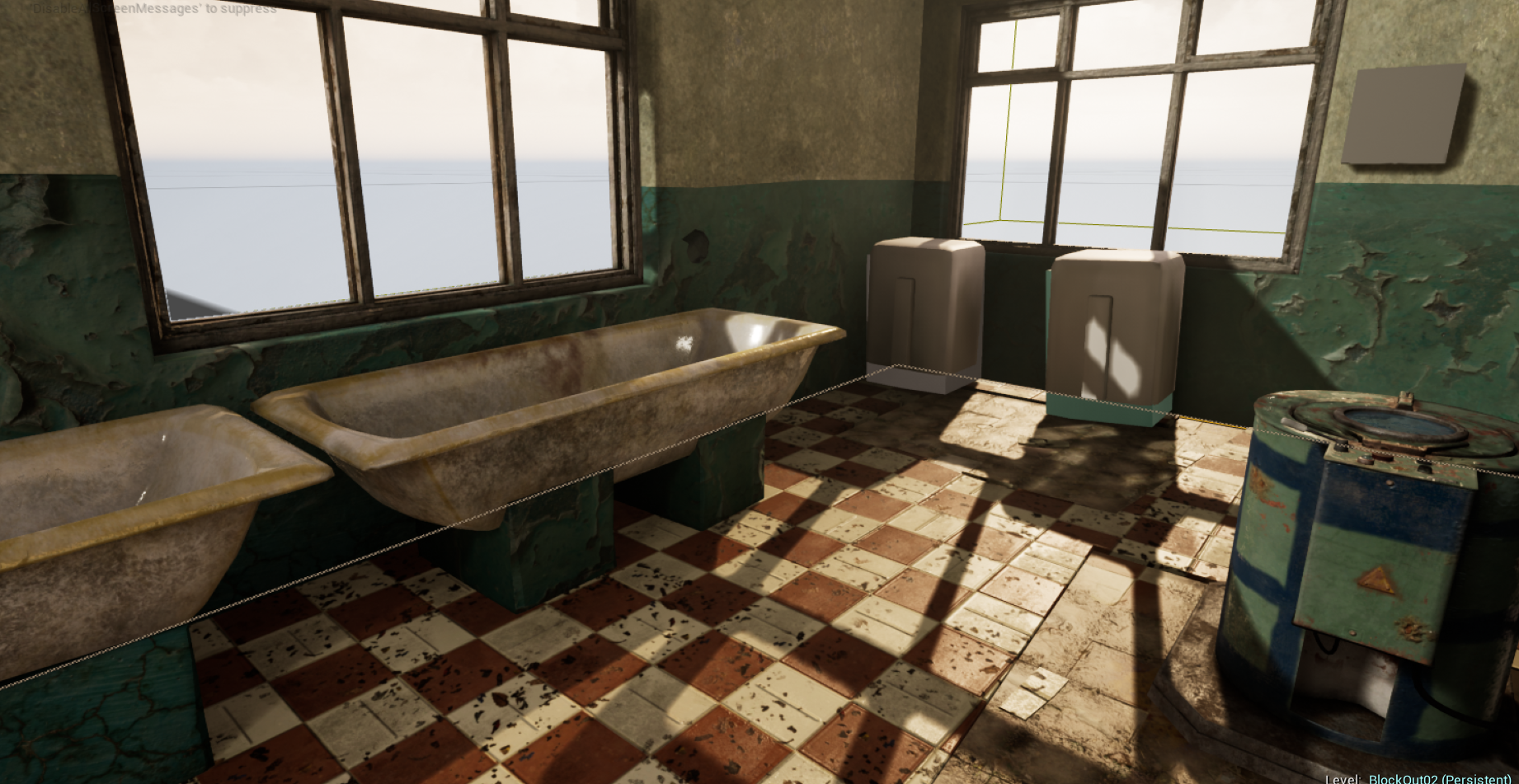
Bathtubs inside of unreal.

starting to look like something. probably need to add a roughness slider for the bathtubs. They are a way too shiny

Modelling this weird looking dryer and going to do a low to high poly Bake

Almost done with this- old dryer don't know if I am happy with it wanted it to look scanned object.

I think the right now the green colour is too green in the scene so I will have to redo the wall texture.


Trying to get a a bit darker mood .


Creating Master Material For the assets


Replies
I think your textures are looking really blurry for some reason. For a scene this small, and for a portfolio environment you should consider disabling mip mapping on all of your textures. That will help them look much more crisp and taking high resolution screenshots will help get rid of any artifacting that results from the lack of mipping.
Also you should consider using parallax occlusion mapping for the walls in particular. The depth of the wallpaper isn't really working yet, but with parallax that might make it look quite a bit better.
The wood planks on the left laying on the tubs need quite a bit of work. They don't really look like anything I can identify. Try starting with a scanned wood material and then build up grime, wear, and color variation from there in painter.
The tubs have pretty uniform grime and wear. I'd suggest adding things like water lines in the tube, drain streaks and less collection of dirt and grim on the outside vs the inside. Definitely look up some references for that because right now it looks a bit uniform.
The scene has a lot of potential. Keep up the good work and I'm excited to see where you take the scene.
a tiny update. Did change the wood. I think I still need work a bit more on that part. I also did disable mipmapping for the wall texture.
I was also hoping for some further comment on the Green wall texture I like the ugly green color but I am not sure if it's realistic enough if I was going for a semi-realistic scene I would be pretty happy with it. but something feels wrong. maybe it is just the depth like jack mentioned.
curtain material in substance.
here is what I got so far
Just have to do a few things more until I finish but still have the feeling something is missing.
only have 2 assets left on my to-do list a tiny polish on few objects and textures,
so any suggestion or feedback would be great.
Thank you for the feedback.
I did kinda make the shadows a bit harder and more saturated. but are you then talking about trying to make them softer and less obvious like in real life?
finally starting to like-ing this like that but I am worst in lighting in my opinion, so I might have to work on it more.
I re uv the beams. I hope they look a bit nicer now there was a little stretch going on.
so I honestly don't know how to fix something I can not see.
Here is a screenshot with more high-resolution shadows. Did a small tweak to get more bonces I honestly like the darker version more but I think this one is a bit more realistic. but got some small artifacts I have to fix.
but I am using the screen on the left to do the setup because I think he is more correct.
but I might be that he is too bright.
test 1
test2
Thank you glad you like it.
its a vertex painting. and then decal texture on top.
so basically just a textures
on the light in the scene.
I don't know why I like it a lot with full burnout white and grey saturation
maybe I will go somewhere between image 1 and 2. when I finish fixing the shadows.