The BRAWL² Tournament Challenge has been announced!
It starts May 12, and ends Oct 17. Let's see what you got!
https://polycount.com/discussion/237047/the-brawl²-tournament
It starts May 12, and ends Oct 17. Let's see what you got!
https://polycount.com/discussion/237047/the-brawl²-tournament
Second opinions about this hard surface topology?
Hi guys, I got some feedback from some professionals about some work I completed recently. One thing that was pointed out specifically was this weapon. They said that the topology was a no-go as it was not clean and wouldn't suffice in production environment. I am gonna ask them directly for any further clarification, but there's a lot of great hard-surface gurus here so I want to get some varied opinions as well.
First, let me explain how I made this weapon.
I began by getting a reference. In this case, I had a nice photo that was at a flat angle so I just put it on a plane in maya, made the plane live, and used quad draw to trace it directly. I adjust proportions a little afterwards just to make it feel better. That initial blockout was built in all quads, designed to be cleanly subdivided. Support edges and all that -- your basic subD modeling. The blade recieved two levels of smooth, and the handle I took into zbrush to add engraving and some IMM ornamentation.
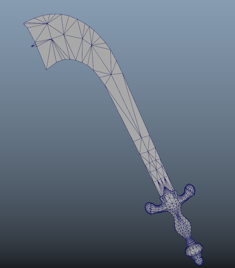
Then I took that initial blockout and turned it into game model. I stitched off all edges not holding silhouette defining shape. So the blade is flat on either side except a mild taper on the inside, which is why I need the one edge going down the middle. Everything else can be reduced to only essentials.
I did the bake, came out good. You can see the final textured result below.
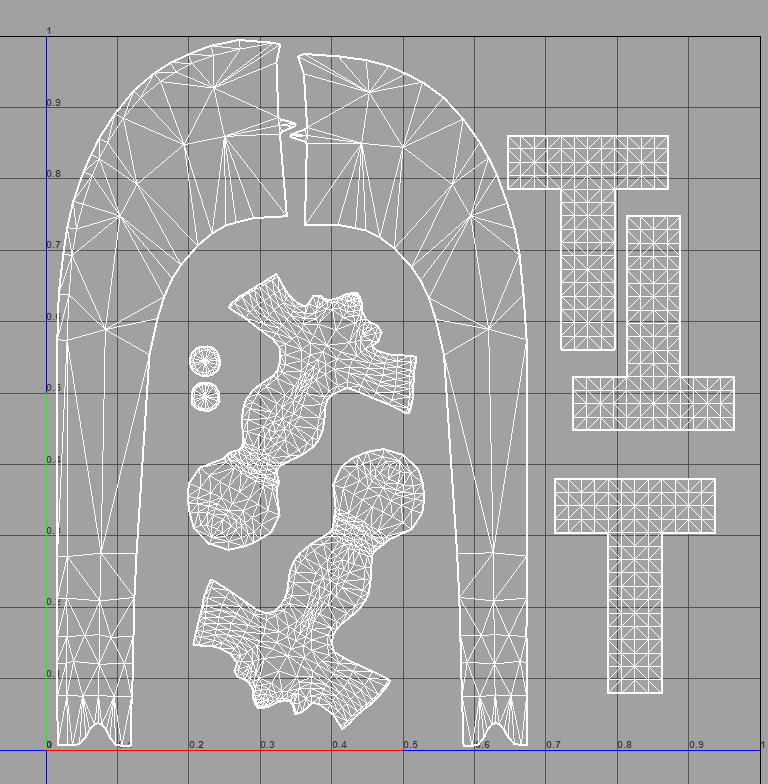
In your opinion, where can my topology be improved? Would you say it's a no-go? I'd appreciate it a ton if you can explain why. Some examples why this wouldn't work in a game, or might be a pain in the ass for other parts of the pipeline. One thing I always try and do is have clean edge loops running the length of an object so that you can split into UV shells very easily. Not always possible but I did so for this model. Blade splits into two sides and the handle as well.


UV's. I kept the handle at the same texel density as the blade, but this is a mistake because the blade does not have enough detail on it to show a discernible difference even if there is some texel density disparity. So I could have sized the handle shells up more. Anyway, just wanted to show that I design the topology with cleanliness in mind.


Replies
1. Does the mesh need to deform at any point?
2. If you are using a subdivision workflow, are there nice edge loops and topology for it to divide correctly?
3. Will the mesh cause any issues with vertex normal shading?
4. If the model is being used for a game, is the triangle and vertex count too high?
5. Is the model not a complete nightmare to unwrap?
---
In relation to this particular model I would say:
1. No it probably doesn't need to deform.
2. Apparently you did factor in having nice topology for the subdivision workflow, though it's not one of the screenshots shown.
3. It's hard to tell how clean the normal shading is with the texture, but it looks fine for the most part.
4. I would say the poly-count is kind of fine, certainly a few areas I would definitely optimise, but I tend to work with mobile / lower end pc, so everything tends to look pretty high too me.
5. You already unwrapped and textured the model, so I assume you were fine on this front.
---
At the end of the day as long as the final result is displaying fine in-game or in a render, and it's not too much of a pain to make changes to for yourself or other people then the topology doesn't really matter a great deal.
Yes, you could certainly do some further optimisation, but from a strictly topology perspective(I agree with Noors on Uvs/blade design) just blankly writing off the topology as unacceptable, without knowing its purpose or destination, just seems elitist to me.
I also scanned your char WIP a month or so back for a sticky beak, really come up nice man! cheers to that. Can see the end result for all the effort put in which IMHO the sword can definitly benefit from as a purely aesthetic point of view. When or if time permits of course.
OK. Brutal bit first..
If this was the most recent piece in your portfolio I would not invite you for an interview.
I don't mean any offence, I feel it is extremely unhelpful to be indirect.
The distribution of detail is very uneven - the blade is the biggest bit, why is it so much more faceted than the handle? You could get a better silhouette by moving geometry from the handle to the blade and incur no overall cost.
How well does the blade shade? I suspect badly based on the mesh and the shaded screenshot. Evenly spaced strips would almost certainly shade better, any extra cost incurred could be saved elsewhere.
UV questions...
Do you really need unique UVs for each side of the blade.. Can you see both sides at once?
Why aren't the shells for the handle straight?
Why didn't you unwrap the handle as a straight cylinder?
Those dirty great T shaped shells are way too big and why aren't they overlapped?
Honestly the UVs just look lazy to me and that in itself is enough to put me off a candidate
I won't go into the material work because that's my specialist subject and I don't feel like typing that much. I would back up everything Noors said on that though.
Advice:
Work out what your view distance is and prioritise the distribution of mesh detail according to that.
Do the same with your UVs and for the love of all that is holy re-use texture space where you can.
Again, I'm not shitting on you for fun. those are the sort of initial assements I make on a lot of pieces that come past me.
I do agree with everyone in that the feedback you got was pap - they were probably just busy..