The BRAWL² Tournament Challenge has been announced!
It starts May 12, and ends Oct 17. Let's see what you got!
https://polycount.com/discussion/237047/the-brawl²-tournament
It starts May 12, and ends Oct 17. Let's see what you got!
https://polycount.com/discussion/237047/the-brawl²-tournament
[WIP] Feedback Request for Low Poly 3D Roguelike Characters
I would like to get some feedback for some characters I made:

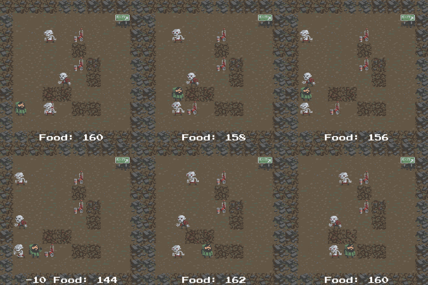
They are meant for a 3D roguelike. Here's an example of how a roguelike can look:

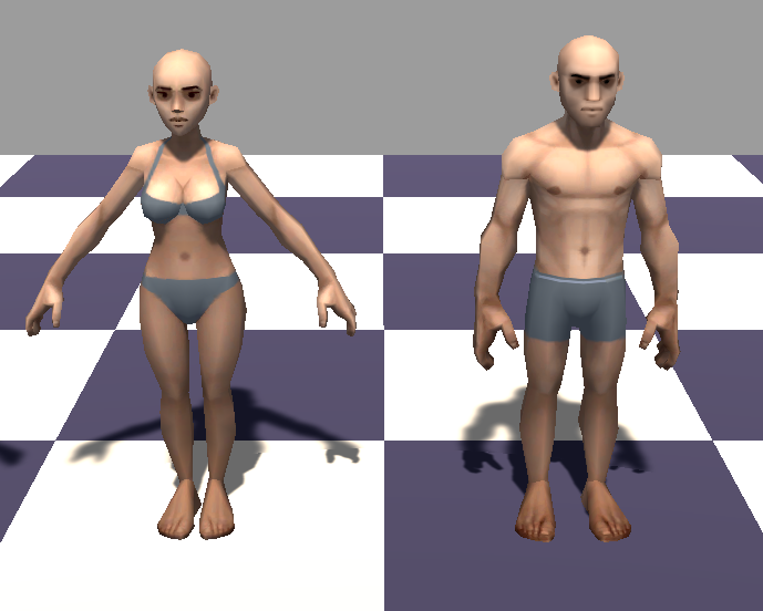
So roguelikes are games that are usually quite simplistic in their visual aesthetics. I basically want to keep the simplicity but move it to 3D. So here is what I came up with so far:
The thing that bothers me the most is how the mesh deforms at the shoulders. The T-Pose makes the shoulder muscles almost disappear. Is there a better way to do it? I am interested in criticism in general regarding these models but feedback aiming to improve the shoulder deformations will be valued the most. 
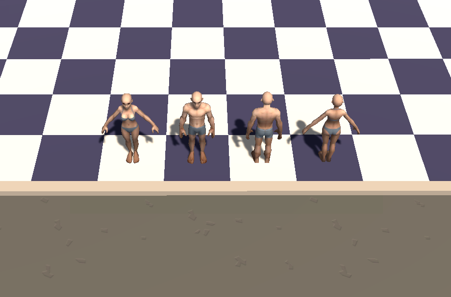
Here is how the models appear in an early prototype:

What do you think?
Here is a downloadable version where the shoulder deformation is emphasized to prove my point:
Any feedback is welcome!