Home 3D Art Showcase & Critiques

[UE4] Between Two Worlds Scene

s1ayer450
polycounter lvl 2
Offline / Send Message
s1ayer450 polycounter lvl 2
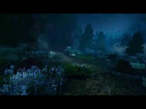
A recent scene made with Unreal Engine 4 for school project diorama.

Within the Japanese forest, there is a lost traveller wandering around is a sacred cave along the river is a gateway towards the spirit world.

A fantasy art theme.

Any feedback or critique will be appreciated. Most of the assets have made by me.

For self-critique, I will wanna improve my modelling topology skills, some texturing improvements, and implement more story within the scene.


Replies

  • JohannesAg
    Offline / Send Message
    JohannesAg greentooth
    well I´m not an environment guy so I don´t have too much to say. But those rocks/cliffs look strange to me, they feel kind of blobby and the tiling texture is a bit "scaly". What was your reference for those? 
  • MorbidPandaUK
    Offline / Send Message
    MorbidPandaUK polycounter lvl 2
    That looks nice overall! The environment's certainly got a pleasant, tranquil atmosphere to it and the plants are looking good in general.

    I think in terms of criticism I would agree the rocks look a bit soft and clay-like. In the video, the cliffs seemed kind of blurry. Making the rocks look more solid and angular, and possibly reducing the amount of fogginess could help there.

    The grass and trees are maybe a bit over-saturated in their colour, and the purple plants look notably flat when up close. I understand detailed 2D plants are necessary for a real-time environment, but perhaps some more 2D planes at different angles could help there? Alternatively, keeping the plants at a distance away from the viewer would sort that out too.

    Those are fairly minor nit-picks though! I think the only other thing I would suggest is adding some unique assets that would separate this from any other forest scene to make it more memorable. Perhaps the ruins of a Japanese shrine, or some low-poly animals to inhabit the scene? 
  • s1ayer450
    Offline / Send Message
    s1ayer450 polycounter lvl 2
    That looks nice overall! The environment's certainly got a pleasant, tranquil atmosphere to it and the plants are looking good in general.

    I think in terms of criticism I would agree the rocks look a bit soft and clay-like. In the video, the cliffs seemed kind of blurry. Making the rocks look more solid and angular, and possibly reducing the amount of fogginess could help there.

    The grass and trees are maybe a bit over-saturated in their colour, and the purple plants look notably flat when up close. I understand detailed 2D plants are necessary for a real-time environment, but perhaps some more 2D planes at different angles could help there? Alternatively, keeping the plants at a distance away from the viewer would sort that out too.

    Those are fairly minor nit-picks though! I think the only other thing I would suggest is adding some unique assets that would separate this from any other forest scene to make it more memorable. Perhaps the ruins of a Japanese shrine, or some low-poly animals to inhabit the scene? 
    Thanks for the feedback! I'll add that to my notes. I see where you are coming from, and that's what I may do and improve on is the rocks. For 2D plants maybe can get away if the plants sorta rotated on XY axis towards the player may help not be so noticeable in cinematic shots?

    well I´m not an environment guy so I don´t have too much to say. But those rocks/cliffs look strange to me, they feel kind of blobby and the tiling texture is a bit "scaly". What was your reference for those? 

    As for references here is one of them, I will need to do some practices with rock models but something will be willing to do :)


Sign In or Register to comment.